Alert
Document Metadata
Category: Applications Platform / UI Components — Alert Component
Audience: Developers, Engineers, UI/UX Designers, Support Team
Difficulty: Intermediate
Time Required: Approximately 15–20 minutes
Prerequisites: Access to the ConnexCS Apps Platform IDE and familiarity with basic UI component configuration (via Page Builder or custom code)
Related Topics: Page Builder / UI Components Overview, ScriptForge / App Logic Layer
Next Steps: Add Alert component → configure type/message/styling → trigger via app logic → test scenarios and accessibility
Description
The Alert component can be used to display success, warning, information or error-type boxes.

Use Case
You can use alerts to display:
- An Information box is a form is successfully saved.
- An error if it doesn't save.
- A warning if some data is incomplete on the form.
- Information to advise how to better complete a form.
Interactivity
Alerts lack a natural ability for interaction.
They're modal dialogue boxes that remain visible until the user decides to close them.
You would need to make a custom alert element and include event listeners in it in order to add interactivity to an alert.
Examples may include:
- Clicking on a button to dismiss the alert.
- Typing text into a text box to provide feedback.
- Selecting an option from a list.
- Submitting a form.
API
Methods
| Name | Description | Parameters |
|---|---|---|
this.hide |
Hides the field | (fields: String|String[]) |
this.show |
Displays the field | (fields: String|String[]) |
Info
- The show() and hide() methods can also be used to control the visibility of an alert in response to user input.
- Fields refers to a component ID or a list of component IDs. You can fetch the ID from the Component Attribute panel in the Page Builder.
- Before using this.show(fields), make sure the component is hidden. This can be done using this.hide(fields) or by enabling the Hidden checkbox in the Component Attribute panel.
Steps to use the methods for the Page Builder components
- Go to Form Attribute Action Panel Setting (Mounted | refresh | click 'Add action').
- Write the method/code as shown in the Example below.
- Click on
Save. - On the main screen click on
Saveagain. - Click on
Previewto see the code in action.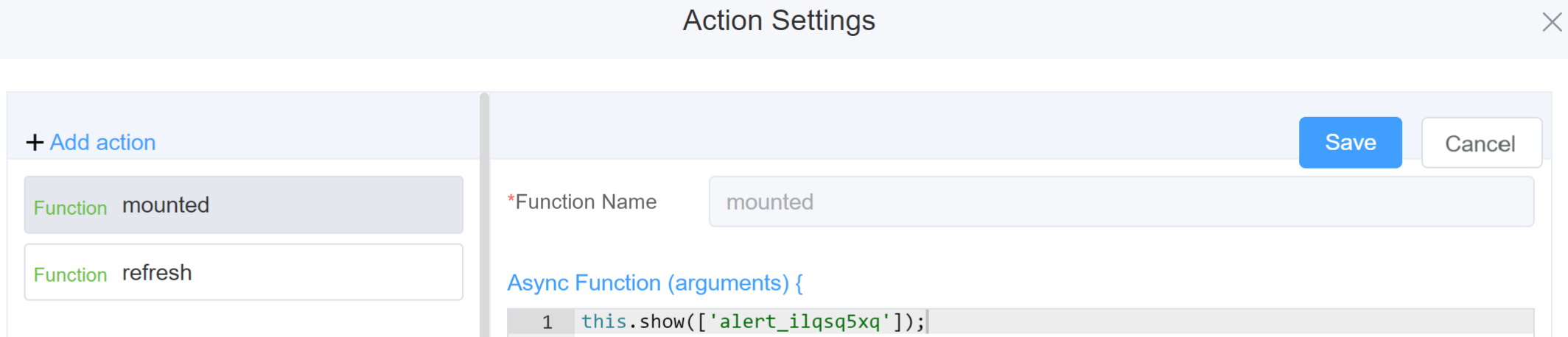
Example
-
this.hide(fields)1 2
var fields= ['alert_ilqsq5xq'] this.hide(fields) -
this.show(fields)1 2
var fields= ['alert_ilqsq5xq']
this.show(fields)
Config
| Name | Description | Icon |
|---|---|---|
| ID | The alert component's unique identifier | 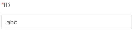 |
| Title | [Optional] The visual identifier label of the field |  |
| Description | [Optional] Gives information about the alert |  |
| Width | [Optional] The width of the field. Example: 20%, 20px, 20rem | 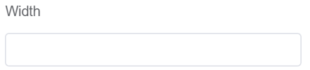 |
| Effect | You can either choose from Dark or Light Mode | 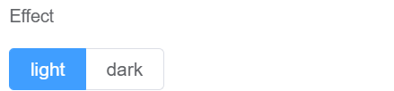 |
| Type | Sets the icon of the selected alert type. Success, Warning, Info and Error will have different icons associated with them | 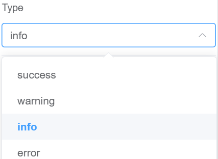 |
| Closable | The user can close the alert box | 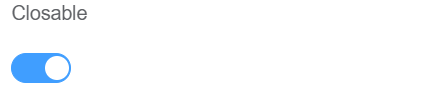 |
| Center | Sets the position of the alert label at the center | 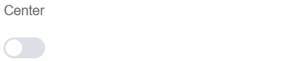 |
| Show Icon | Displays/Hides the symbol associated with each Type of alert |  |
| Attribute Action | Enable Hidden action to hide the alert | 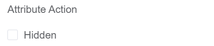 |
First time User?
If you are using the Page Builder components on the ConnexCS platform for the first time, we request you to use our guide on steps to use the Components.