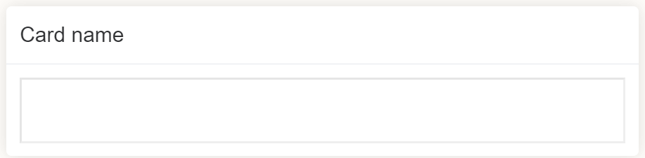
Card
Document Metadata
Category: Applications Platform / UI Components — Card Component
Audience: Developers, Engineers, UI/UX Designers, Support Team
Difficulty: Intermediate
Time Required: Approximately 15–20 minutes
Prerequisites: Access to the ConnexCS Apps Platform IDE and familiarity with basic UI component configuration (via Page Builder or custom code)
Related Topics: Page Builder / UI Components Overview, Button Component, Alert Component (for mixing components)
Next Steps: Add Card → configure title/content/styling → populate dynamically → combine with other components → test across devices
Description
A Card in a page builder is a type of container that can be used to group related form fields together.
Cards are typically used to create a more organized and visually appealing form layout.
They can also help to improve the user experience by making it easier for users to scan the form and find the information they need.
Use Case
Some of the use cases are as follows:
- Grouping related fields together.
- Creating multi-step forms.
- Breaking up long forms into smaller chunks.
- Creating sidebars.
- Adding visual interest.
- Creating responsive forms.
- Improving accessibility.
Interactivity
Interactivity is the ability of a web page or application to respond to user input.
Card components can be interactive in a page builder.
They can be used to display information, collect user input, and trigger actions.
Some examples of how card components can be made interactive include:
-
Adding Input fields to Cards: You can add input fields, such as text fields, select boxes, and checkboxes, to cards to collect user input.
-
Displaying Dynamic content: You can use JavaScript to display dynamic content in cards, such as error messages or additional information based on user input.
-
Triggering actions: You can add buttons or links to cards to trigger actions, such as submitting a form or opening a pop-up window.
-
Adding animations and effects: You can use CSS to add animations and effects to cards, such as fading in or out elements or highlighting fields upon clicking.
-
Responding to user interactions: You can use JavaScript to handle user interactions with cards, such as clicks, selections, and changes. For example, you could use JavaScript to hide or show additional fields based on the user's selection in a dropdown menu.
API
Methods
| Name | Description | Parameters |
|---|---|---|
this.addClassName |
Add style class to a form item | (fields: String|String[], className: String) |
this.removeClassName |
Remove style class from a form item | (fields: String|String[], className: String) |
this.getComponent |
Returns a component whose id has been passed as a parameter | (component_ID: String) : Object |
this.getValue |
Get A Value From a component | (fieldName: String) |
this.getValues |
Gets the current values of all fields | () : Object |
this.hide |
Hides the field | (fields: String|String[]) |
this.show |
Displays the field | (fields: String|String[]) |
Info
- The show() and hide() methods can also be used to control the visibility of the card component in response to user input.
- Fields refers to a component ID or a list of component IDs. You can fetch the ID from the Component Attribute panel in the Page Builder.
- Before using this.show(fields), make sure the component is hidden. This can be done using this.hide(fields) or by enabling the Hidden checkbox in the Component Attribute panel.
Steps to use the methods for the Page Builder components
- Go to Form Attribute Action Panel Setting (Mounted | refresh | click 'Add action').
- Write the method/code as shown in the Example below.
- Click on
Save. - On the main screen click on
Saveagain. - Click on
Previewto see the code in action.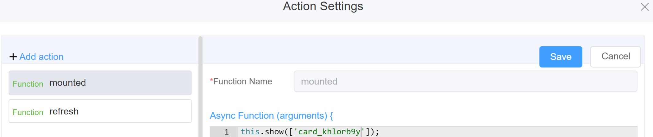
Example
-
this.addClassName(fields, className)- Go to Form Attribute Style Sheets add the class
.abc{ // abc is the class name background-color: red; } -
Follow the steps mentioned above, under Steps to use the methods for the Page Builder components
this.addClassName('card_khlorb9y', 'abc')
- Go to Form Attribute Style Sheets add the class
-
this.removeClassName(fields, className)1this.removeClassName('card_khlorb9y', 'abc') -
this.getValue(fieldName)1 2
var cardname = this.getValue('card_khlorb9y'); console.log('getValue', cardname); this.getValues()1 2
var data = this.getValues(); console.log(data);this.hide(fields)1 2
var fields= ['card_khlorb9y'] this.hide(fields)this.show(fields)1 2
var fields= ['card_khlorb9y'] this.show(fields)this.getComponent('component_ID')1 2
var cardname = this.getComponent('card_khlorb9y');
console.log('getComponent', cardname);
Info
Use the following syntax to add multiple classes to a component:
1 | |
Config
| Name | Description | Icon |
|---|---|---|
| ID | The card's component's unique identifier | |
 |
||
| Title | [Optional] The visual identifier label of the field | 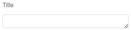 |
| Width | [Optional] The width of the field. Example: 20%, 20px, 20rem |  |
| Padding | [Optional] Specifies the amount of space between an element's content and its border. Example: 20%, 20px, 20rem | 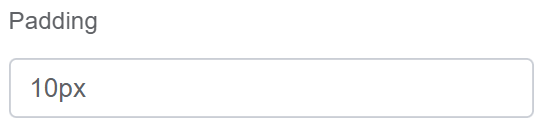 |
| Show Header | [Optional] Hides/Displays the Title of the card |  |
| Bordered | [Optional] Adds/Removes the border around the card |  |
| Shadow | [Optional]It's used to create a more visually appealing and engaging page. Shadows can also be used to make it easier for users to find and interact with page elements. the terms "always," "hover," and "never" refer to the visibility of the component's shadow | 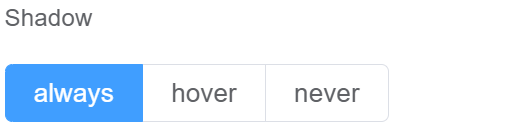 |
| Custom Class | An HTML class attribute which allows further customisation See Form Attribute > Style Sheets |  |
| Attribute Action | Enable Hidden action to hide the field | 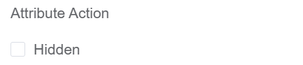 |
First time User?
If you are using the Page Builder components on the ConnexCS platform for the first time, we request you to use our guide on steps to use the Components.