Table
Document Metadata
Category: Applications & Components
Audience: Administrators, Engineers, App Developers
Difficulty: Beginner to Intermediate
Time Required: Approximately 15–30 minutes
Prerequisites: Active ConnexCS account, access to the Applications module, basic understanding of UI component configuration and data-driven components (tables, lists, data binding)
Related Topics: Grid Component, Pagination Component, Input Component, Page Layout Component
Next Steps: Create a sample table using the Table component to display data sets; test column configuration, sorting/filtering (if supported), data binding and integration with backend data sources; combine with Pagination or other components for large data sets
Description
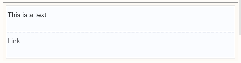
The Table component isn't just about presenting data in neat rows and columns.
It can be a powerful tool for enhancing user experience, streamlining data entry, and even adding a touch of visual appeal to your forms.
Tables provide a structured format for organizing related data within a form. Users can easily scan information, compare options, and make informed choices.
Use Case
- Structure and Flexibility
- Enhanced User Experience
- Streamlined Data Entry
Interactivity
- Beyond static data display, tables can incorporate interactive elements like checkboxes, dropdown menus, and input fields directly within cells, streamlining data entry and eliminating the need for multiple form sections.
- Integration with buttons or actions can enable bulk editing, selection, or removal of entries within the table, saving users time and effort.
- Integrating interactive elements like drag-and-drop reordering or row customization can increase user engagement and make data manipulation more intuitive.
- Interactive Data Entry
API
Methods
| Name | Description | Parameters |
|---|---|---|
this.addClassName |
Add style class to a form item | (fields: String|String[], className: String) |
this.removeClassName |
Remove style class from a form item | (fields: String|String[], className: String) |
this.getComponent |
Returns a component whose id has been passed as a parameter | (component_ID: String) : Object |
this.hide |
Hides the field | (fields: String|String[]) |
this.show |
Displays the field | (fields: String|String[]) |
this.getValues |
Gets the current values of all fields | () : Object |
Info
- The show() and hide() methods can also be used to control the visibility of a table in response to user input.
- Fields refers to a component ID or a list of component IDs. You can fetch the ID from the Component Attribute panel in the Page Builder.
- Before using this.show(fields), make sure the component is hidden. This can be done using this.hide(fields) or by enabling the Hidden checkbox in the Component Attribute panel.
Steps to use the methods for the Page Builder components
- Go to Form Attribute Action Panel Setting (Mounted | refresh | click 'Add action').
- Write the method/code as shown in the Example below.
- Click on
Save. - On the main screen click on
Saveagain. - Click on
Previewto see the code in action.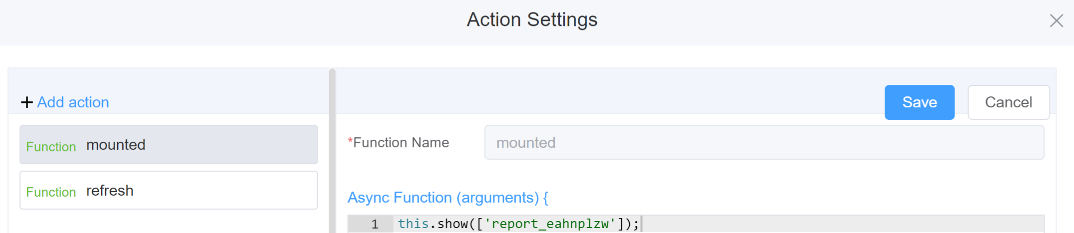
Example
-
this.addClassName(fields, className)- Go to Form Attribute Style Sheets add the class
.abc{ // abc is the class name background-color: red; } - Follow the steps mentioned above, under Steps to use the methods for the Page Builder components
this.addClassName('report_eahnplzw', 'abc')
- Go to Form Attribute Style Sheets add the class
-
this.removeClassName(fields, className)1this.removeClassName('report_eahnplzw', 'abc') -
this.hide(fields)1 2
var fields= ['report_eahnplzw'] this.hide(fields) -
this.show(fields)1 2
var fields= ['report_eahnplzw'] this.show(fields) -
this.enable(['fields'])1this.enable(['report_eahnplzw']) -
this.getComponent('component_ID')1 2
var reportname = this.getComponent('report_eahnplzw'); console.log('getComponent', reportname); -
this.getValues()1 2
var data = this.getValues();
console.log(data);
Config
| Name | Description | Icon |
|---|---|---|
| ID | The table component's unique identifier |  |
| Width | [Optional] Width of the field |  |
| Border Width | Choose the width of the table | 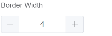 |
| Border Color | Choose the color of the table |  |
| Custom Class | An HTML class attribute which allows further customisation See Form Attribute > Style Sheets |  |
| Attribute Action | Enable Hidden action to hide the field | 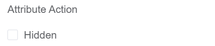 |
First time User?
If you are using the Page Builder components on the ConnexCS platform for the first time, we request you to use our guide on steps to use the Components.