Rate
Document Metadata
Category: Applications & Components
Audience: Administrators, Engineers, App Developers
Difficulty: Beginner to Intermediate
Time Required: Approximately 15–30 minutes
Prerequisites: Active ConnexCS account, access to the Applications module, basic familiarity with UI component configuration and rating/rating-input components
Related Topics: Input Component, Number Component, Radio Component, Grid Component
Next Steps: Create a form or UI that incorporates the Rate component (e.g., for user feedback or scoring); test with various rating scales and default values to validate functionality
Description
A Rate component allows users to express their level of satisfaction, preference, or opinion on something using a visual scale.

Use Case
- Evaluating products or services
- Gauging satisfaction levels
- Prioritizing user preferences
- Enhancing user engagement
- Interactive feedback loops
- Gathering quantitative data
- Market research surveys
- Website usability testing
- A/B testing
Interactivity
- Tooltips: Informative pop-ups explaining the implications or meaning of each rating level, especially for complex criteria.
- Remember past ratings: Pre-fill the rating based on the user's previous rating for the same item, saving time and effort.
- Contextual recommendations: Based on the user's rating, suggest similar items or content they might enjoy.
- Adaptive interfaces: Adjust the rating scale or feedback options based on the user's previous interactions or browsing behavior.
API
Events
| Name | Description |
|---|---|
onChange (element) |
The onChange event occurs when the value of a field is changed |
Methods
| Name | Description | Parameters |
|---|---|---|
this.addClassName |
Add style class to a form item | (fields: String|String[], className: String) |
this.removeClassName |
Remove style class from a form item | (fields: String|String[], className: String) |
this.getComponent |
Returns a component whose id has been passed as a parameter | (component_ID: String) : Object |
this.getValues |
Gets the current values of all fields | () : Object |
this.getValue |
Get A Value From a component | (fieldName: String) |
this.hide |
Hides the field | (fields: String|String[]) |
this.show |
Displays the field | (fields: String|String[]) |
this.disable |
Disable rate field from user interaction | (fields: String|String[]) |
this.enable |
Enable rate field from user interaction | (fields: String|String[]) |
this.setData |
Set the data in the field. The Value object should be of type { componentId: componentValue } | (Value: Object) |
Info
- The show() and hide() methods can also be used to control the visibility of the rate component in response to user input.
- Fields refers to a component ID or a list of component IDs. You can fetch the ID from the Component Attribute panel in the Page Builder.
- Before using this.show(fields), make sure the component is hidden. This can be done using this.hide(fields) or by enabling the Hidden checkbox in the Component Attribute panel.
- Before using this.enable(fields), make sure the component is disabled. This can be done using this.disable(fields) or by enabling the Disabled checkbox in the Component Attribute panel.
Steps to use the methods for the Page Builder components
- Go to Form Attribute Action Panel Setting (Mounted | refresh | click 'Add action').
- Write the method/code as shown in the Example below.
- Click on
Save. - On the main screen click on
Saveagain. - Click on
Previewto see the code in action.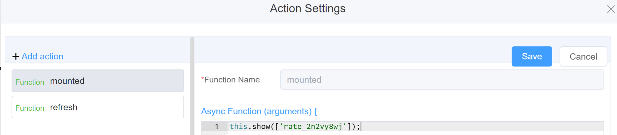
Example
-
this.addClassName(fields, className)- Go to Form Attribute Style Sheets add the class
.abc{ // abc is the class name background-color: red; } - Follow the steps mentioned above, under Steps to use the methods for the Page Builder components
this.addClassName('rate_2n2vy8wj', 'abc')
- Go to Form Attribute Style Sheets add the class
-
this.removeClassName(fields, className)1this.removeClassName('rate_2n2vy8wj', 'abc') -
this.getValues()1 2
var data = this.getValues(); console.log(data); -
this.hide(fields)1 2
var fields= ['rate_2n2vy8wj'] this.hide(fields) -
this.show(fields)1 2
var fields= ['rate_2n2vy8wj'] this.show(fields) -
this.disable(['fields'])1this.disable(['rate_2n2vy8wj']) -
this.enable(['fields'])1this.enable(['rate_2n2vy8wj']) -
this.getValue('fieldName')1 2
var ratename = this.getValue('rate_2n2vy8wj'); console.log('getValue', ratename); -
this.getComponent('component_ID')1 2
var ratename = this.getComponent('rate_2n2vy8wj'); console.log('getComponent', ratename); -
this.setData(Value)1 2 3
this.setData({
"tabs": 4.5
});
Config
| Name | Description | Icon |
|---|---|---|
| ID | The rate component's unique identifier |  |
| Name | [Optional] The display name of the rate field |  |
| Width | [Optional] Width of the field |  |
| Label Width | Width of the label associated with an input field. It determines the horizontal space occupied by the label text |  |
| Label Wrap | If the label is longer than the allowed width the text will continue on another line |  |
| Hide Label | Hides the label on the form |  |
| Text Prompt | A description to aid the user when completing the field |  |
| Maximum | Number of stars for rating | 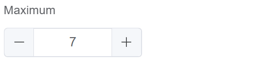 |
| Allow Half | Enable this option to allow half rating. Half rating values are decimals like 3.5 |  |
| Custom Class | An HTML class attribute which allows further customisation See Form Attribute > Style Sheets |  |
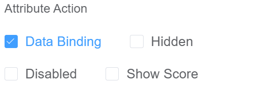
| Attribute Action | Enable Data Binding to connect the data to UI. Enable Hidden action to hide the field. Enable Disabled action to make the field unusable. Enable Show Score for displaying the rate score. |
 |
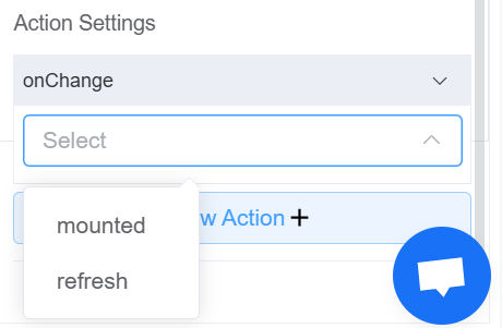
| Action Settings | Click on the drop-down to select the pre-defined methods you wish to apply to your component. In this case, you can choose either mounted or refresh for onChange |
 |
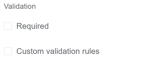
Validation
Form validation is the process of checking the data entered into a form to ensure that it's valid and complete.
This helps to prevent users from submitting forms with invalid data, which can cause problems for the application that's processing the form.
Form validation can be performed using a variety of methods, including:
| Name | Description |
|---|---|
| Required | If enabled, then the field value can't be empty, otherwise an error message is emitted |
| Custom Validation Rules | (rule, value, callback) => { |
| rule: Verification rule, you can view the verification configuration information through this parameter; rule.field can get the field identifier of the current verification | |
| value: Value of the current field | |
| callback: Callback function (must be called) upon completion of validation; callback('Error message')/ callback(new Error('Error message')). These are two ways to return an error message |
Info
- The callback() function is also called to verify success in the custom checkup method.
First time User?
If you are using the Page Builder components on the ConnexCS platform for the first time, we request you to use our guide on steps to use the Components.