Data Grid
Document Metadata
Category: Applications Platform / UI Components — Data Grid Component
Audience: Developers, Engineers, Data Analysts, UI/UX Designers, Support Team
Difficulty: Intermediate to Advanced
Time Required: Approximately 20–30 minutes
Prerequisites: Access to the ConnexCS Apps Platform IDE (Page Builder), familiarity with tabular data representation, and a dataset (from internal database, API, or Query Builder) to feed into the grid component
Related Topics: Page Builder Overview, Database / Query Builder for data retrieval, UI Components – Card / Table / Chart for layout & data presentation
Next Steps: Add Data Grid → set data source → configure columns and sorting/filtering → enable pagination → add actions if needed → test across data sizes/devices
Description
Data Grid is a tabular data display component. It enables you to add different functionalities.
Use Case
- Displaying and Editing Tabular Data.
- Collecting and Managing Lists.
- Building Dynamic Forms.
- Integrating with External Data.
Interactivity
- Allow users to directly edit data within cells, eliminating the need for separate edit forms or modals.
- Provide tools for users to sort data by different columns and apply filters to narrow down the displayed information.
- Pagination
- Expandable Rows
- Enforce data integrity by implementing validation rules to ensure data accuracy and consistency.
API
Events
| Name | Description |
|---|---|
onCellClicked |
The onCellClicked event occurs when the cell in a data grid is clicked |
onLinkClicked |
The onLinkClicked event occurs when the link is clicked |
Methods
| Name | Description | Parameters |
|---|---|---|
this.getComponent |
Returns a component whose id has been passed as a parameter | (component_ID: String) : Object |
this.getValues |
Gets the current values of all fields | () : Object |
this.getValue |
Get A Value From a component | (fieldName: String) |
this.setData |
Set the data in the field. The Value object should be of type { componentId: componentValue } | (Value: Object) |
this.hide |
Hides the field | (fields: String|String[]) |
this.show |
Displays the field | (fields: String|String[]) |
this.refreshFieldDataSource |
Refresh the datasource data bound to the whole page |
Info
- The show() and hide() methods can also be used to control the visibility of the datagrid in response to user input.
- Fields refers to a component ID or a list of component IDs. You can fetch the ID from the Component Attribute panel in the Page Builder.
- Before using this.show(fields), make sure the component is hidden. This can be done using this.hide(fields) or by enabling the Hidden checkbox in the Component Attribute panel.
Steps to use the methods for the Page Builder components
- Go to Form Attribute Action Panel Setting (Mounted | refresh | click 'Add action').
- Write the method/code as shown in the Example below.
- Click on
Save. - On the main screen click on
Saveagain. - Click on
Previewto see the code in action.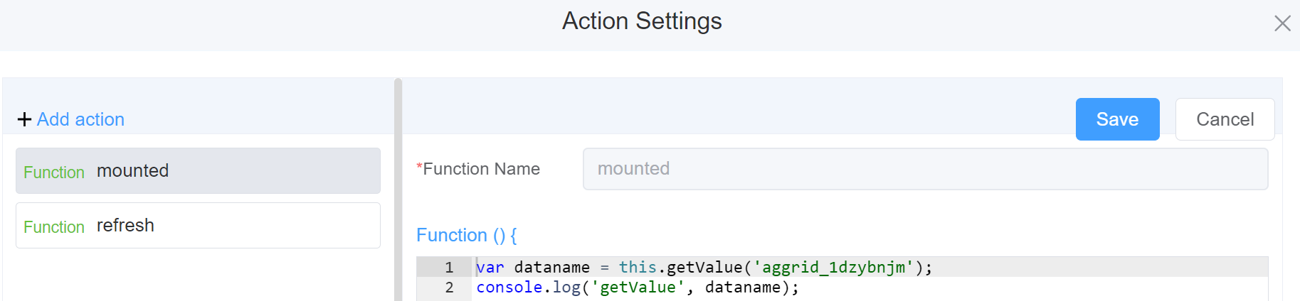
Example
-
this.getValue(fieldName)1 2
var dataname = this.getValue('aggrid_nd93m43c'); console.log('getValue', dataname); -
this.getValues()1 2
var data = this.getValues(); console.log(data); -
this.getComponent('component_ID')1 2
var dataname = this.getComponent('aggrid_nd93m43c'); console.log('getComponent', dataname); -
this.setData1 2 3 4 5 6 7 8 9 10 11 12 13 14 15 16 17
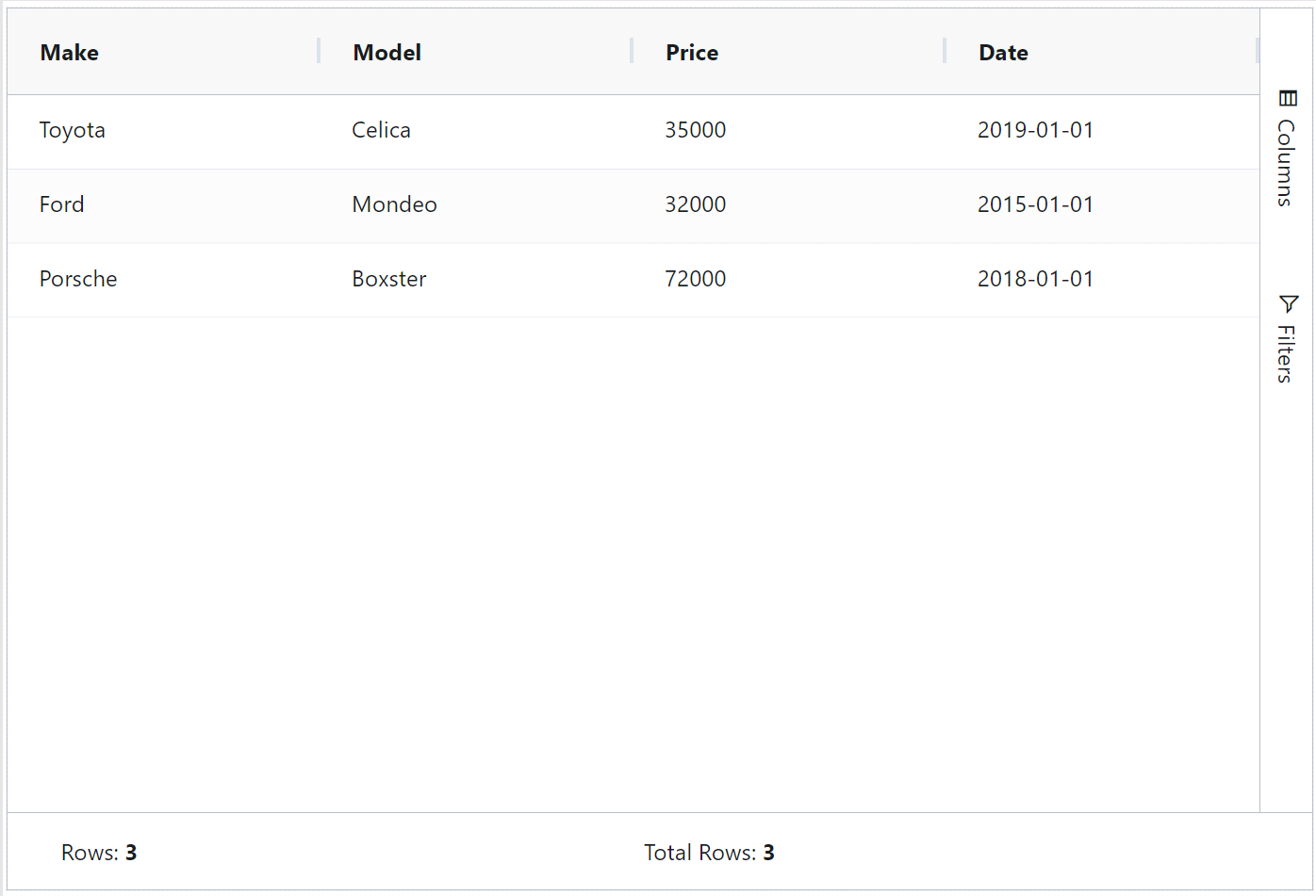
this.setData( { "grid_qwer": [ { "make": "suzuki", "model": "Celica", "price": 350000, "date": "2019-01-01" }, { "make": "audi", "model": "Mondeo", "price": 42000, } ] } ) -
this.hide(fields)1 2
var fields= ['aggrid_nd93m43c'] this.hide(fields) -
this.show(fields)1 2
var fields= ['aggrid_nd93m43c'] this.show(fields) -
this.refreshFieldDataSourcemake the function or data as dynamic
Info
Use the following syntax to add multiple classes to a component:
1 | |
Config
| Name | Description | Icon |
|---|---|---|
| ID | The data-grid component's unique identifier |  |
| Width | [Optional] Width of the field |  |
| Status Bar | Displays information about the number of rows and columns |  |
| Side Bar | Displays the side bar with Columns and Filters |  |
| Enable Range Selection | Enable to select multiple cells in the data-grid and it provides you with minimum value, maximum value, average, sum, count |  |
| Suppress Context Menu | When disabled, it disables the mouse right-click feature which has custom options like export into .CSV file or Excel, copy or copy with headers, etc. and instead the browser default and generic right-click options become available |
 |
| Context Menu | You can select from various options to add to your context menu. This option is ONLY effective if suppress Context Menu is Disabled | 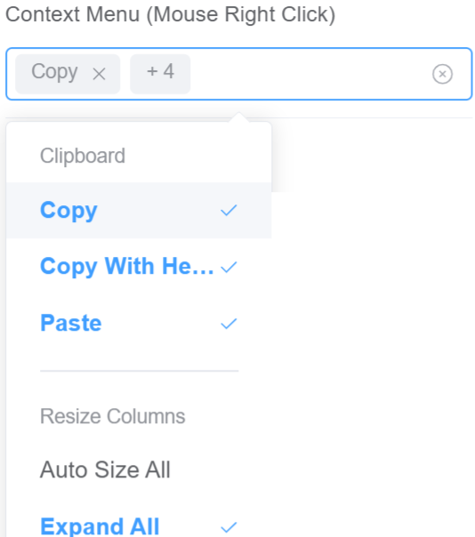 |
| Attribute Action | Enable Data Binding to connect the data to UI. Enable Hidden action to hide the field |
 |
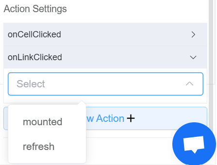
| Action Settings | Click on the drop-down to select the pre-defined methods you wish to apply to your component. In this case, you can choose either mounted or refresh for onCellClicked, or onLinkClicked |
 |
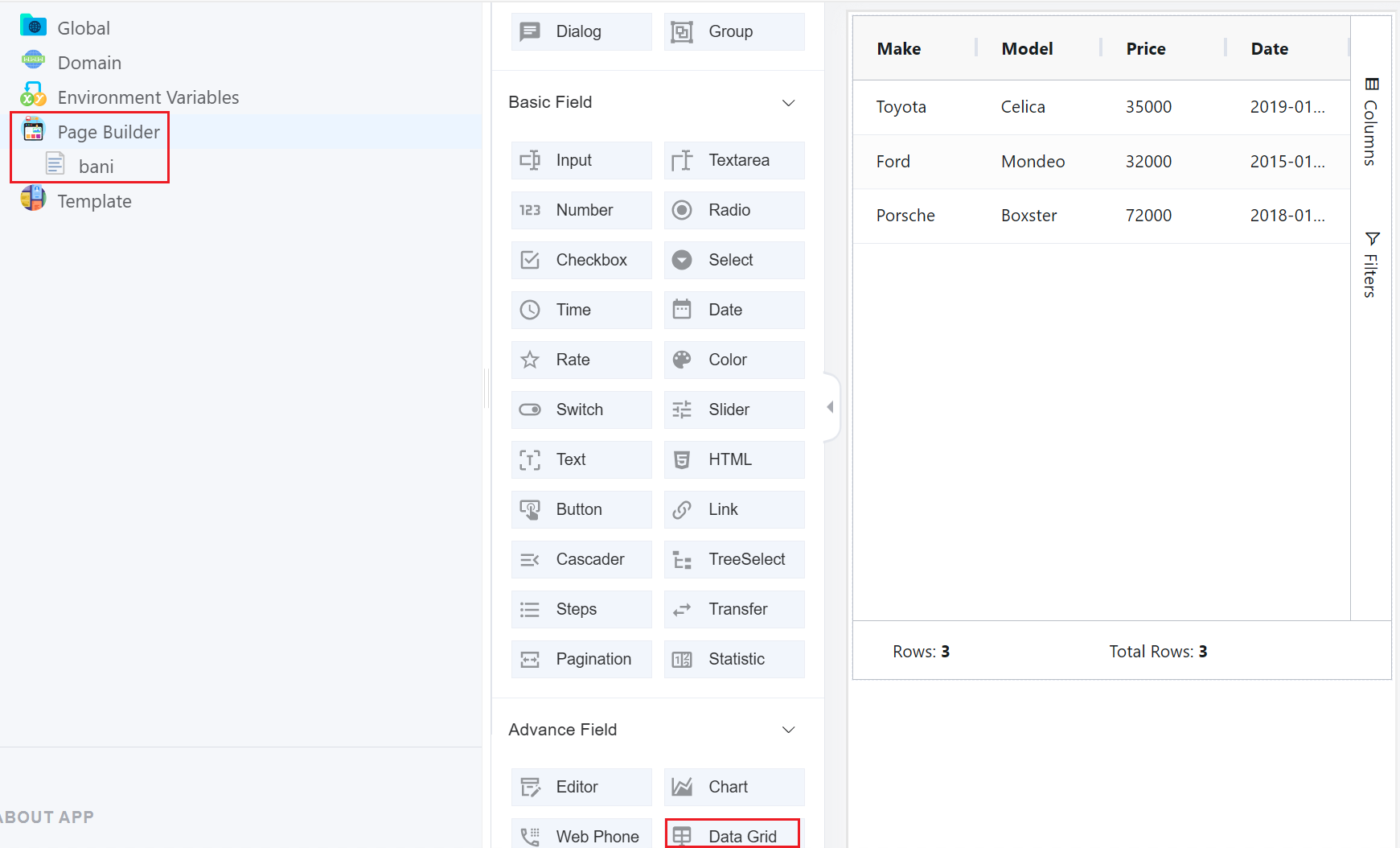
We're talking about Column Config separately as it's a comprehensive component. Click on + to add a new column.
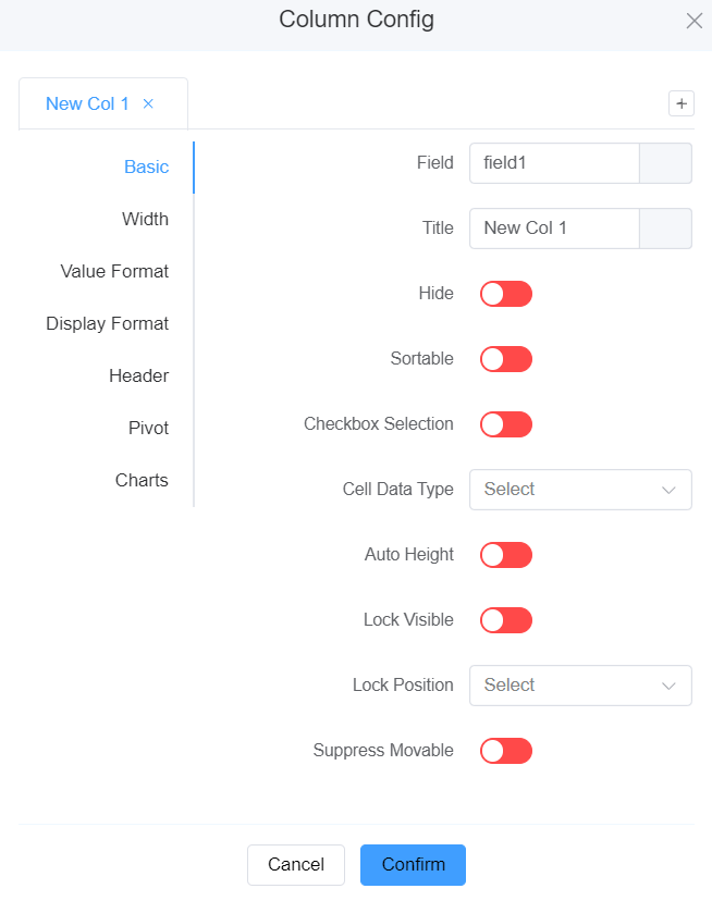
- Basic
- Field: Write the Field name.
- Title: Give the Title to your column.
- Hide: Toggle this option to either hide or show the column.
- Sortable: Enable to allow sorting of the table rows by this column.
- Checkbox Selection: Allow users to choose multiple choices from a list.
- Cell Data Type: Choose data type from various options like Auto, Text, Number, Boolean, Date, Date String.
- Auto Height: Automatically adjusts the height of the column.
- Wrap Text: Automatically adjusts the arrangement of text to fit within a specified area.
- Lock Visible: It keeps key columns or rows always in view, even when scrolling, for focused data navigation and analysis.
- Lock Position: Set the Lock Position to either Left, Right or None.
- Suppress Movable: It locks the grid's layout, preventing manual reordering and ensuring consistent data presentation.
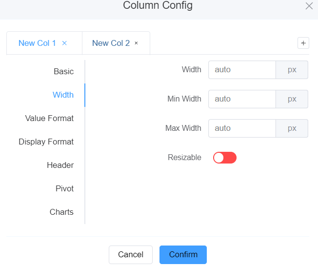
2.Width
-
Width: Enter the width of the column in pixels.
-
Min Width: Enter the minimum value width of the column in pixels.
-
Max Width: Enter the maximum value width of the column in pixels.
-
Re-sizable: Enable to resize the column width.
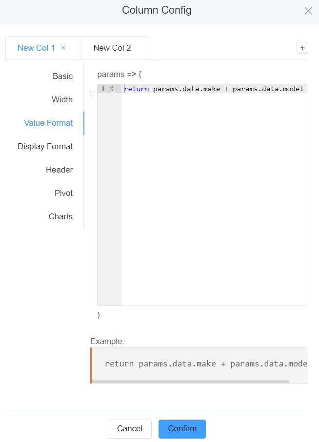
3.Value Format Value format in a data-grid is a feature that controls how raw data values are displayed within individual cells.
It allows you to customize the appearance of data to improve readability, highlight specific information, and ensure consistency across the grid.
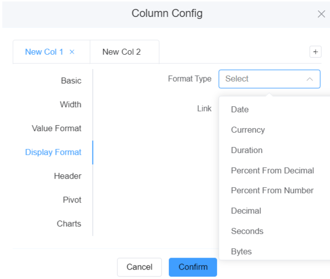
4.Display format
-
Format Type: You can select the format options for a column from Date, Currency, Duration, Percent from Decimal, Percent from Number, Decimal, Second, Bytes.
-
Link:This property is used to turn the values in the column into links that emit the onLinkClicked event.
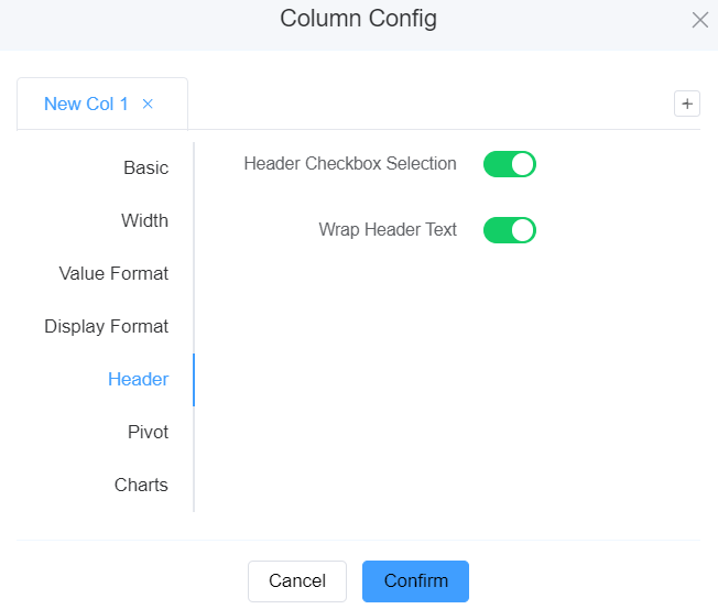
5.Header
-
Header Checkbox Selection: Refers to a feature in data tables or grids that allows you to select all or multiple rows by clicking a checkbox in the header row.
-
Wrap Header Text:Allows the text in header cells to automatically wrap onto multiple lines if it exceeds the available space.
6.Pivot
-
Pivot: Allows you to dynamically rearrange and restructure the data by rotating the grid's axis. You can switch rows and columns to create different view of the information in the grid. You can also filter the required fields, which you wish to see on the screen.
-
Enable Pivot: Enable/Disable pivot mode.
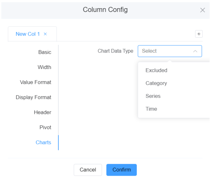
7.Charts
Info
To use the Charts option, first enable the Enable Range Selection option. Click on Preview, select the values on the grid, right-click on the selected the area then Charts. Below are further filters you can apply on the charts under Column Config.
-
Charts Data Type:
-
Excluded: Data in columns marked as "excluded" aren't included in the visual representation of the chart.
-
Category: Data in columns marked as "category" are used to group data points into distinct categories or segments.
-
Series: Data in columns marked as "series" create separate lines or sets of data points within the chart, often for comparison purposes.
-
Time: Data in columns marked as "time" represent temporal information, often used for time-series charts that track trends or changes over time.
-
Pagination
Pagination is a user interface design pattern that organizes content or large data sets into separate pages, each displaying a limited number of items. By doing so, it enhances user navigation and improves application performance.
Server Side Row Model (Server Side Pagination)
When handling substantial amounts of data, applications often employ pagination to assist users in navigating through the information.
The Server-Side Row Model (SSRM) enables applications to manage extensive datasets by employing lazy-loading techniques.
This is achieved through the following mechanisms:
- Infinite scrolling: It loads additional data as the user scrolls through the application.
- Lazy loading from group rows: You can decide how much data you wish to see like 10 rows of data or 100 rows of data.
How to use it with Datagrid?
-
Infinite Scrolling
- Click here to add the Data Grid component.
- Click on Form Attribute Data source (Setting) Add data source.
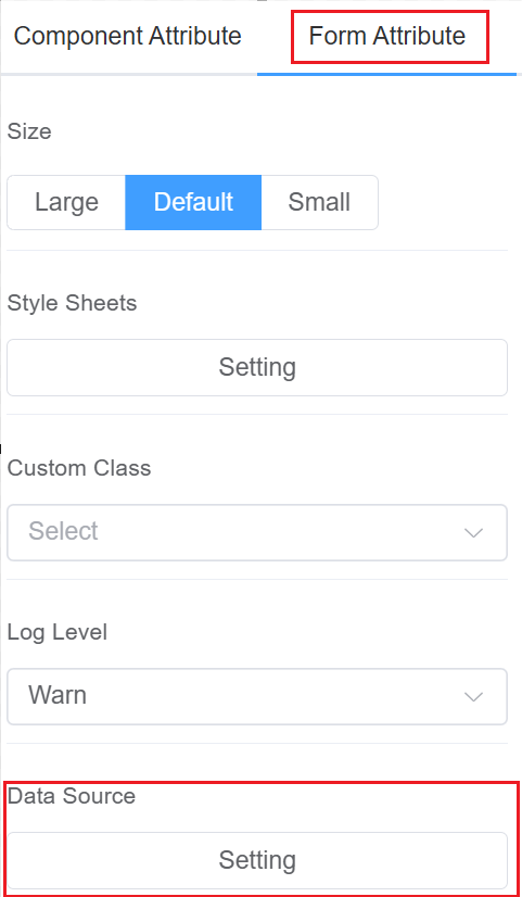
- Select form the various data sources like ScriptForge, Stores, Database, Saved Query, External. Make sure you have enabled
Whether the form is initialized to send the request(for auto-loading the data source). Click onSave.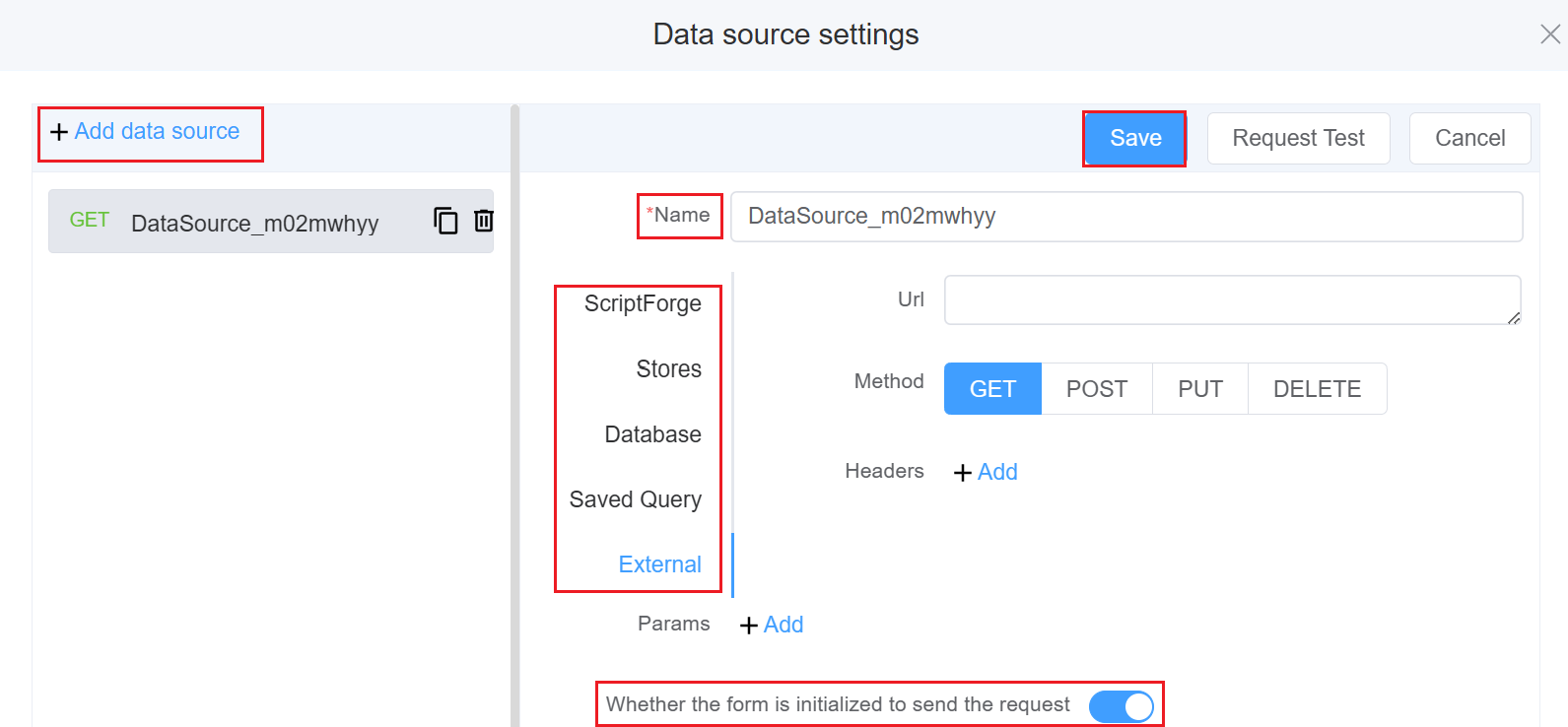
-
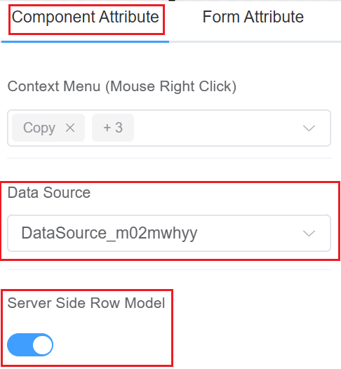
Click on Component Attribute, select the saved Data source and enable the Server Side Row Model.
-
Click on
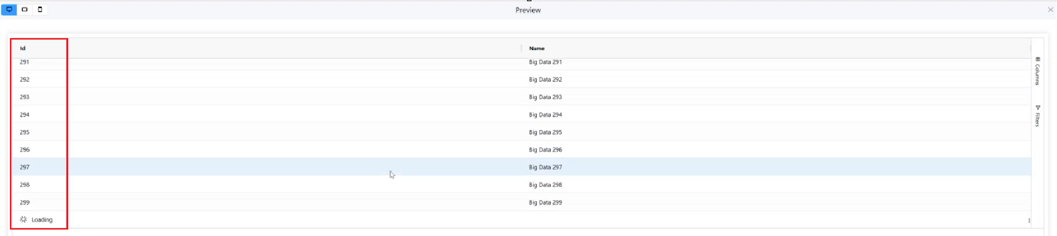
Preview. You will see that all the data has been auto-loaded in one go (10,000 rows of data). This type of loading is the Infinite scrolling.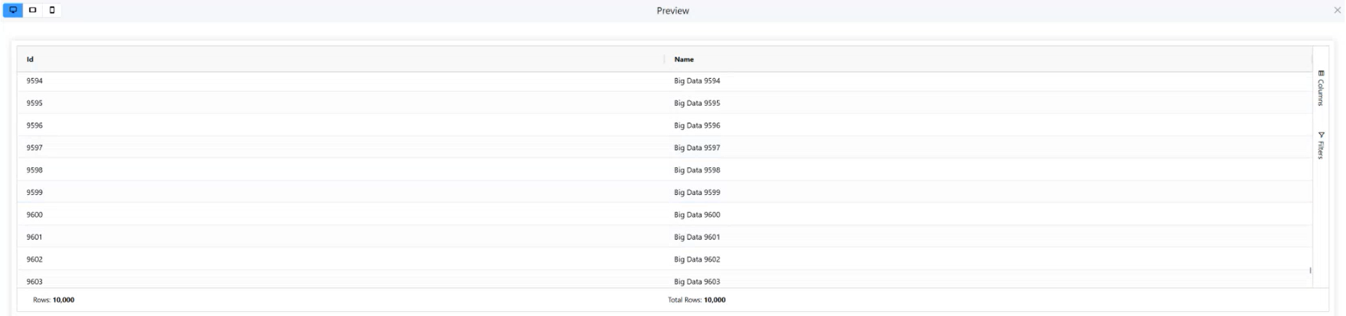
- Click here to add the Data Grid component.
2.Lazy-loading of data in groups
- Click here to add the Data Grid component.
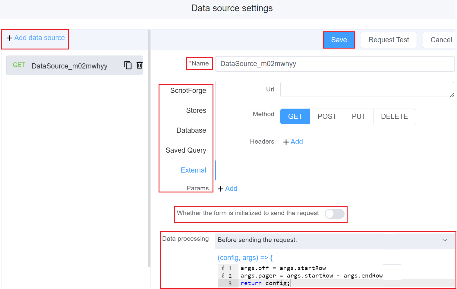
- Click on Form Attribute Data source (Setting) Add data source.
-
Select form the various data sources like ScriptForge, Stores, Database, Saved Query, External. Make sure
Whether the form is initialized to send the requestis disabled. -
In the Data Processing field Before sending the request, write the following code which will only load finite number of rows (as you want) as you scroll, but won't load the whole dataset.
1 2 3 | |
- Click on
Save.
- Click on Component Attribute, select the saved Data source and enable the Server Side Row Model.
- Click on
Preview. You will see that all the data hasn't been auto-loaded instead only 100 rows of data is loading at a time. This type of loading is the Lazy-loading in groups.
First time User?
If you are using the Page Builder components on the ConnexCS platform for the first time, we request you to use our guide on steps to use the Components.