Divider
Document Metadata
Category: Applications Platform / UI Components — Divider Component
Audience: Developers, Engineers, UI/UX Designers, Support Team
Difficulty: Beginner
Time Required: Approximately 5–10 minutes
Prerequisites: Access to the ConnexCS Apps Platform IDE (Page Builder), familiarity with UI layout and page structure principles
Related Topics: Page Builder / Layout Components Overview
Description
A Divider in a page builder is a visual element that separates different sections of a page.
It can be used to improve the readability and usability of forms by making it easier for users to scan the form and identify where different sections begin and end.

Use Case
- To group related form fields.
- To separate different sections of a form.
- To create columns in a form.
- To create sub-headers in a form.
API
Methods
| Name | Description | Parameters |
|---|---|---|
this.hide |
Hides the field | (fields: String|String[]) |
this.show |
Displays the field | (fields: String|String[]) |
Info
- The show() and hide() methods can also be used to control the visibility of the divider in response to user input.
- Fields refers to a component ID or a list of component IDs. You can fetch the ID from the Component Attribute panel in the Page Builder.
- Before using this.show(fields), make sure the component is hidden. This can be done using this.hide(fields) or by enabling the Hidden checkbox in the Component Attribute panel.
Steps to use the methods for the Page Builder components
- Go to Form Attribute Action Panel Setting (Mounted | refresh | click 'Add action').
- Write the method/code as shown in the Example below.
- Click on
Save. - On the main screen click on
Saveagain. - Click on
Previewto see the code in action.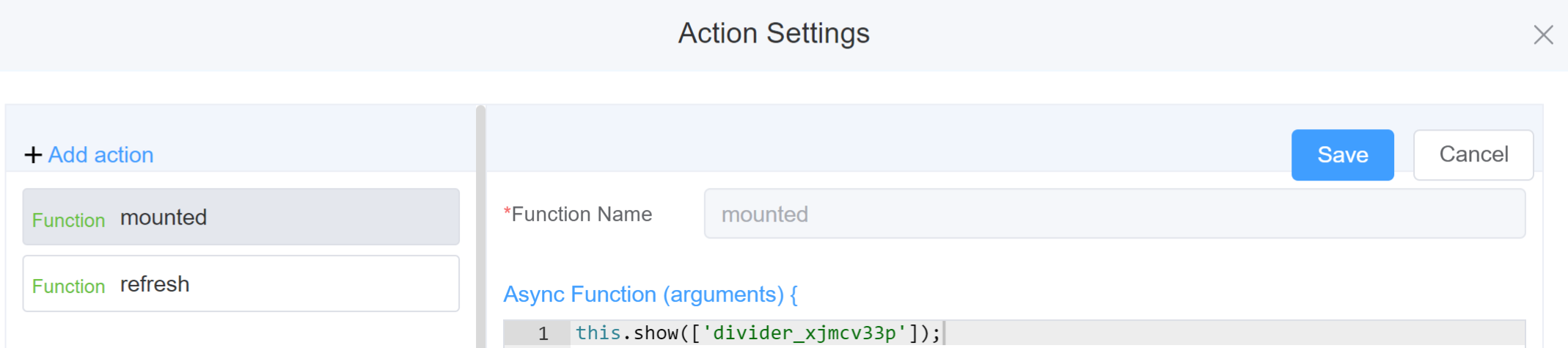
Example
-
this.hide(fields)1 2
var fields= ['divider_xjmcv33p'] this.hide(fields) -
this.show(fields)1 2
var fields= ['divider_xjmcv33p']
this.show(fields)
Config
| Name | Description | Icon |
|---|---|---|
| ID | The divider component's unique identifier |  |
| Name | [Optional] The display name of the divider |  |
| Content Position | Specifies how the divider is positioned relative to the form content, like Left, Center or Right |  |
| Attribute Action | Enable Hidden action to hide the field | 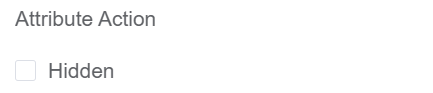 |
First time User?
If you are using the Page Builder components on the ConnexCS platform for the first time, we request you to use our guide on steps to use the Components.