Chart
Document Metadata
Category: Applications Platform / UI Components — Chart Component
Audience: Developers, Engineers, Data Analysts, UI/UX Designers
Difficulty: Intermediate to Advanced
Time Required: Approximately 20–30 minutes
Prerequisites: Access to the ConnexCS Apps Platform IDE (Page Builder), familiarity with data-driven UI and basic charting concepts (data series, axes, labels)
Related Topics: Page Builder / UI Components Overview, Database, Query Builder
Next Steps: Add Chart → configure data source → set type/axes/styling → bind dynamic data → test across devices and data scenarios
Description
Charts are visual representations of data that use symbols, colors, and shapes to communicate information clearly and efficiently.
The 5 types of Charts we use are:
- Bar charts: Use bars to represent data points. Often used for comparing values across categories.
- Line charts: Show trends and changes over time. Connecting data points with lines allows for easy visualization of patterns.
- Area charts: Its similar to line charts, but displays the area below the curve.
- Pie charts: Show the proportion of each category in a data set as slices of a pie. Useful for highlighting the relative size of different parts of a whole.
- Sankey Charts: The Sankey diagram encodes each node of the raw data into a small rectangle. Different nodes are presented in different colors as far as possible.
Use Case
- Data Visualization Dashboards
- Web Analytics
- Financial Analysis
- Interactive Presentations and Report
- Captivating Presentations
- Interactive Reports
- Geographic Data Visualization
Interactivity
- Connect your forms to external charting services: Google Charts, ChartBlocks, or others.
- Pass form data to these services to generate interactive charts.
- Embed the generated charts back into your form using iframes or other techniques.
API
Methods
| Name | Description | Parameters |
|---|---|---|
this.addClassName |
Add style class to a form item | (fields: String|String[], className: String) |
this.removeClassName |
Remove style class from a form item | (fields: String|String[], className: String) |
this.getComponent |
Returns a component whose id has been passed as a parameter | (component_ID: String) : Object |
this.getValues |
Gets the current values of all fields | () : Object |
this.hide |
Hides the field | (fields: String|String[]) |
this.show |
Displays the field | (fields: String|String[]) |
this.getValue |
Get A Value From a component | (fieldName: String) |
this.setData |
Set the data in the field. The Value object should be of type { componentId: componentValue } | (Value: Object) |
Info
- The show() and hide() methods can also be used to control the visibility of a chart in response to user input.
- Fields refers to a component ID or a list of component IDs. You can fetch the ID from the Component Attribute panel in the Page Builder.
- Before using this.show(fields), make sure the component is hidden. This can be done using this.hide(fields) or by enabling the Hidden checkbox in the Component Attribute panel.
Steps to use the methods for the Page Builder components
- Go to Form Attribute Action Panel Setting (Mounted | refresh | click 'Add action').
- Write the method/code as shown in the Example below.
- Click on
Save. - On the main screen click on
Saveagain. - Click on
Previewto see the code in action.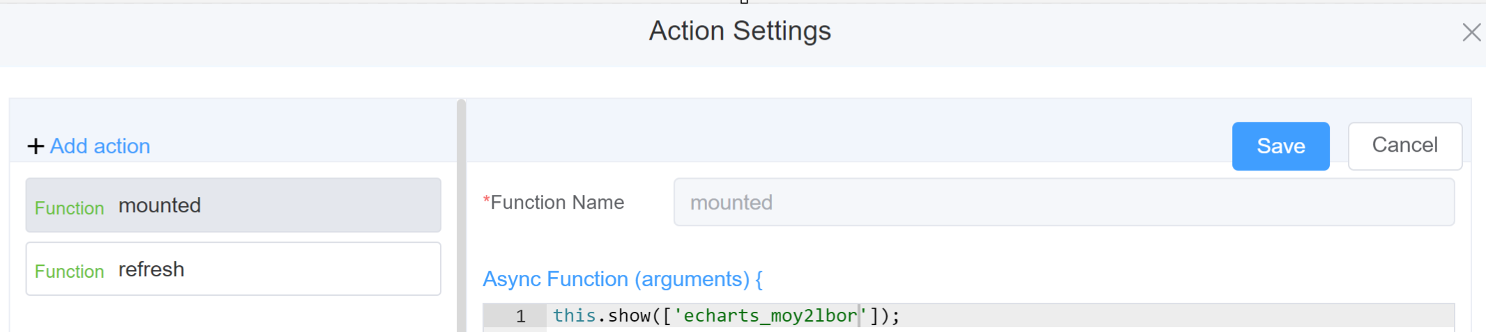
Example
-
this.addClassName(fields, className)- Go to Form Attribute Style Sheets add the class
.abc{ // abc is the class name background-color: red; } - Follow the steps mentioned above, under Steps to use the methods for the Page Builder components
this.addClassName('echarts_moy2lbor', 'abc')
- Go to Form Attribute Style Sheets add the class
-
this.removeClassName(fields, className)1this.removeClassName('echarts_moy2lbor', 'abc') -
this.getValue(fieldName)1 2
var chartname = this.getValue('echarts_moy2lbor'); console.log('getValue', chartname); -
this.getValues()1 2
var data = this.getValues(); console.log(data); -
this.hide(fields)1 2
var fields= ['echarts_moy2lbor'] this.hide(fields) -
this.show(fields)1 2
var fields= ['echarts_moy2lbor'] this.show(fields) -
this.enable(['fields'])1this.enable(['echarts_moy2lbor']) -
this.getValue('fieldName')1 2
var chartname = this.getValue('echarts_moy2lbor'); console.log('getValue', chartname); -
this.getComponent('component_ID')1 2
var chartname = this.getComponent('echarts_moy2lbor'); console.log('getComponent', chartname); -
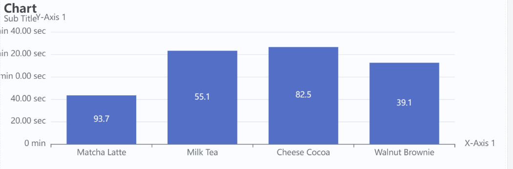
this.setData(Value)1 2 3 4 5 6 7 8 9 10 11
this.setData(
{
"echarts_moy2lbor":[
{
    "2015":43.3,
    "2016":90,
    "2017":10,
    "product":"Matcha Latte"
},
]
}
Warning
Please note when you're using Pie Charts, its mandatory to select the Formatter Type from the Label Formatter field. Please Click here for further information on the Label Formatter.
Config
| Name | Description | Icon |
|---|---|---|
| ID | The chart component's unique identifier | 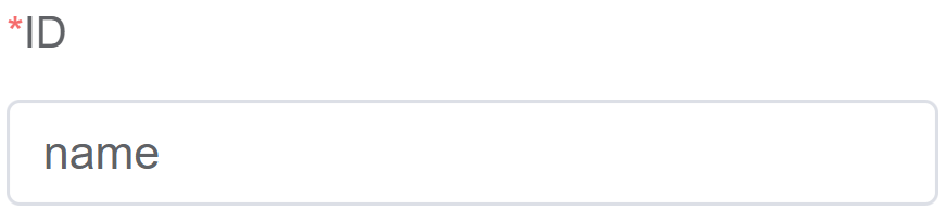 |
| Width | [Optional] Width of the field | 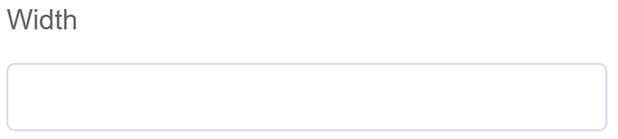 |
| Height | [Optional] Height of the field |  |
| Default | Default data for the charts |  |
| Custom Class | An HTML class attribute which allows further customisation See Form Attribute > Style Sheets |  |
| Attribute Action | Enable Data Binding to connect the data to UI |  |
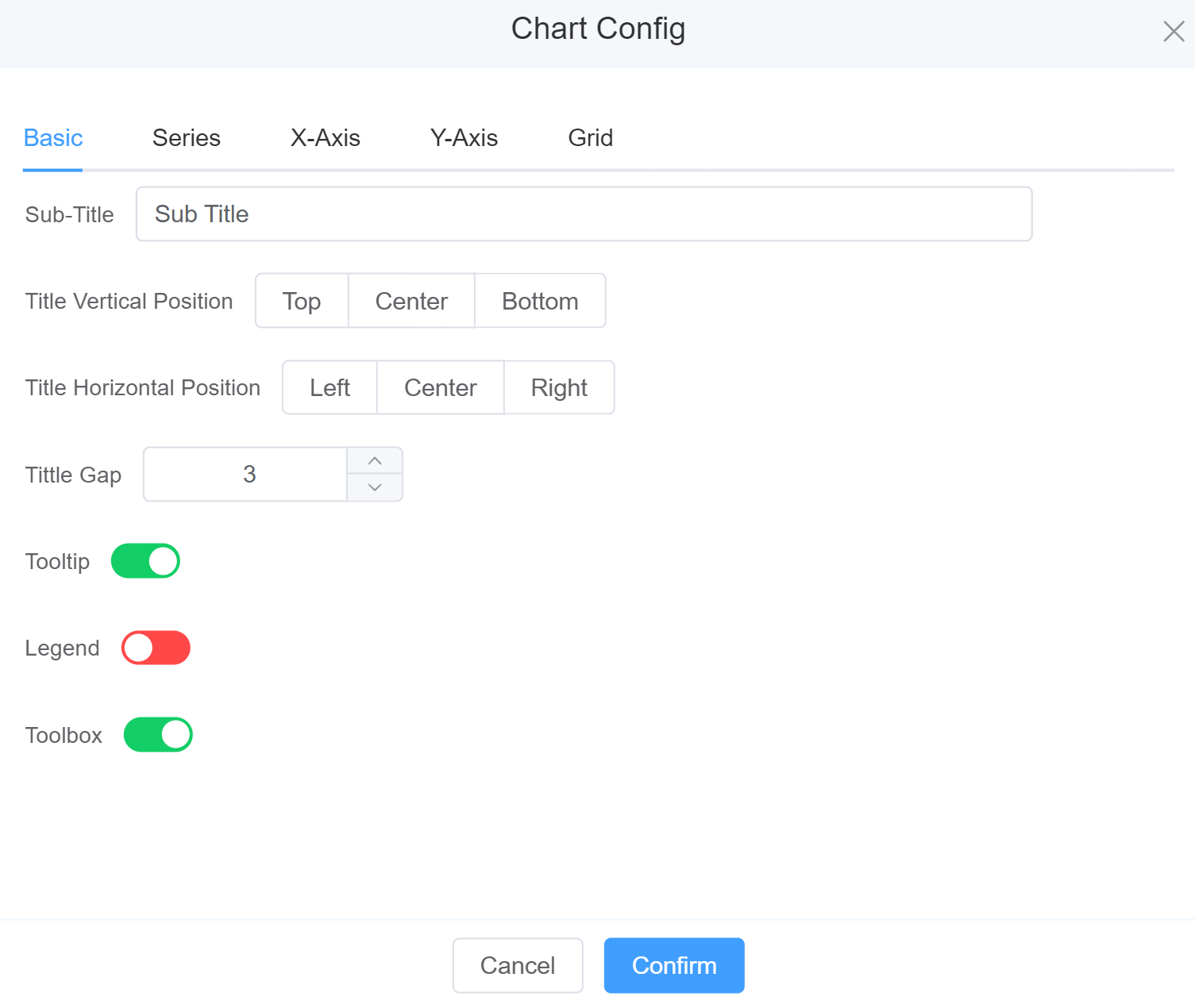
Chart Config
-
Basic: Set the basic fields in a chart.
-
Sub-Title: Enter the sub-title of the chart.
-
Title Vertical Position: Place the sub-title either at the Top, Center or Bottom.
- Title Horizontal Position: Place the sub-title either at the Left, Center or Right.
-
Title Gap: Space between the Main Title and Sub-Title.
-
Enable Tooltip open small, contextual pop-up window that provides additional information or guidance when users hover over, point to, or tap an element on a GUI.
-
Enable Legend to decode the visual elements used to represent data.
-
Enable Toolbox to get options like Zoom and Zoom Reset.
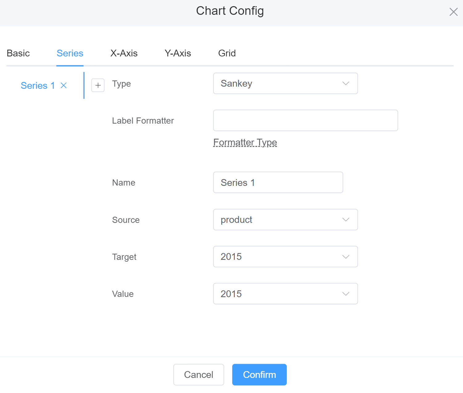
2.Series: When you have more than 2 charts in a single chart.
- Type: Select Bar, Line, Pie, Area or Sankey charts.
- Label Formatter: It helps you display the following information: Model variation includes: * {a}: series name. * {b}: the name of a data item. * {c}: the value of a data item. * {@xxx}: the value of a dimension named 'xxx', for example, {@product} refers to the value of 'product' dimension. * {@[n]}: the value of a dimension at the index of n, for example, {@[3]} refers to the value at dimensions[3].
- Name: Name of the Series.
- Encode X: The X-axis index in a graph refers to the numerical values or categories displayed along the bottom horizontal axis.
- Encode Y: The Y-axis index in a graph refers to the numerical values displayed along the vertical axis.
Info
When you select Line Charts some additional fields are displayed:
Symbol: Allows you to choose the symbol of the connecting the line.
Connect Nulls: Whether to connect the line across null points.
Info
When you select Area some fields are displayed:
Color: Select the area under the curve.
Info
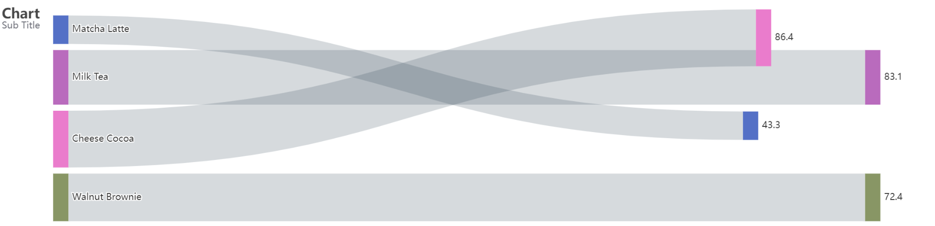
A Sankey chart is a type of diagram that helps you show how things flow from one part to another.
Sankey charts are handy for understanding and visualizing how resources or information move through complex systems. They're used in various fields to make it easier to see and analyze these flows.
3.X-Axis: To change the settings for X-Axis.
- Grid Index: Select the grid you wish to place your X-Axis.
- Name: Enter the name of the X-Axis.
- Formatter: Select the value you want to display on X-axis like Duration, Millisecond, Decimal, Percent, Bytes.

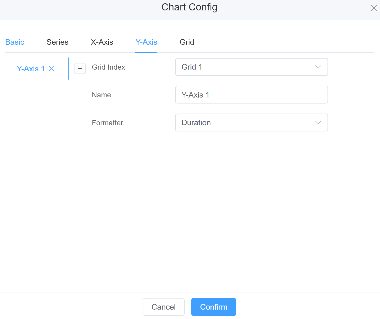
4.Y-Axis: To change the settings for Y-Axis.
- Grid Index: Select the grid you wish to place your Y-Axis.
- Name: Enter the name of the Y-Axis.
- Formatter: Select the value you want to display on X-axis like Duration, Millisecond, Decimal, Percent, Bytes.
4.Grid: To change the settings for Grid when we've multiple charts.
- Left: Place the chart on left-side using the slider.
- Top: Place the chart on the Top using the slider.
- Width: Change the width of the chart using the slider.
- Height: Change the height of the chart using the slider.

First time User?
If you are using the Page Builder components on the ConnexCS platform for the first time, we request you to use our guide on steps to use the Components.