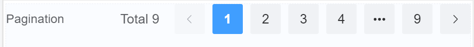
Pagination
Document Metadata
Category: Applications & Components
Audience: Administrators, Engineers, App Developers
Difficulty: Beginner to Intermediate
Time Required: Approximately 15–30 minutes
Prerequisites: Active ConnexCS account, access to the Applications module, basic understanding of UI component configuration and data-driven components (lists, tables, pagination concepts)
Related Topics: Grid Component, Input Component, Number Component, Page Layout Component
Next Steps: Create a sample data-listing (e.g., table or list) using the Pagination component; test behavior with varying dataset sizes; integrate navigation controls to browse pages of data
Description
Pagination is a mechanism for presenting and navigating through large chunks of information within a form in a structured way.
Imagine you have a form with hundreds of items to choose from, like products in a catalog. Without pagination, users would have to scroll through an endless list, making it incredibly time-consuming and frustrating.
Use Case
- Dividing content: When there's a large amount of data which split into smaller, bite-sized pages.
- Displaying current page: Only a specific number of items are shown on each page, usually indicated by a page number or counter.
- Navigation controls: Users can easily navigate between pages using various controls like page numbers, links, buttons, or arrows. This allows them to quickly find the information they need without scrolling through every single item.
- Improved user experience: Reduces frustration and simplifies browsing large amounts of data, keeping users engaged and efficient.
- Better visual design: Breaks down information into manageable chunks, making the form appear less overwhelming and cluttered.
- Performance optimization: Reduces loading times by displaying only the necessary data on each page, especially for complex forms.
- Accessibility: Makes the form easier to navigate for users with disabilities who may rely on keyboard navigation or screen readers.
API
Events
| Name | Description |
|---|---|
onChange (element) |
The onChange event occurs when the value of a field is changed |
Methods
| Name | Description | Parameters |
|---|---|---|
this.addClassName |
Add style class to a form item | (fields: String|String[], className: String) |
this.removeClassName |
Remove style class from a form item | (fields: String|String[], className: String) |
this.getComponent |
Returns a component whose id has been passed as a parameter | (component_ID: String) : Object) |
this.hide |
Hides the field | (fields: String|String[]) |
this.show |
Displays the field | (fields: String|String[]) |
this.disable |
Disable pagination field from user interaction | (fields: String|String[]) |
this.enable |
Enable pagination field from user interaction | (fields: String|String[]) |
this.getValue |
Get A Value From a component | (fieldName: String) |
this.getValues |
Gets the current values of all fields | () : Object |
this.setData |
Set the data in the field. The Value object should be of type { componentId: componentValue } | (Value: Object) |
Info
- The show() and hide() methods can also be used to control the visibility of the pagination component in response to user input.
- Fields refers to a component ID or a list of component IDs. You can fetch the ID from the Component Attribute panel in the Page Builder.
- Before using this.show(fields), make sure the component is hidden. This can be done using this.hide(fields) or by enabling the Hidden checkbox in the Component Attribute panel.
- Before using this.enable(fields), make sure the component is disabled. This can be done using this.disable(fields) or by enabling the Disabled checkbox in the Component Attribute panel.
Steps to use the methods for the Page Builder components
- Go to Form Attribute Action Panel Setting (Mounted | refresh | click 'Add action').
- Write the method/code as shown in the Example below.
- Click on
Save. - On the main screen click on
Saveagain. - Click on
Previewto see the code in action.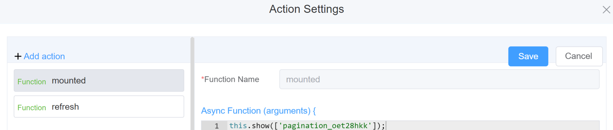
Example
-
this.addClassName(fields, className)- Go to Form Attribute Style Sheets add the class
.abc{ // abc is the class name background-color: red; } - Follow the steps mentioned above, under Steps to use the methods for the Page Builder components
this.addClassName('pagination_oet28hkk', 'abc')
- Go to Form Attribute Style Sheets add the class
-
this.removeClassName(fields, className)js linenums="1" this.removeClassName('pagination_oet28hkk', 'abc') -
this.hide(fields)1 2
var fields= ['pagination_oet28hkk'] this.hide(fields) -
this.show(fields)1 2
var fields= ['pagination_oet28hkk'] this.show(fields) -
this.disable(['fields'])1this.disable(['pagination_oet28hkk']) -
this.enable(['fields'])1this.enable(['pagination_oet28hkk']) -
this.getValue('fieldName')1 2
var pagename = this.getValue('pagination_oet28hkk'); console.log('getValue', pagename); -
this.getComponent('component_ID')1 2
var pagename = this.getComponent('pagination_oet28hkk'); console.log('getComponent', pagename); -
this.getValues()1 2
var data = this.getValues(); console.log(data); -
this.setData(Value)1 2 3
this.setData({
pagination: 3
});
Config
| Name | Description | Icon |
|---|---|---|
| ID | The pagination component's unique identifier |  |
| Name | [Optional] The display name of the pagination field |  |
| Label Width | Width of the label associated with an input field. It determines the horizontal space occupied by the label text |  |
| Label Wrap | If the label is longer than the allowed width the text will continue on another line |  |
| Hide Label | Hides the label on the form |  |
| Page Size | The page size determines how much information users see at a glance. A larger size shows more items per page, while a smaller size displays fewer | 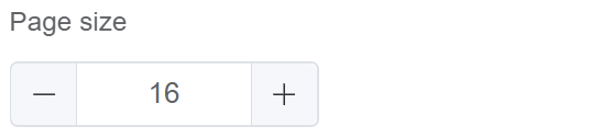 |
| Pager Count | Refers to the total number of visible page numbers displayed at once |  |
| Total | Total number of pages you wish to keep for navigation | 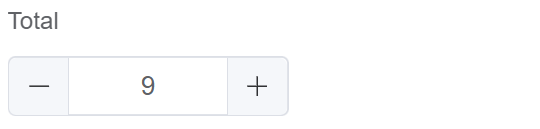 |
| Background | Enable this option to add backdrop to the pages while navigating |  |
| Custom Class | An HTML class attribute which allows further customisation See Form Attribute > Style Sheets |  |
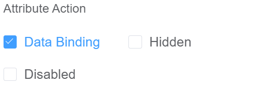
| Attribute Action | Enable Data Binding to connect the data to UI. Enable Hidden action to hide the field. Enable Disabled action to make the field unusable |
 |
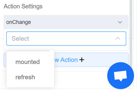
| Action Settings | Click on the drop-down to select the pre-defined methods you wish to apply to your component. In this case, you can choose either mounted or refresh for onChange |
 |
First time User?
If you are using the Page Builder components on the ConnexCS platform for the first time, we request you to use our guide on steps to use the Components.