Date
Document Metadata
Category: Applications Platform / UI Components — Date Picker / Date Component
Audience: Developers, Engineers, UI/UX Designers, Support Team
Difficulty: Beginner to Intermediate
Time Required: Approximately 10–15 minutes
Prerequisites: Access to the ConnexCS Apps Platform IDE (Page Builder), and familiarity with form design including date-input controls
Related Topics: Other form input components (e.g., checkbox, select)
Next Steps: Add Date component → configure format/constraints → bind to logic → handle timezone/validation → test interactions
Description
Date is a specialized input field designed to collect date information from users.
It typically provides a user-friendly interface for selecting a date, often in the form of a calendar or a date picker.

Use Case
-
Calendar interface: A visual calendar grid allows users to select dates by clicking or tapping on specific days.
-
Date picker: A compact pop-up calendar appears when the user clicks on the input field, providing a more focused way to choose a date.
-
Range selection: Users can select a range of dates, such as a check-in and check-out date for a reservation.
-
Time selection: Date components can be combined with time input fields to collect both date and time information simultaneously.
-
Pre-filled values: Date components can be pre-filled with default values, such as the current date or a date from a previous form submission.
-
Validation messages: Date components can display error messages when users enter invalid dates, providing clear feedback and helping them correct their input.
Examples may include:
- Date of Birth: For collecting and validating DOB in forms like signups, profiles etc.
- Event registration: Selecting a date for an event, conference, workshop registration.
- Schedule appointments: Choosing date/time slots for appointments, meetings, classes.
- Reservation systems: Hotel, flight, venue booking for reserving dates.
- Time-sheets: Selecting dates for shifts, clock-in/out in timesheets.
- Patient records: Storing visit dates, admit/discharge dates for healthcare.
- Order forms: Allow selecting delivery or start dates for orders.
- Job applications: Entering start availability date on application forms.
- Reports & Analytics:Choosing date ranges to filter reports and analytics.
- Expiration date: Set expiry date for deals, offers, trials, memberships.
- Reminders: Choosing future dates to set reminders and deadlines.
- Release planners: Manage product/project release dates.
Interactivity
Interactivity is the ability of a web page or application to respond to user input.
The're a number of ways to add interactivity to Date component.
Some of the most common methods include:
-
Event Handling: Event listeners can be attached to the date component to capture user interactions, such as clicks, changes, or selections. These events can then be used to trigger actions, update data, or modify the appearance of the component. For example, when a user clicks on a calendar day, an event handler can update the selected date and display a tooltip with additional information about that date.
-
Data Binding: The date component can be bound to a data source, allowing it to update its content dynamically based on changes to the underlying data. This enables real-time feedback and data synchronization between the component and the form. For instance, a date component could be linked to a user's birthday data, automatically updating the date field when the user updates their birthday in their profile.
-
State Management: State management techniques can be implemented to track the internal state and behavior of the date component. This allows for dynamic responses to user actions and ensures that the component's state is consistent across different interactions. For example, a date picker component could maintain its open/closed state, allowing users to toggle the calendar display programmatically.
-
Animations and Transitions: Animations and transitions can be incorporated to enhance the visual appeal and user experience of the date component. Libraries like GSAP or CSS animations can be used to add smooth transitions, visual feedback, and engaging interactions to the component. For instance, a date component could animate the calendar slide-in transition when the user clicks on the input field.
-
Accessibility: Accessibility measures should be considered to ensure that the date component is usable by users with disabilities. This includes providing keyboard navigation, screen reader support, and appropriate color contrast. For example, a date component could provide keyboard navigation shortcuts for selecting dates, making it accessible to users who rely on keyboard input.
Examples may include:
- Change date picker styling based on user input or events.
- Show/hide date picker conditionally using logic and other field values.
- Disable specific dates if they fall on weekends or holidays.
- Trigger confirmation if date selected is a significant one.
- Update multiple date pickers together when a single one changes.
- Validate date as user navigates and show errors dynamically.
- Disable future/past dates outside of allowed range.
- Prevent form submission until a valid date is selected.
- Populate data visualizations and charts based on selected date range.
- Make API calls when date is selected to check availability.
- Trigger animations and transitions when date is changed.
- Allow typing date directly or via shortcuts for power users.
- Sync date selection across multiple instances of the form.
- Pre-fill date based on user info and persist on form reload
API
Events
| Name | Description |
|---|---|
onChange (element) |
The onChange event occurs when the value of a field is changed |
onFocus (element) |
The onfocus event occurs when a field gets focus |
onBlur (element) |
The onblur event occurs when a field loses focus |
Methods
| Name | Description | Parameters |
|---|---|---|
this.addClassName |
Add style class to a form item | (fields: String|String[], className: String) |
this.removeClassName |
Remove style class from a form item | (fields: String|String[], className: String) |
this.getComponent |
Returns a component whose id has been passed as a parameter | (component_ID: String) : Object |
this.getValues |
Gets the current values of all fields | () : Object) |
this.hide |
Hides the field | (fields: String|String[]) |
this.show |
Displays the field | (fields: String|String[]) |
this.disable |
Disable date field from user interaction | (fields: String|String[]) |
this.enable |
Enable date field from user interaction | (fields: String|String[]) |
this.getValue |
Get A Value From a component | (fieldName: String) |
this.setData |
Set the data in the field. The Value object should be of type { componentId: componentValue } | (Value: Object) {'field-id': 'field-value'} |
Info
- The show() and hide() methods can also be used to control the visibility of the date component in response to user input.
- Fields refers to a component ID or a list of component IDs. You can fetch the ID from the Component Attribute panel in the Page Builder.
- Before using this.show(fields), make sure the component is hidden. This can be done using this.hide(fields) or by enabling the Hidden checkbox in the Component Attribute panel.
- Before using this.enable(fields), make sure the component is disabled. This can be done using this.disable(fields) or by enabling the Disabled checkbox in the Component Attribute panel.
Steps to use the methods for the Page Builder components
- Go to Form Attribute Action Panel Setting (Mounted | refresh | click 'Add action').
- Write the method/code as shown in the Example below.
- Click on
Save. - On the main screen click on
Saveagain. - Click on
Previewto see the code in action.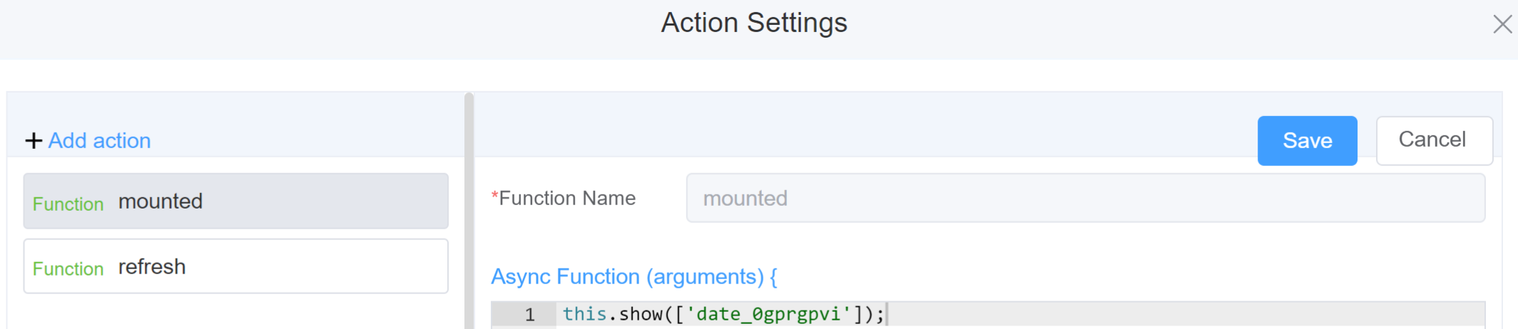
Example
-
this.addClassName(fields, className)- Go to Form Attribute Style Sheets add the class
.abc{ // abc is the class name background-color: red; } - Follow the steps mentioned above, under Steps to use the methods for the Page Builder components
this.addClassName('date_0gprgpvi', 'abc')
- Go to Form Attribute Style Sheets add the class
-
this.removeClassName(fields, className)1this.removeClassName('date_0gprgpvi', 'abc') -
this.getValues()1 2
var data = this.getValues(); console.log(data); -
this.hide(fields)1 2
var fields= ['date_0gprgpvi'] this.hide(fields) -
this.show(fields)1 2
var fields= ['date_0gprgpvi'] this.show(fields) -
this.disable(['fields'])1this.disable(['date_0gprgpvi']) -
this.enable(['fields'])1this.enable(['date_0gprgpvi']) -
this.getValue('fieldName')1 2
var datename = this.getValue('date_0gprgpvi'); console.log('getValue', datename); -
this.setData(Value)1 2 3 4
this.setData( { "date_0gprgpvi": "2023-11-30",} ); -
this.getComponent('component_ID')1 2
var datename = this.getComponent('date_0gprgpvi');
console.log('getComponent', datename);
Info
Use the following syntax to add multiple classes to a component:
1 | |
Config
| Name | Description | Icon |
|---|---|---|
| ID | The date component's unique identifier |  |
| Name | [Optional] The display name of the date field |  |
| Width | [Optional] Width of the field |  |
| Label Width | Width of the label associated with an input field. It determines the horizontal space occupied by the label text |  |
| Label Wrap | If the label is longer than the allowed width the text will continue on another line |  |
| Hide Label | Hides the label on the form |  |
| Text Prompt | A description to aid the user when completing the field |  |
| Display Type | You can select from various options including Year, Month, Date, Week, Dates, Datetime, Datetimerange, Daterange, or Monthrange | 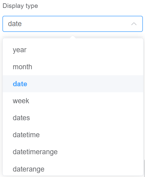 |
| Placeholder | The short hint is displayed in the input field before the user enters a value | 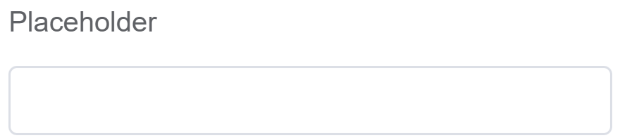 |
| Format | You can decide the format of your date like YYYY-MM-DD or DD/MM/YY | 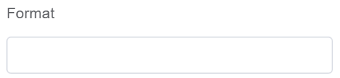 |
| Default Value | Specifies the initial value that's displayed in the date field when the form is loaded | 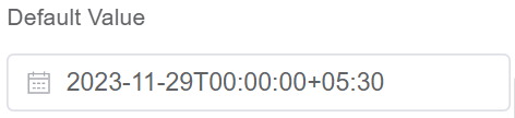 |
| Custom Class | An HTML class attribute which allows further customisation See Form Attribute > Style Sheets |  |
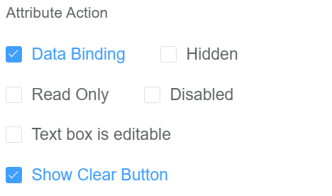
| Attribute Action | Enable Data Binding to connect the data to UI. Enable Read Only to make the field non-editable. Enable Disabled action to make the field unusable. Enable Text box is editable to allow users to manually type in a date value instead of only selecting from the date picker. Enable Show Clear button action to make the clear button visible |
 |
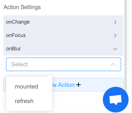
| Action Settings | Click on the drop-down to select the pre-defined methods you wish to apply to your component. In this case, you can choose either mounted or refresh for onChange, onFocus, or onBlur |
 |
Validation
Form validation is the process of checking the data entered into a form to ensure that it's valid and complete.
This helps to prevent users from submitting forms with invalid data, which can cause problems for the application that's processing the form.
Form validation can be performed using a variety of methods, including:
| Name | Description |
|---|---|
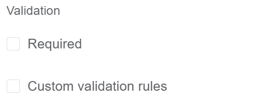
| Required | If enabled, then the field value can't be empty, otherwise an error message is emitted |
| Custom Validation Rules | (rule, value, callback) => { |
| rule: Verification rule, you can view the verification configuration information through this parameter; rule.field can get the field identifier of the current verification. | |
| value: Value of the current field | |
| callback: Callback function (must be called) upon completion of validation; callback('Error message')/ callback(new Error('Error message')). These are two ways to return an error message. |
Info
- The callback() function is also called to verify success in the custom checkup method.
First time User?
If you are using the Page Builder components on the ConnexCS platform for the first time, we request you to use our guide on steps to use the Components.