Link
Document Metadata
Category: Applications & Components
Audience: Administrators, Engineers, App Developers
Difficulty: Beginner to Intermediate
Time Required: Approximately 15–30 minutes
Prerequisites: Active ConnexCS account, access to the Applications module, basic familiarity with UI component configuration
Related Topics: Input Component, Inline Component, Grid Component, Dialog Component
Next Steps: Create a UI prototype using the Link component; test navigation and linking between app screens/pages
Description
Link components can be used in forms to provide additional functionality, such as opening external resources, navigating to different sections of the form, or triggering specific actions.

Use Case
- Opening External Resources
- Navigating Form Sections
- Triggering Specific Actions
- Providing Contextual Help and Resources
- Enhancing Accessibility and Usability
Interactivity
-
A link could be used to display a message indicating that a required field has been left blank.
-
Links can be used to trigger validation of user input before the form is submitted.
API
Events
| Name | Description |
|---|---|
onClick (element) |
Event handler that's triggered when the button is clicked. This event handler can be used to perform any number of actions, such as submitting the form, redirecting the user to a different page, or displaying an error message |
Methods
| Name | Description | Parameters |
|---|---|---|
this.addClassName |
Add style class to a form item | (fields: String|String[], className: String) |
this.removeClassName |
Remove style class from a form item | (fields: String|String[], className: String) |
this.hide |
Hides the field | (fields: String|String[]) |
this.show |
Displays the field | (fields: String|String[]) |
this.disable |
Disable link field from user interaction | (fields: String|String[]) |
this.enable |
Enable link field from user interaction | (fields: String|String[]) |
this.getValues |
Gets the current values of all fields | () : Object |
Info
- The show() and hide() methods can also be used to control the visibility of the link component in response to user input.
- Fields refers to a component ID or a list of component IDs. You can fetch the ID from the Component Attribute panel in the Page Builder.
- Before using this.show(fields), make sure the component is hidden. This can be done using this.hide(fields) or by enabling the Hidden checkbox in the Component Attribute panel
- Before using this.enable(fields), make sure the component is disabled. This can be done using this.disable(fields) or by enabling the Disabled checkbox in the Component Attribute panel.
Steps to use the methods for the Page Builder components
- Go to Form Attribute Action Panel Setting (Mounted | refresh | click 'Add action').
- Write the method/code as shown in the Example below.
- Click on
Save. - On the main screen click on
Saveagain. - Click on
Previewto see the code in action.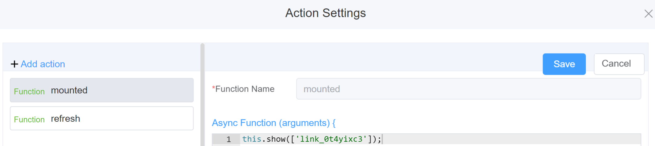
Example
-
this.addClassName(fields, className)- Go to Form Attribute Style Sheets add the class
.abc{ // abc is the class name background-color: red; } - Follow the steps mentioned above, under Steps to use the methods for the Page Builder components
this.addClassName('link_0t4yixc3', 'abc')
- Go to Form Attribute Style Sheets add the class
-
this.removeClassName(fields, className)1this.removeClassName('link_0t4yixc3', 'abc') -
this.hide(fields)1 2
var fields= ['link_0t4yixc3'] this.hide(fields) -
this.show(fields)1 2
var fields= ['link_0t4yixc3'] this.show(fields) -
this.disable(['fields'])1this.disable(['link_0t4yixc3']) -
this.enable(['fields'])1this.enable(['link_0t4yixc3']) -
this.getValues()1 2
var data = this.getValues();
console.log(data);
Config
| Name | Description | Icon |
|---|---|---|
| ID | The link component's unique identifier |  |
| Name | [Optional] The display name of the date field |  |
| Link Name | [Optional] Name of the link you wish to provide | 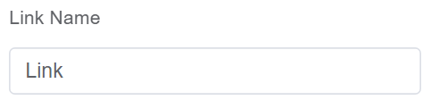 |
| Label Width | Width of the label associated with an input field. It determines the horizontal space occupied by the label text |  |
| Label Wrap | If the label is longer than the allowed width the text will continue on another line |  |
| Hide Label | Hides the label on the form |  |
| Text Prompt | A description to aid the user when completing the field |  |
| Link Type | You can select from various types of link you can represent including Default, Primary, Success, Warning, Danger, Info | 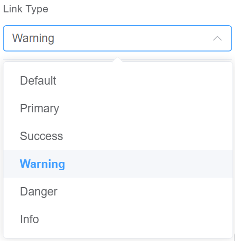 |
| whether the component has underline | Enable this option to underline the link component | 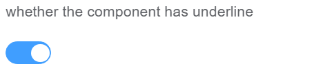 |
| Whether to open in a new window | Enable this option to open the link in the new window | 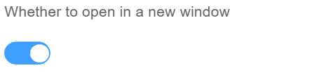 |
| Custom Class | An HTML class attribute which allows further customisation See Form Attribute > Style Sheets |  |
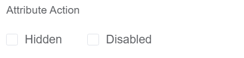
| Attribute Action | Enable Hidden action to hide the field Enable Disabled action to make the field unusable |
 |
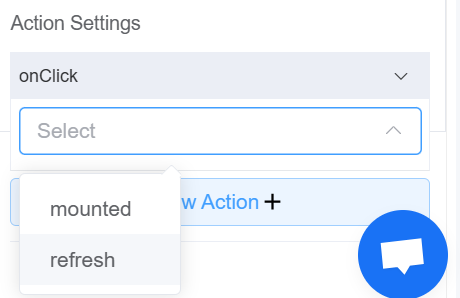
| Action Settings | Click on the drop-down to select the pre-defined methods you wish to apply to your component. In this case, you can choose either mounted or refresh for onClick |
 |
First time User?
If you are using the Page Builder components on the ConnexCS platform for the first time, we request you to use our guide on steps to use the Components.