Button
Document Metadata
Category: Applications Platform / UI Components — Button Component
Audience: Developers, Engineers, UI/UX Designers, Support Team
Difficulty: Intermediate
Time Required: Approximately 15–20 minutes
Prerequisites: Access to the ConnexCS Apps Platform IDE and familiarity with basic UI component configuration (via Page Builder or custom code)
Related Topics: Page Builder / UI Components Overview, ScriptForge / App Logic Layer
Next Steps: Add Button → configure label/style/icon → assign action → test across devices and accessibility
Description
A Button can be used to trigger an event when it's clicked.
Buttons are typically used to submit forms, navigate between pages, or perform other actions.

Use Case
Some use cases are listed as follows:
- Submit Form
- Navigate Through Multi-step Forms/Different Pages (Next, Continue, Previous, Back)
-
Trigger Specific Actions:
- Display or hide additional fields or sections
- Perform calculations or validations
- Open pop-up windows or dialogs
- Reset or Clear Form
-
Trigger Custom Workflows
Interactivity
Interactivity is the ability of a web page or application to respond to user input.
Here are some examples of how interactivity can be implemented for Button components:
-
Submit forms: A common use of button interactivity is to submit forms to a server for processing. When a user clicks the submit button, the form data is validated and sent to the server, resulting in actions such as saving data, creating accounts, or processing orders.
-
Display or Hide elements: Buttons can be used to toggle the visibility of specific elements on the form. For instance, clicking a "Show Advanced Options" button might reveal additional fields or sections of the form, providing more granular control to users.
-
Perform Data Manipulation or Calculations: It's useful for real-time validation, dynamic calculations, or updating form fields based on other inputs.
-
Navigate to Different Pages or Sections: It allows for multi-step forms, progressive disclosure, or branching based on user choices.
-
Trigger Animations or Visual Effects: Buttons can initiate animations or visual effects to enhance the user experience and provide visual feedback. It can include highlighting fields upon clicking, fading in or out elements, or displaying progress indicators.
-
Open pop-up windows or dialogs: Buttons can be used to open pop-up windows or dialogs for displaying additional information, collecting supplementary data, or providing context-sensitive guidance.
-
Trigger custom actions or workflows: It allows for extending the form builder's functionality and integrating it with external systems.
API
Events
| Name | Description |
|---|---|
onClick (element) |
Event handler that's triggered when the button is clicked. This event handler can be used to perform any number of actions, such as submitting the form, redirecting the user to a different page, or displaying an error message |
Methods
| Name | Description | Parameters |
|---|---|---|
this.addClassName |
Add style class to a form item | (fields: String|String[], className: String) |
this.removeClassName |
Remove style class from a form item | (fields: String|String[], className: String) |
this.getComponent |
Returns a component whose id has been passed as a parameter | (component_ID: String) : Object |
this.getValues |
Gets the current values of all fields | () : Object |
this.hide |
Hides the field | (fields: String|String[]) |
this.show |
Displays the field | (fields: String|String[]) |
this.disable |
Disable button from user interaction | (fields: String|String[]) |
this.enable |
Enable button from user interaction | (fields: String|String[]) |
this.$('agentStatus').disable() |
Disable button from user interaction | (fields: String|String[]) |
this.$('agentStatus').enable() |
Enable button from user interaction | (fields: String|String[]) |
Info
- The show() and hide() methods can also be used to control the visibility of the button in response to user input.
- Fields refers to a component ID or a list of component IDs. You can fetch the ID from the Component Attribute panel in the Page Builder.
- Before using this.show(fields), make sure the component is hidden. This can be done using this.hide(fields) or by enabling the Hidden checkbox in the Component Attribute panel.
Steps to use the methods for the Page Builder components
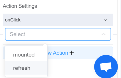
- Go to Form Attribute Action Panel Setting (Mounted | refresh | click 'Add action').
- Write the method/code as shown in the Example below.
- Click on
Save. - On the main screen click on
Saveagain. - Click on
Previewto see the code in action.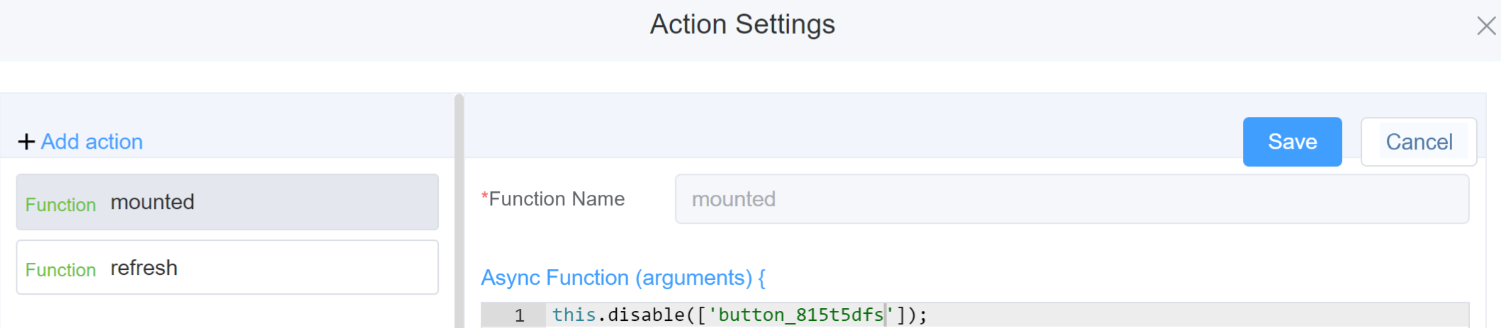
Example
-
this.addClassName(fields, className)- Go to Form Attribute Style Sheets add the class
.abc{ // abc is the class name background-color: red; } - Follow the steps mentioned above, Steps to use the methods for the Page Builder components
this.addClassName('button_815t5dfs', 'abc')
- Go to Form Attribute Style Sheets add the class
-
this.removeClassName(fields, className)1this.removeClassName('button_815t5dfs', 'abc') -
this.getValues()1 2
var data = this.getValues(); console.log(data); -
this.hide(fields)1 2
var fields= ['button_815t5dfs'] this.hide(fields) -
this.show(fields)1 2
var fields= ['button_815t5dfs'] this.show(fields) -
this.disable(['fields'])1this.disable(['button_6ytj0ne9']) -
this.getComponent('component_ID')1 2
var butonname = this.getComponent('button_815t5dfs'); console.log('getComponent', buttonname); -
this.enable(['fields'])1this.enable(['button_6ytj0ne9'])
Info
Use the following syntax to add multiple classes to a component:
1 | |
Config
| Name | Description | Icon |
|---|---|---|
| ID | The button component's unique Identifier | 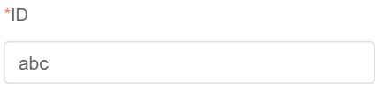 |
| Name | [Optional] An identifier for the button within the page. It's used by the page builder to associate the button with the data it's submitting. The name is typically not displayed to the user | 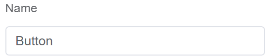 |
| Button Name | [Optional] The display name of the button | 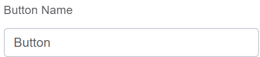 |
| Width | [Optional] The width of the field |  |
| Label Width | [Optional] The width of the label field |  |
| Label Wrap | If the label is longer than the allowed width the text will continue on another line |  |
| Hide Label | Hides the label on the page |  |
| Text Prompt | A description to aid the user when completing the field |  |
| Button Size | Select the size of the button from 3 choices; Large, Default or Small | 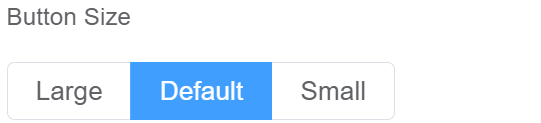 |
| Button Type | Select the type of button from: Default, Primary, Success, Warning, Danger, Info, Text, or Link | 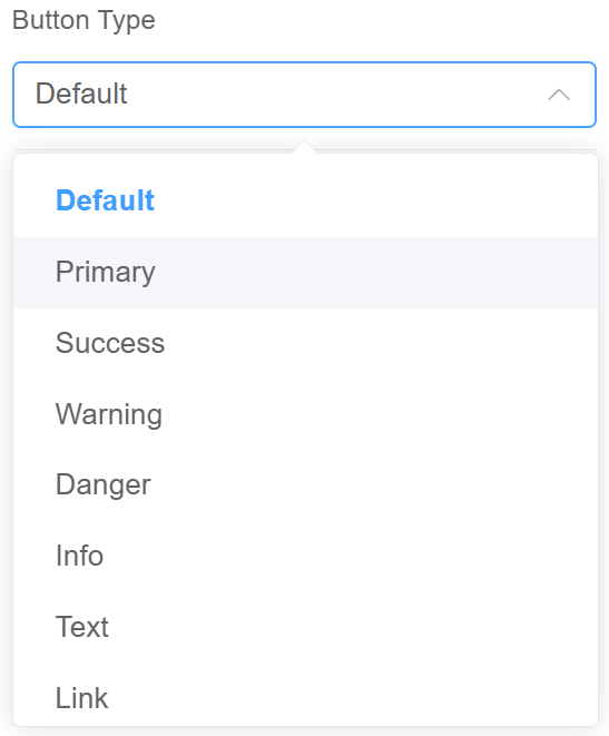 |
| Determine whether it's | You may select the shape of the button as plain, round or circle | 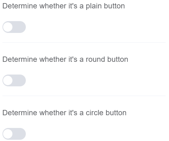 |
| Custom Class | An HTML class attribute which allows further customisation See Form Attribute > Style Sheets |  |
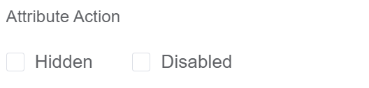
| Attribute Action | Enable Hidden action to hide the field Enable Disabled action to make the field unusable |
 |
| Action Settings | Click on the drop-down to select the pre-defined methods you wish to apply to your component. In this case, you can choose either mounted or refresh for onClick |
 |
First time User?
If you are using the Page Builder components on the ConnexCS platform for the first time, we request you to use our guide on steps to use the Components.