Page Builder
Document Metadata
Category: Applications Platform / Page Builder
Audience: Engineers, Developers, Platform Integrators
Difficulty: Intermediate
Time Required: Approximately 25–35 minutes
Prerequisites: Access to the ConnexCS Apps Platform IDE, familiarity with basic web application UI design and event/data-binding concepts
Related Topics: Apps Platform – Introduction, Apps Platform – Button Builder
Next Steps: Create page → add components → configure attributes and data sources → implement events/API methods → test across devices → publish
Introduction
Our Page Builder allows users to easily create and design forms/pages without needing or minimalist requirement to write code.
It provides a user-friendly interface with drag-and-drop functionality and various pre-built elements, making form creation accessible even to those with limited technical expertise.
Key features and functionalities of the Page builder:
- Drag-and-drop interface: You can drag and drop various form elements e.g. text fields, checkboxes, radio buttons, drop-down menus, and more onto a visual canvas.
- Customization options: You can customize the appearance of your form by changing colors, fonts, layouts, and adding your own branding elements.
- Conditional logic: You can set up conditional logic, where certain form fields appear or disappear depending on the user's selections in other fields.
- Data validation: Page builders offer built-in validation rules to ensure users enter data in the correct format (e.g., email address, phone number).
- Integrations: You have the option to integrate with various services like email marketing platforms, payment gateways, and CRM systems.
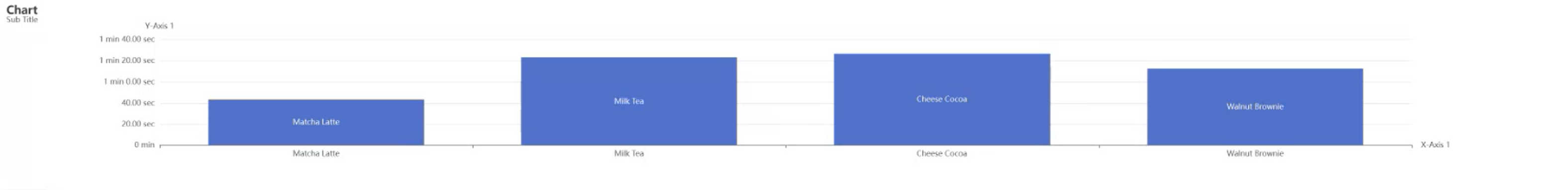
- Charts: You can display your data using various types of charts.
Create a new Page
-
Login to your account.
-
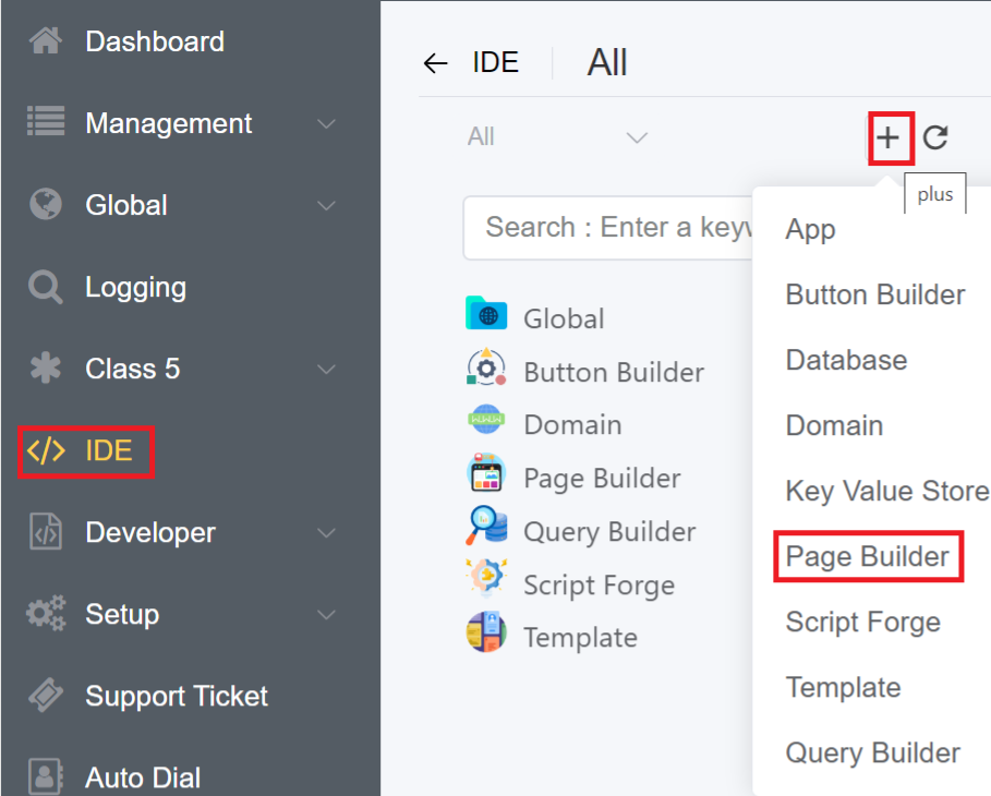
Navigate to IDE
+icon Page Builder.
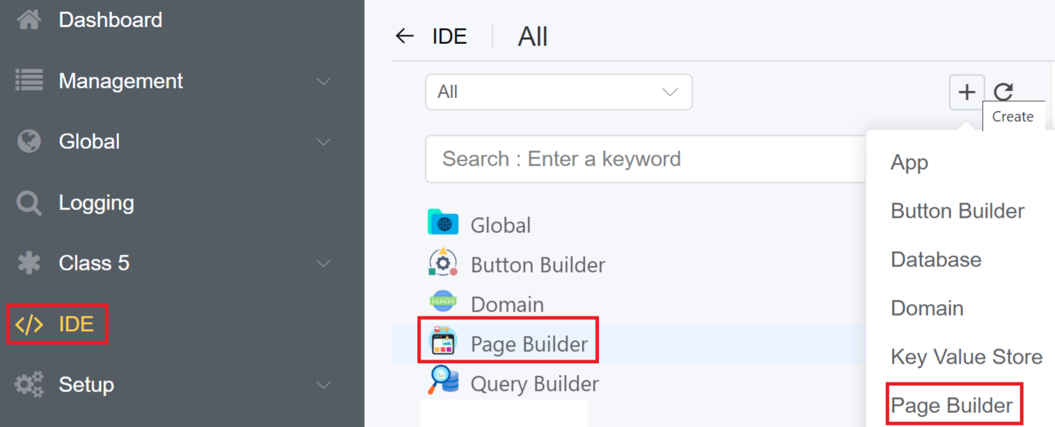
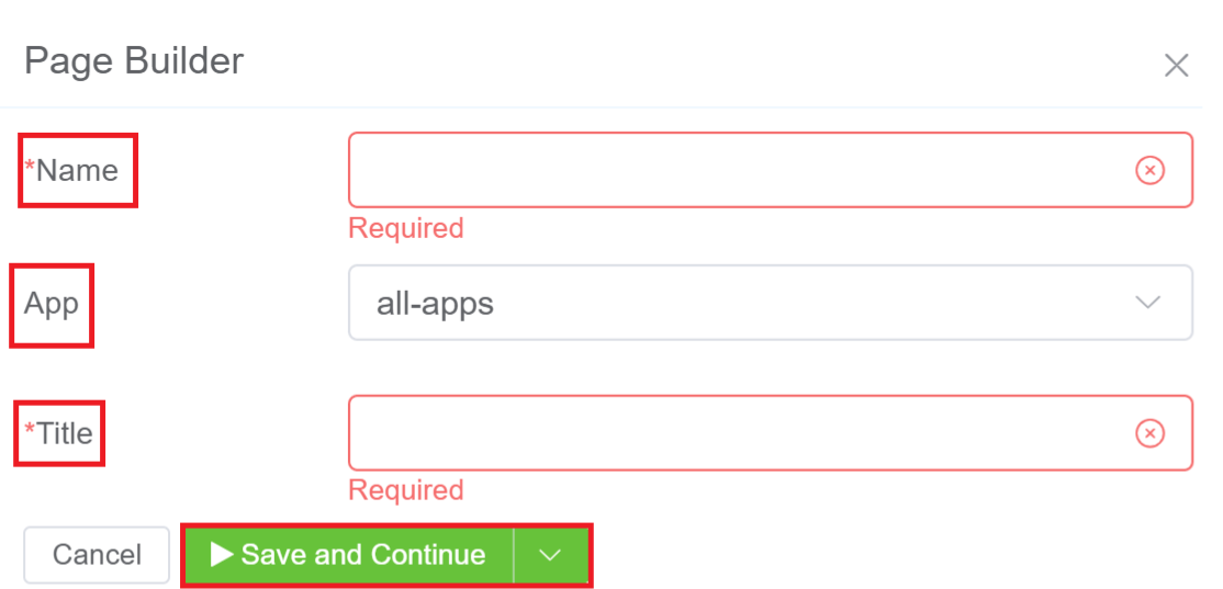
3.Enter the Name and Title of your Page. From the App drop-down you can select the application for which you wish to create for the page for and click on Save and Continue.
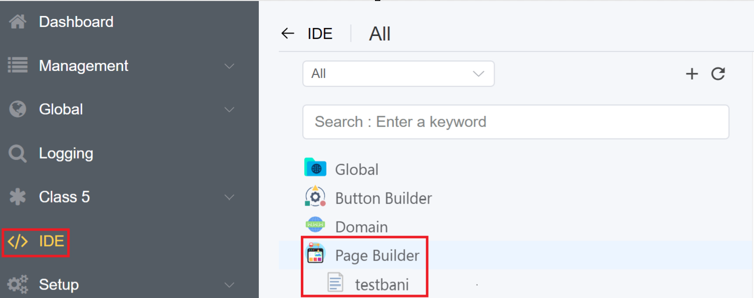
4.The created Page will be visible on the IDE panel under Page Builder. Click on the created blank page to create your customize form/page.
Tip
Use the Search Components feature to find the components in the Layout, Collection, Basic Fields or Advance Fields.
Component Attribute
A component attribute is a piece of data associated with a specific component within a Page.
It serves as a way to customize the component's behavior, appearance, or functionality.
Components in a Page Builder include Alert, Buttons, Sub-Form, Sub-Form+, Table etc.
We've explained the Component Attribute for each component individually in the Components section.
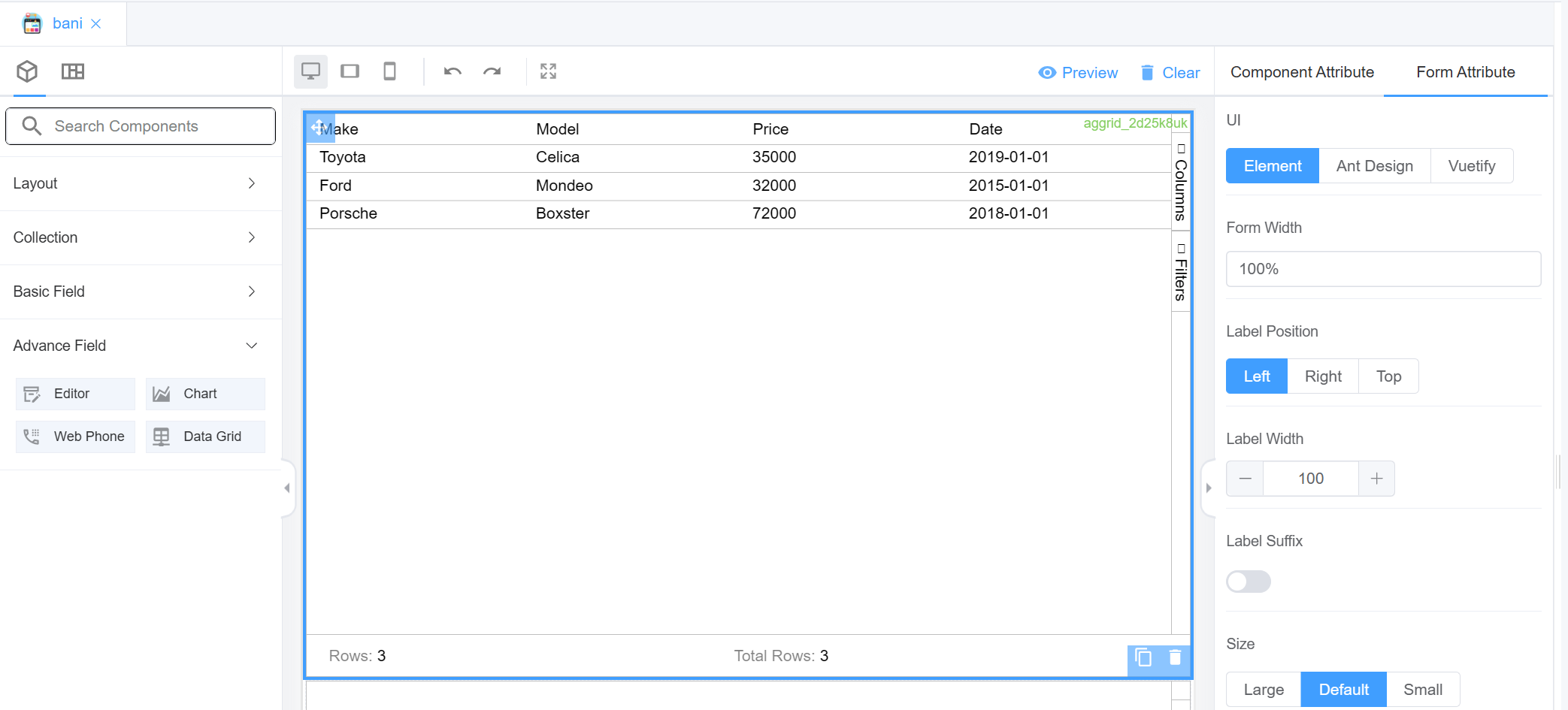
Form Attribute
The Form attribute helps you specify values for the following parameters for all the fields in the form or on the form itself:
| Name of the Component | Description | Icon |
|---|---|---|
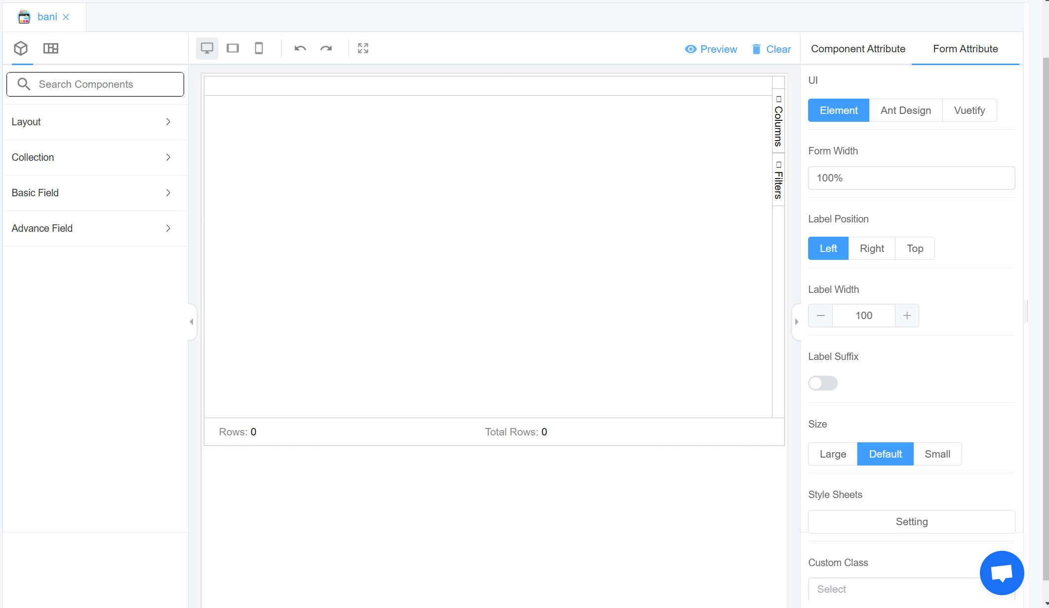
| UI | User Interface refers to the graphical layout of an application. Element and Ant Design are for desktop components design and Vuetify focuses on designing for mobile components | 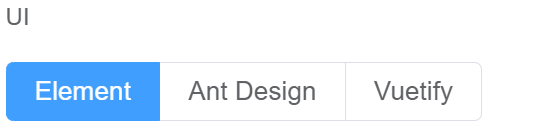 |
| Form Width | Form width helps you decide the dimensions of the complete form | 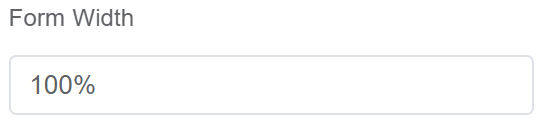 |
| Label Position | Label position helps you position the field labels. You can decide between Left, Right and Top |
 |
| Label Width | Refers to the horizontal space allocated for displaying labels in a form or dialog box | 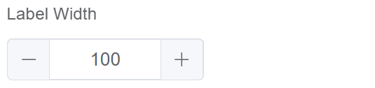 |
| Label Suffix | A label suffix typically refers to a set of characters or symbols that are added to the end of a label or identifier to provide additional information or context | 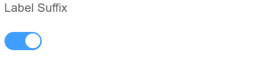 |
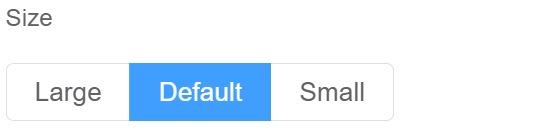
| Size | Size describes the dimensions of all the fields in the form. You can choose from Large, Default, and Small |
 |
| Style Sheets | You can add custom Style Sheets to make the interface look more pleasing | 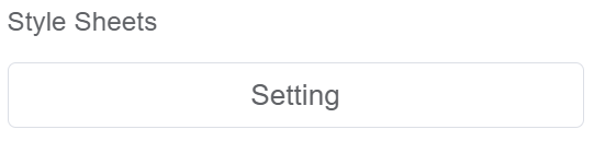 |
| Custom Class | You can select class names created in Style Sheets |  |
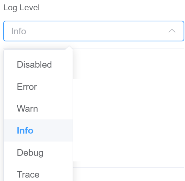
| Log Level | Log messages based on the severity of the event they describe, helping users prioritize and interpret the vast amount of information typically found in logs. 1.Disabled signifies is entirely turned off. No messages, regardless of their severity (error, warning, info, etc.), will be written to the log file. 2. Use Error log level that should be used when the application hits an issue preventing one or more functionalities from properly functioning. 3. Use Warn log for unexpected behavior happened inside the application, but it's continuing its work and the key business features are operating as expected. 4. Info An event happened, the event is purely informative and can be ignored during normal operations. 5. Use Debug level for troubleshooting or test environments to diagnose potential issues. 6. Trace Detailed code execution for deep debugging, ignored during normal operation. { label: 'Disabled', value: 5 }, { label: 'Error', value: 4 }, { label: 'Warn', value: 3 }, { label: 'Info', value: 2 }, { label: 'Debug', value: 1 }, { label: 'Trace', value: 0 } |
 |
| Data Source | Data Source can be External, from Script Forge or a Database |  |
| Action Panel | Allows you to create functions/JavaScript methods to specify the actions for various components in the form/page |  |
| Javascript CDN Library | Allows you to load external javascript libaries. Our search feature lets you quickly search for libraries from cdnjs.cloudflare.com |
 |
Config
Events
| Name | Description |
|---|---|
| mounted | When the page is first loaded |
| refresh | When the page is first loaded and every time .refresh() is called |
API
- sendRequest()
send a request to GET, POST, PUT, DELETE
- validate(fields) â
Promise.<Boolean> Validates the form data or a key-value pair
- getData([isValidate]) â
Promise.<Object> To get form data
- refresh()
refreshs the data
- setData(Value)
Set Data
- getComponent(name) â
Object 'dialog' is the ID field in the 'Component Attribute' tab
- getValues()() â
To get form data values from a component
- getValue() â
Get A Value From An Object
- setRules()
Set Rules For A Field
- addClassName()
Add class name, field can optionally be an array
- removeClassName()
Remove class name, field can optionally be an array
sendRequest()
send a request to GET, POST, PUT, DELETE
Kind: global function
Params: string name
Params: Object args - arguments
Params: Object extendOptions - extendOptions
Example
var data = await this.sendRequest('customer')
validate(fields) â Promise.<Boolean>
Validates the form data or a key-value pair
Kind: global function
Returns: Promise.<Boolean> - Validation Success or Failure
| Param | Type | Description |
|---|---|---|
| fields | Object |
Object is key-value pairs, key being the field name |
Example
this.validate(fields)
this.validate()
getData([isValidate]) â Promise.<Object>
To get form data
Kind: global function
Returns: Promise.<Object> - All of the form data
| Param | Type | Default |
|---|---|---|
| [isValidate] | Boolean |
true |
Example
Validate form data Object by default
try {
    var data = await this.getData()
    // if success returns validated data as an object {name: 'XYZ'}
} catch (err) {
    // returns  err message {Name is required}
}
            }
var data = await this.getData(false)
// data contains {name: 'XYZ'}
refresh()
refreshs the data
Kind: global function
Example
this.refresh()
setData(Value)
Set Data
Kind: global function
Apidescription: setData can be used to populate a page/form with information stored in a key:value object
| Param | Type |
|---|---|
| Value | Object |
Example
var myData = {name: 'Joe Blogs', age: 30};
this.setData(myData);
getComponent(name) â Object
'dialog' is the ID field in the 'Component Attribute' tab
Kind: global function
Returns: Object - - Component Object
| Param | Type | Description |
|---|---|---|
| name | string |
The component name |
Example
this.getComponent('dialog')
getValues()() â
To get form data values from a component
Kind: global function
Returns: The Data
Example
this.getComponent('dialog').getValues()
var dialog = this.getComponent('dialog')
dialog.getValues()
getValue() â
Get A Value From An Object
Kind: global function
Returns: 'Joe Blogs'
Params: string fieldName - Field Name
returns Value of the selected field
Example
var myData = {name: 'Joe Blogs', age: 30};
this.getValue('name')
setRules()
Set Rules For A Field
Kind: global function
Params: string field
Params: Array rules
Example
var field = 'name'
var rules = [
{ required: true, message: 'Name is requried' }
]
this.setRules(field, rules)
addClassName()
Add class name, field can optionally be an array
Kind: global function
Params: string|array fields
Params: string className
Example
// Add class name to a component
this.addClassName('myField', 'myClass')
removeClassName()
Remove class name, field can optionally be an array
Kind: global function
Params: string|array fields
Params: string className
Example
// Remove class name to a component
this.removeClassName('myField', 'myClass')
Info
Form Attribute Datasource ScriptForge Websocket WebSocket enables you to create and manage WebSocket connections within your application. WebSockets are a powerful technology for establishing persistent, two-way communication channels between a web browser and a server, enabling real-time data exchange without the need for constant polling.
Example:
1 2 3 4 5 6 7 | |
Info
Form Attribute Datasource Stores Stores accesses Datasource form the Control Panel only.
Info
Form Attribute Datasource Databases Stores accesses Datasource form the Control Panel only.
Info
Form Attribute Datasource Saved Query Using the Page Builder interface we can run a complicated query (runs behind the scenes) and it returns the data. the Saved Queries can be accessed via ScriptForge.
- A query can be ran against different endpoints, (CDR, Primary Database, G3 Analytics), so we will need a selector.
- From the IDE perspective, we should be able to run an ad-hoc query, e.g we shouldn't need to create a new item and save it before we can run it.
- There should be a section for variables to be filled in, for example: SELECT * FROM customers WHERE customer_id = :customer_id :customer_id is the replacement syntax.
- Then when we run the query it will automatically replace :customer_id with the value associated with that variable.
- When the query is saved (/api/cp/setup/query) you can run it /api/cp/setup/query/1234/run with POST or GET and pass the variable along with it. Then it will inject the variables into the saved query and execute it.
- This query will then be accessible from ScriptForge or via the Page-builder.
Info
Form Attribute Datasource External Access information externally.
Info
window.cx: This function, when called, returns an object with the name ctx. This can be accessed using the browser's console. When any functions are being executed, "this" context is equivalent to "ctx." It's an incredibly efficient method for modifying code directly from the browser console. For example, using the below code you can interact with the Page Builder from the Console.
- Example 1
1 | |
1 | |
2.Example 2: Set the Log Level
1 | |
Platform Features
Drag & Drop Admin Interface Builder, using the following components.
- Alert
- Button
- Card
- Cascader
- Chart
- Checkbox
- Collapse
- Color
- Data Grid
- Date
- Dialog
- Divider
- Editor
- Grid
- Group
- HTML
- I-Frame
- Inline
- Input
- Link
- Number
- Page Layout
- Pagination
- Portal
- Radio
- Rate
- Select
- Slider
- Steps
- Sub-Form
- Sub-Form+
- Switch
- Table
- Tabs
- Text Area
- Text
- Time
- Transfer
- Tree-Select
- WebPhone
Steps to use Components in the Page Builder
-
Create an Application. Click here for creating an Application.
-
Select the created application from the dropdown.
-
After selecting the app it shows a
+on the right side which is a drop down list, select Page Builder.
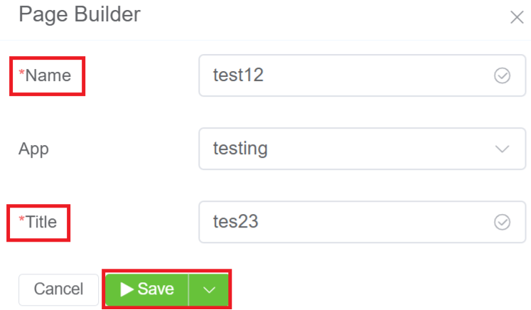
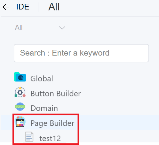
4.Enter the Name and Title of the Page Builder. Select the App for the Page Builder. Click Save.
5.The created Page Builder will be visible on the IDE panel under Page Builder. Click on the created Page Builder (test12).
6.Click on the created page builder, it shows with page builder sections where you can Drag and Drop the components from the left navigation (Layout).