Color
Document Metadata
Category: Applications Platform / UI Components — Color Picker & Color Configuration
Audience: Developers, Engineers, UI/UX Designers, Support Team
Difficulty: Beginner to Intermediate
Time Required: Approximately 10–15 minutes
Prerequisites: Access to the ConnexCS Apps Platform IDE (Page Builder or component config), basic understanding of UI theming or configuration of colour-sensitive elements (e.g., labels, tags, backgrounds)
Related Topics: Page Builder / UI Components Overview, Other UI Components
Next Steps: Add Color Picker → set defaults or user selection → bind to component properties → test contrast/themes
Description
A Color component is a form element that allows users to select a color from a palette or input a color code.
This type of component is commonly used for forms that require users to specify colors for design elements, text formatting, or other visual aspects.

Use Case
-
Highlighting important fields: Enhance form usability by drawing attention to critical fields.
-
Providing visual cues for input validation: Guide users with color-coded feedback for input correctness.
-
Creating a more visually appealing form: Elevate form aesthetics and user engagement through color schemes.
Here are some examples:
-
Input fields: Use different border colors to indicate required, optional, and disabled fields.
-
Labels: Use different text colors to indicate required, optional, and disabled labels.
-
Error messages: Use different text colors to indicate error severity (critical, warning, informational).
-
Buttons: Use different background colors to indicate button type (submit, delete, cancel).
- Highlighting progress: You could use a progress bar with different colors to indicate the current stage of the form.
- Grouping related fields: You could use a different color for each section of a form, or you could use a color gradient to indicate the sequence of fields.
- Reducing Cognitive Load: Limiting color palettes can alleviate cognitive load on users, particularly for long or complex forms, facilitating better focus on the form itself.
Interactivity
Interactivity is the ability of a web page or application to respond to user input.
There are a number of ways to add interactivity to the Color component.
Some of the most common methods include:
-
Disable/enable the color picker based on other form values using the enable() and disable() methods. For example, disable if a checkbox is unchecked.
-
Show/hide the picker conditionally by calling show() and hide() methods. For example, only show it if a radio button is selected.
-
Validate the selected color using validate() and display errors for invalid values.
-
Change available colors in the palette dynamically based on other form selections.
-
Preselect the color based on logic and calculations when the form initializes.
-
Update styles of other elements based on the selected color using CSS custom properties.
-
Display color preview swatches elsewhere in the form when the color changes.
API
Events
| Name | Description |
|---|---|
onChange (element) |
The onChange event occurs when the value of the color field changes. |
Methods
| Name | Description | Parameters |
|---|---|---|
this.addClassName |
Add style class to a form item | (fields: String|String[], className: String) |
this.removeClassName |
Remove style class from a form item | (fields: String|String[], className: String) |
this.getComponent |
Returns a component whose id has been passed as a parameter | (component_ID: String) : Object) |
this.getValues |
Gets the current values of all fields | () : Object |
this.hide |
Hides the field | (fields: String|String[]) |
this.show |
Displays the field | (fields: String|String[]) |
this.disable |
Disable color field from user interaction | (fields: String|String[]) |
this.enable |
Enable color field from user interaction | (fields: String|String[]) |
this.getValue |
Get A Value From a component | (fieldName: String) |
this.setData |
Set the color by passing an object of type, { component_Id: String }. The String should a color in hexadecimal format. e.g. '#443214' | (Value: Object) |
Info
- The show() and hide() methods can also be used to control the visibility of the color in response to user input.
- Fields refers to a component ID or a list of component IDs. You can fetch the ID from the Component Attribute panel in the Page Builder.
- Before using this.show(fields), make sure the component is hidden. This can be done using this.hide(fields) or by enabling the Hidden checkbox in the Component Attribute panel.
- Before using this.enable(fields), make sure the component is disabled. This can be done using this.disable(fields) or by enabling the Disabled checkbox in the Component Attribute panel.
Steps to use the methods for the Page Builder components
- Go to Form Attribute Action Panel Setting (Mounted | refresh | click 'Add action').
- Write the method/code as shown in the Example below.
- Click on
Save. - On the main screen click on
Saveagain. - Click on
Previewto see the code in action.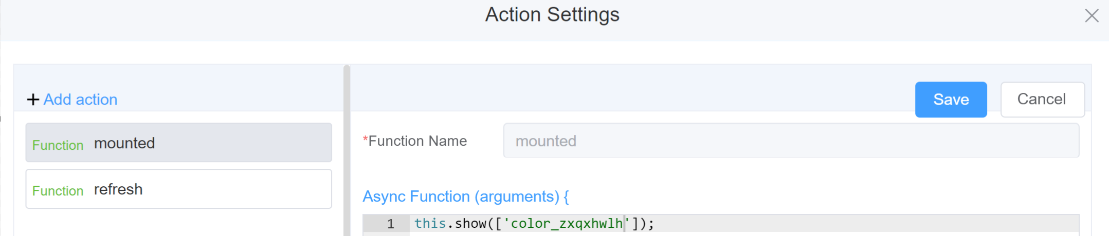
Example
-
this.addClassName(fields, className)- Go to Form Attribute Style Sheets add the class
.abc{ // abc is the class name background-color: red; } - Follow the Steps to use the methods for the Page Builder components
this.addClassName('color_zxqxhwlh', 'abc')
- Go to Form Attribute Style Sheets add the class
-
this.removeClassName(fields, className)1this.removeClassName('color_zxqxhwlh', 'abc') -
this.getValues()1 2
var data = this.getValues(); console.log(data); -
this.hide(fields)1 2
var fields= ['color_zxqxhwlh'] this.hide(fields) -
this.show(fields)1 2
var fields= ['color_zxqxhwlh'] this.show(fields) -
this.disable(['fields'])1this.disable(['color_zxqxhwlh']) -
this.getValue('fieldName')1 2
var colorname = this.getValue('color_zxqxhwlh'); console.log('getValue', colorname); -
this.getComponent('component_ID')1 2
var colorname = this.getComponent('color_zxqxhwlh'); console.log('getComponent', colorname); -
this.setData(Value)1 2
this.setData(
 {""color_o1cfjhoq": "#AEE710",});
Info
Use the following syntax to add multiple classes to a component:
1 | |
Config
| Name | Description | Icon |
|---|---|---|
| ID | The color component's unique identifier |  |
| Name | [Optional] The display name of the color field |  |
| Width | [Optional] Width of the field |  |
| Label Width | Width of the label associated with an input field. It determines the horizontal space occupied by the label text |  |
| Label Wrap | If the label is longer than the allowed width the text will continue on another line |  |
| Hide Label | Hides the label on the form |  |
| Text Prompt | A description to aid the user when completing the field |  |
| Support Transparency Options | Ability to specify the transparency level of a color |  |
| Default Value | Controls the initial color selection in a color picker, while still allowing the user to change it if desired |  |
| Custom Class | An HTML class attribute which allows further customisation See Form Attribute > Style Sheets |  |
| Attribute Action | Enable Data Binding to connect the data to UI Enable Hidden action to hide the fieldEnable Disabled action to make the field unusable |
 |
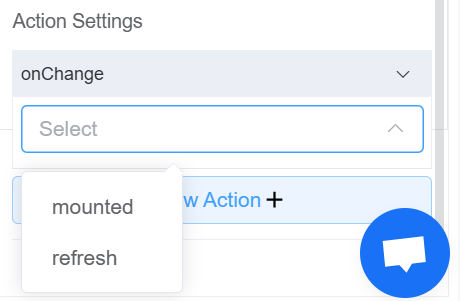
| Action Settings | Click on the drop-down to select the pre-defined methods you wish to apply to your component. In this case, you can choose either mounted or refresh for onChange |
 |
Validation
Form validation is the process of checking the data entered into a form to ensure that it's valid and complete.
This helps to prevent users from submitting forms with invalid data, which can cause problems for the application that's processing the form.
Form validation can be performed using a variety of methods, including:
| Name | Description |
|---|---|
| Required | If enabled, then the field value can't be empty, otherwise an error message is emitted |
| Custom Validation Rules | (rule, value, callback) => { |
| rule: Verification rule, you can view the verification configuration information through this parameter; rule.field can get the field identifier of the current verification. | |
| value: Value of the current field | |
| callback: Callback function (must be called) upon completion of validation; callback('Error message')/ callback(new Error('Error message')). These are two ways to return an error message. |

Info
- The callback() function is also called to verify success in the custom validation method.
First time User?
If you are using the Page Builder components on the ConnexCS platform for the first time, we request you to use our guide on steps to use the Components.