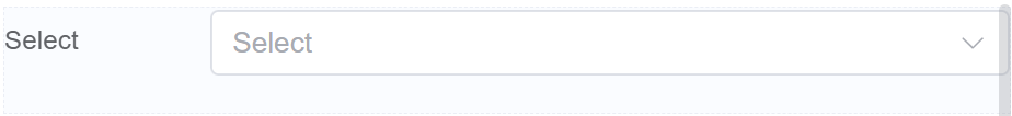
Select
Document Metadata
Category: Applications & Components
Audience: Administrators, Engineers, App Developers
Difficulty: Beginner to Intermediate
Time Required: Approximately 15–30 minutes
Prerequisites: Active ConnexCS account, access to the Applications module, basic understanding of UI component configuration and form input components (dropdown/select behavior)
Related Topics: Input Component, Number Component, Radio Component, Grid Component
Next Steps: Build a sample form or UI using the Select component to present dropdown options; test selection behavior and data binding (single/multiple select, default value, option loading) for different use-cases
Description
The Select component is a dropdown menu that allows users to choose one option from a predefined list.
It's a versatile tool for collecting user input in situations where there are multiple, but not limitless, choices.
Use Case
- Filtering and Selection
- Product Catalog
- Search Results
- Event Calendar
- Dynamically Changing Options
- Dependent Dropdowns
- Conditional Options
- Personalized Offer
- Data Collection and Analytics
- Survey Questions
- Feedback Forms
- Market Research
- Interactive and Engaging Designs
- Customizable Options
Interactivity
- Search functionality: Integrate a search bar within the dropdown menu for quickly finding specific options in long lists.
- Dependent dropdowns: Link multiple select components, making the options in the second dropdown dependent on the selection in the first.
- Conditional options: Based on user input in other form fields, dynamically hide or show irrelevant options in the select list.
- Preview features: When users hover over an option, display a preview of what happens if they select it.
API
Events
| Name | Description |
|---|---|
onChange (element) |
The onChange event occurs when the value of a field is changed |
onFocus (element) |
The onfocus event occurs when a field gets focus |
onBlur (element) |
The onblur event occurs when a field loses focus |
Methods
| Name | Description | Parameters |
|---|---|---|
this.addClassName |
Add style class to a form item | (fields: String|String[], className: String) |
this.removeClassName |
Remove style class from a form item | (fields: String|String[], className: String) |
this.getComponent |
Returns a component whose id has been passed as a parameter | (component_ID: String) : Object |
this.getValues |
Gets the current values of all fields | () : Object |
this.hide |
Hides the field | (fields: String|String[]) |
this.show |
Displays the field | (fields: String|String[]) |
this.disable |
Disable select field from user interaction | (fields: String|String[]) |
this.enable |
Enable select field from user interaction | (fields: String|String[]) |
this.getValue |
Get A Value From a component | (fieldName: String) |
this.setData |
Set the data in the field. The Value object should be of type { componentId: componentValue } | (Value: Object) |
this.refreshFieldDataSource |
Refresh the datasource data bound to the whole page |
Info
- The show() and hide() methods can also be used to control the visibility of a select component in response to user input.
- Fields refers to a component ID or a list of component IDs. You can fetch the ID from the Component Attribute panel in the Page Builder.
- Before using this.show(fields), make sure the component is hidden. This can be done using this.hide(fields) or by enabling the Hidden checkbox in the Component Attribute panel.
- Before using this.enable(fields), make sure the component is disabled. This can be done using this.disable(fields) or by enabling the Disabled checkbox in the Component Attribute panel.
Steps to use the methods for the Page Builder components
- Go to Form Attribute Action Panel Setting (Mounted | refresh | click 'Add action').
- Write the method/code as shown in the Example below.
- Click on
Save. - On the main screen click on
Saveagain. - Click on
Previewto see the code in action.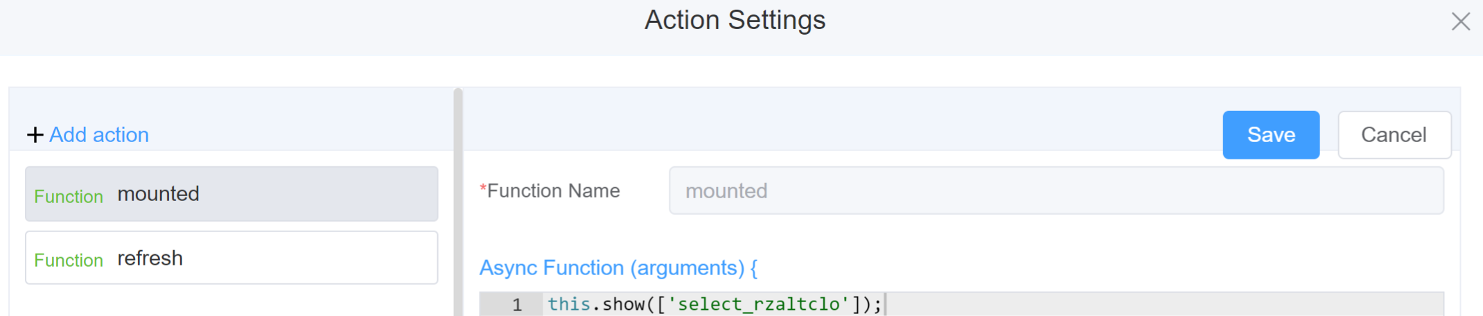
Example
-
this.addClassName(fields, className)- Go to Form Attribute Style Sheets add the class
.abc{ // abc is the class name background-color: red; } - Follow the steps mentioned above, under Steps to use the methods for the Page Builder components
this.addClassName('select_rzaltclo', 'abc')
- Go to Form Attribute Style Sheets add the class
-
this.removeClassName(fields, className)1this.removeClassName('select_rzaltclo', 'abc') -
this.getValues()1 2
var data = this.getValues(); console.log(data); -
this.hide(fields)1 2
var fields= ['select_rzaltclo'] this.hide(fields) -
this.show(fields)1 2
var fields= ['select_rzaltclo'] this.show(fields) -
this.disable(['fields'])1this.disable(['select_rzaltclo']) -
this.enable(['fields'])1this.enable(['select_rzaltclo']) -
this.getValue('fieldName')1 2
var selectname = this.getValue('select_rzaltclo'); console.log('getValue', selectname); -
this.getComponent('component_ID')1 2
var selectname = this.getComponent('select_rzaltclo'); console.log('getComponent', selectname); -
this.setData(Value)1 2
this.setData( {"select_rzaltclo": "Option 2",}); -
this.refreshFieldDataSource(datasource)1 2
const dataSource = 'Name Of The Data Source Function'
this.refreshFieldDataSource(dataSource)
Config
| Name | Description | Icon |
|---|---|---|
| ID | The select component's unique identifier |  |
| Name | [Optional] The display name of the select field |  |
| Width | [Optional] Width of the field |  |
| Label Width | Width of the label associated with an input field. It determines the horizontal space occupied by the label text |  |
| Label Wrap | If the label is longer than the allowed width the text will continue on another line |  |
| Hide Label | Hides the label on the form |  |
| Placeholder | The short hint is displayed in the input field before the user enters a value |  |
| Text Prompt | A description to aid the user when completing the field |  |
| Multiple | Choose multiple options from the available list | 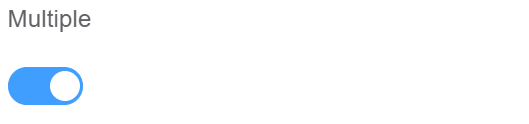 |
| Searchable | Enable this option to search the options from the list |  |
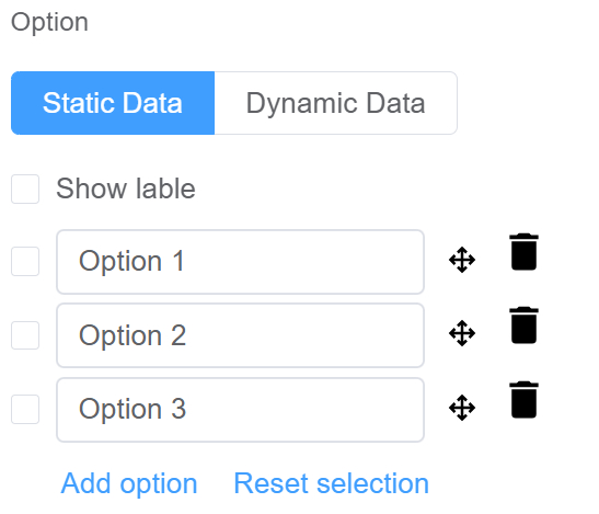
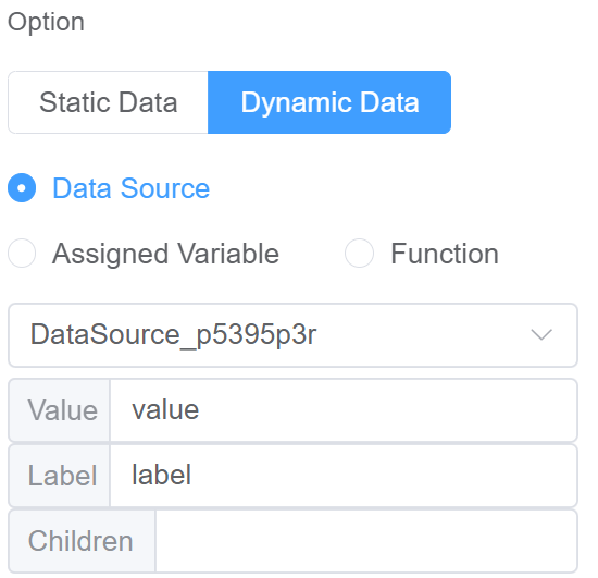
| Option | Choose either Static or Dynamic way of adding data to the options of the Select Static data refers to a fixed set of options that are pre-defined and loaded into the select at the time of initialization Dynamic data are options fetched as needed from sources like databases or APIs. The select updates choices based on user selections. You select from Data source which refers to the origin of the data; Function which refers to the code that manipulates the data, and Assigned Value which refers to the specific value stored or associated with a data element |
  |
| Custom Class | An HTML class attribute which allows further customisation See Form Attribute > Style Sheets |  |
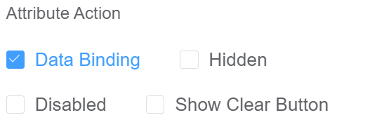
| Attribute Action | Enable Data Binding to connect the data to UI. Enable Hidden action to hide the field. Enable Disabled action to make the field unusable. Enable Show Clear button action to make the clear button visible. |
 |
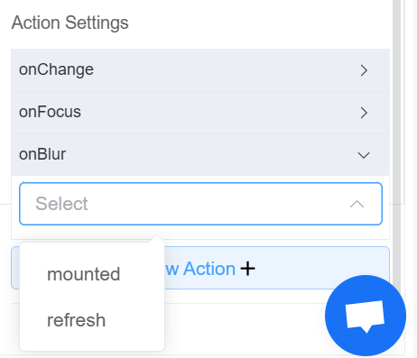
| Action Settings | Click on the drop-down to select the pre-defined methods you wish to apply to your component. In this case, you can choose either mounted or refresh for onChange, onFocus, or onBlur |
 |
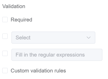
Validation
Form validation is the process of checking the data entered into a form to ensure that it's valid and complete.
This helps to prevent users from submitting forms with invalid data, which can cause problems for the application that's processing the form.
Form validation can be performed using a variety of methods, including:
| Name | Description |
|---|---|
| Required | If enabled, then the field value can't be empty, otherwise an error message is emitted |
| Custom Validation Rules | (rule, value, callback) => { |
| rule: Verification rule, you can view the verification configuration information through this parameter; rule.field can get the field identifier of the current verification | |
| value: Value of the current field | |
| callback: Callback function (must be called) upon completion of validation; callback('Error message')/ callback(new Error('Error message')). These are two ways to return an error message |
Info
- The callback() function is also called to verify success in the custom validation method.
First time User?
If you are using the Page Builder components on the ConnexCS platform for the first time, we request you to use our guide on steps to use the Components.