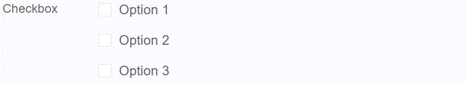
Checkbox
Document Metadata
Category: Applications Platform / UI Components — Checkbox Component
Audience: Developers, Engineers, UI/UX Designers, Support Team
Difficulty: Beginner to Intermediate
Time Required: Approximately 10–15 minutes
Prerequisites: Access to the ConnexCS Apps Platform IDE, familiarity with basic form controls and user-input handling (forms, event logic)
Related Topics: Page Builder / UI Components Overview
Next Steps: Add Checkbox → configure label/state/grouping → read value in logic for conditional behavior → test scenarios
Description
A checkbox is a type of input field in a form builder that allows users to select multiple options from a set of choices.
Checkboxes are typically used to collect data about user preferences or choices.
Use Case
- Allowing users to select multiple options
- Enabling or disabling other fields
- Collecting preferences
- Accepting terms and conditions
- Gathering consent
- Filtering search results
Interactivity
There are a number of ways to add interactivity to Checkboxes.
Some of the most common methods include:
-
Conditional logic and dynamic content updates: Checkboxes can dynamically control other form fields based on selections, enhancing personalization.
-
Validation checks and error prevention: Checkboxes can enforce validation rules, ensuring correct user input and data integrity.
-
Data collection and processing: Checkboxes allow for collecting user preferences and tailoring experiences accordingly.
-
Visual feedback and user engagement: Visual feedback from checkboxes improves user interaction and form engagement.
-
Accessibility and inclusive design: Accessible checkboxes ensure inclusive participation and form usability for all.
-
Conditional page navigation: Dynamically switch between form pages based on checkbox selections
- Real-time progress indicators: Keep users engaged by showing their progress and remaining tasks
- Autofill and smart suggestions: Suggest relevant options based on user choices, reducing input effort.
- Contextual tooltips and pop-ups: Provide additional context and explanations for specific checkboxes.
- Interactive visuals and animations: Enhance visual feedback and engagement with dynamic responses.
- Conditional page navigation: Dynamically switch between form pages based on checkbox selections
- Real-time progress indicators: Keep users engaged by showing their progress and remaining tasks
- Autofill and smart suggestions: Suggest relevant options based on user choices, reducing input effort.
- Contextual tooltips and pop-ups: Provide additional context and explanations for specific checkboxes.
- Interactive visuals and animations: Enhance visual feedback and engagement with dynamic responses.
API
Events
| Name | Description |
|---|---|
onChange (element) |
The onChange event occurs when the value of a field is changed |
Methods
| Name | Description | Parameters |
|---|---|---|
this.addClassName |
Add style class to a form item | (fields: String|String[], className: String) |
this.removeClassName |
Remove style class from a form item | (fields: String|String[], className: String) |
this.getComponent |
Returns a component whose id has been passed as a parameter | (component_ID: String) : Object |
this.getValues |
Gets the current values of all fields | () : Object |
this.hide |
Hides the field | (fields: String|String[]) |
this.show |
Displays the field | (fields: String|String[]) |
this.disable |
Disable checkbox from user interaction | (fields: String|String[]) |
this.enable |
Enable checkbox from user interaction | (fields: String|String[]) |
this.getValue |
Get A Value From a component | (fieldName: String) |
this.setData |
Set the data in the field. The Value object should be of type { componentId: componentValue } | (Value: Object) |
this.refreshFieldDataSource |
Refresh the datasource data bound to the whole page |
Info
- The show() and hide() methods can also be used to control the visibility of the checkbox component in response to user input.
- Fields refers to a component ID or a list of component IDs. You can fetch the ID from the Component Attribute panel in the Page Builder.
- Before using this.show(fields), make sure the component is hidden. This can be done using this.hide(fields) or by enabling the Hidden checkbox in the Component Attribute panel.
- Before using this.enable(fields), make sure the component is disabled. This can be done using this.disable(fields) or by enabling the Disabled checkbox in the Component Attribute panel.
Steps to use the methods for the Page Builder components
- Go to Form Attribute Action Panel Setting (Mounted | refresh | click 'Add action').
- Write the method/code as shown in the Example below.
- Click on
Save. - On the main screen click on
Saveagain. - Click on
Previewto see the code in action.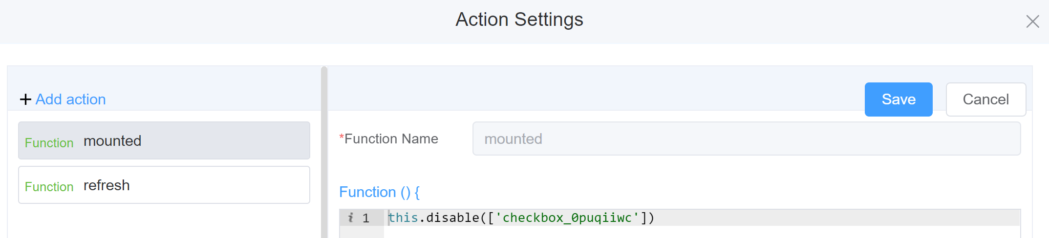
Example
-
this.addClassName(fields, className)- Go to Form Attribute Style Sheets add the class
.abc{ // abc is the class name background-color: red; } - Follow the steps mentioned above, under Steps to use the methods for the Page Builder components
this.addClassName('checkbox_g0x4pt54z', 'abc')
- Go to Form Attribute Style Sheets add the class
-
this.removeClassName(fields, className)1this.removeClassName('checkbox_g0x4pt54z', 'abc') -
this.getValues()1 2
var data = this.getValues(); console.log(data); -
this.hide(fields)1 2
var fields= ['checkbox_g0x4pt54z'] this.hide(fields) -
this.show(fields)1 2
var fields= ['checkbox_g0x4pt54z'] this.show(fields) -
this.disable(['fields'])1this.disable(['checkbox_g0x4pt54z']) -
this.enable(['fields'])1this.enable(['checkbox_g0x4pt54z']) -
this.getValue('fieldName')1 2
var checkname = this.getValue('checkbox_g0x4pt54z'); console.log('getValue', checkname); -
this.getComponent('component_ID')1 2
var checkname = this.getComponent('checkbox_g0x4pt54z'); console.log('getComponent', checkname); -
this.setData(Value)1 2 3 4
this.setData( { "checkbox_g0x4pt54z": "Option 1", "Option 2",} ); -
this.refreshFieldDataSourcemake the function or data as dynamic
Config
| Name | Description | Icon |
|---|---|---|
| ID | The checkbox component's unique identifier |  |
| Name | [Optional] The display name of the checkbox |  |
| Width | [Optional] Width of the field |  |
| Label Width | Width of the label associated with an input field. It determines the horizontal space occupied by the label text |  |
| Label Wrap | If the label is longer than the allowed width the text will continue on another line |  |
| Hide Label | Hides the label on the form |  |
| Text Prompt | A description to aid the user when completing the field |  |
| Layout | Select the format of the Checkbox as Block or Inline | 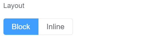 |
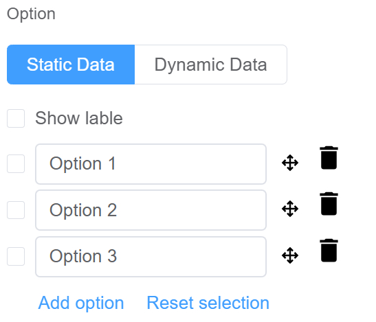
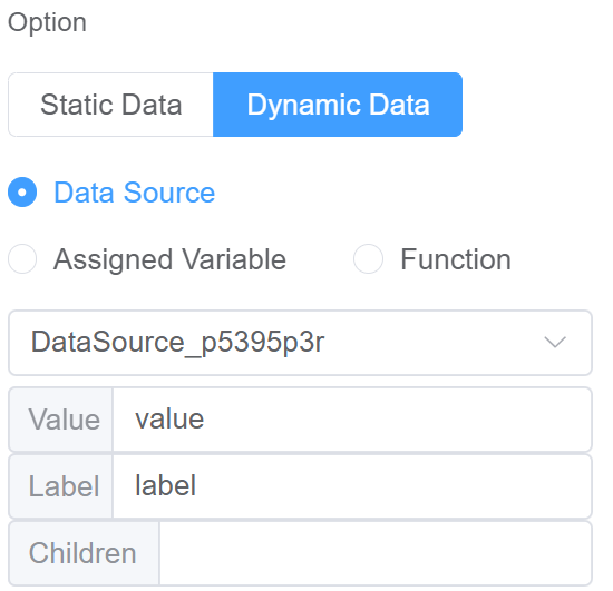
| Option | Choose either Static or Dynamic way of adding data to the options of the Checkbox Static data refers to a fixed set of options that are pre-defined and loaded into the Checkbox at the time of initialization Dynamic data option refers to the ability to automatically populate form/page fields or modify the form's/page behavior based on various sources like databases or APIs. The checkbox updates choices based on user selections. You select from Data source takes information from databases, APIs etc; Assigned Variable refers to the specific value stored or associated with a data element and serve as a way to capture and manage dynamic data within the form/page and Function refers specific block of code that performs a particular task related to manipulating data and influencing the form's behavior. These functions operate on the data obtained from various sources like databases, APIs, user inputs and use them to dynamically modify the form experience. |
  |
| Custom Class | An HTML class attribute which allows further customisation See Form Attribute > Style Sheets |  |
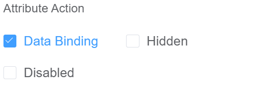
| Attribute Action | Enable Data Binding to connect the data to UI Enable Hidden action to hide the fieldEnable Disabled action to make the field un-suable |
 |
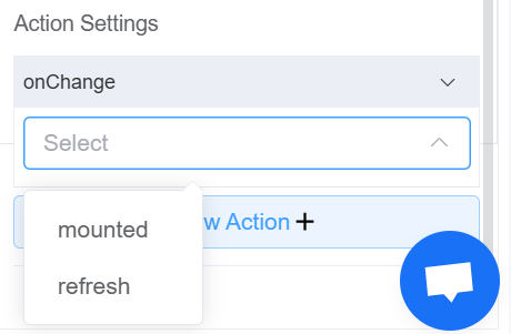
| Action Settings | Click on the drop-down to select the pre-defined methods you wish to apply to your component. In this case, you can choose either mounted or refresh for onChange |
 |
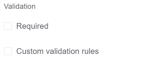
Validation
Form validation is the process of checking the data entered into a form to ensure that it's valid and complete.
This helps to prevent users from submitting forms with invalid data, which can cause problems for the application that's processing the form.
Form validation can be performed using a variety of methods, including:
| Name | Description |
|---|---|
| Required | If enabled, then the field value can't be empty, otherwise an error message is emitted |
| Custom Validation Rules | (rule, value, callback) => { |
| rule: Verification rule, you can view the verification configuration information through this parameter; rule.field can get the field identifier of the current verification. | |
| value: Value of the current field | |
| callback: Callback function (must be called) upon completion of validation; callback('Error message')/ callback(new Error('Error message')). These are two ways to return an error message. |
Info
- The callback() function is also called to verify success in the custom validation method.
First time User?
If you are using the Page Builder components on the ConnexCS platform for the first time, we request you to use our guide on steps to use the Components.