Collapse
Document Metadata
Category: Applications Platform / UI Components — Collapse Component
Audience: Developers, Engineers, UI/UX Designers, Support Team
Difficulty: Beginner to Intermediate
Time Required: Approximately 10–15 minutes
Prerequisites: Access to the ConnexCS Apps Platform IDE (Page Builder), basic knowledge of UI layout and form design
Related Topics: Page Builder / Layout Components, Other UI Components
Description
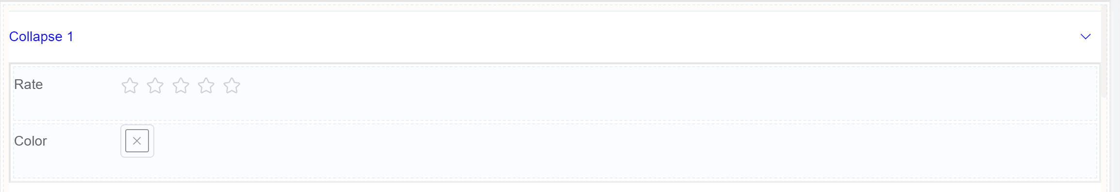
Collapse helps to hide or conceal a section of a form, typically by minimizing or folding it into a smaller, more compact view.
This feature is often used to organize lengthy or complex forms, making them easier to navigate and reducing visual clutter.
Use Case
- Improved form organization
- Reduced visual clutter
- Enhanced user experience
- Conditional visibility
- Registration forms
- Survey forms
- Order forms
- Contact forms
- Customer feedback forms
Interactivity
There are a number of ways to add interactivity to the Collapse component.
Some of the most common methods include:
- Toggle Visibility: Implement the collapse/expand functionality to switch an element's state between being visible and hidden on a user interface.
- Attach JavaScript Event Listeners: Attach event listeners to the toggle button or link using JavaScript. These listeners will detect clicks or other user interactions and trigger the collapse/expand functionality.
- Add a Toggle Button or Link: Create a toggle button or link that will trigger the collapse/expand action. This element can be placed within the header element or alongside the container element.
- Conditional Collapse: Show or hide specific collapse sections based on user input or form data.
- Nested Collapse: Organize complex forms with multiple levels of collapsible sections.
- Enhanced animations and transitions: Improve the visual appeal of the collapse/expand action.
- Accessibility considerations: Optimize the collapse component for users with disabilities.
API
Methods
| Name | Description | Parameters |
|---|---|---|
this.addClassName |
Add style class to a form item | (fields: String|String[], className: String) |
this.removeClassName |
Remove style class from a form item | (fields: String|String[], className: String) |
this.getComponent |
Returns a component whose id has been passed as a parameter | (component_ID: String) : Object |
this.hide |
Hides the field | (fields: String|String[]) |
this.show |
Displays the field | (fields: String|String[]) |
Info
- The show() and hide() methods can also be used to control the visibility of the collapse component in response to user input.
- Fields refers to a component ID or a list of component IDs. You can fetch the ID from the Component Attribute panel in the Page Builder.
- Before using this.show(fields), make sure the component is hidden. This can be done using this.hide(fields) or by enabling the Hidden checkbox in the Component Attribute panel.
Steps to use the methods for the Page Builder components
- Go to Form Attribute Action Panel Setting (Mounted | refresh | click 'Add action').
- Write the method/code as shown in the Example below.
- Click on
Save. - On the main screen click on
Saveagain. - Click on
Previewto see the code in action.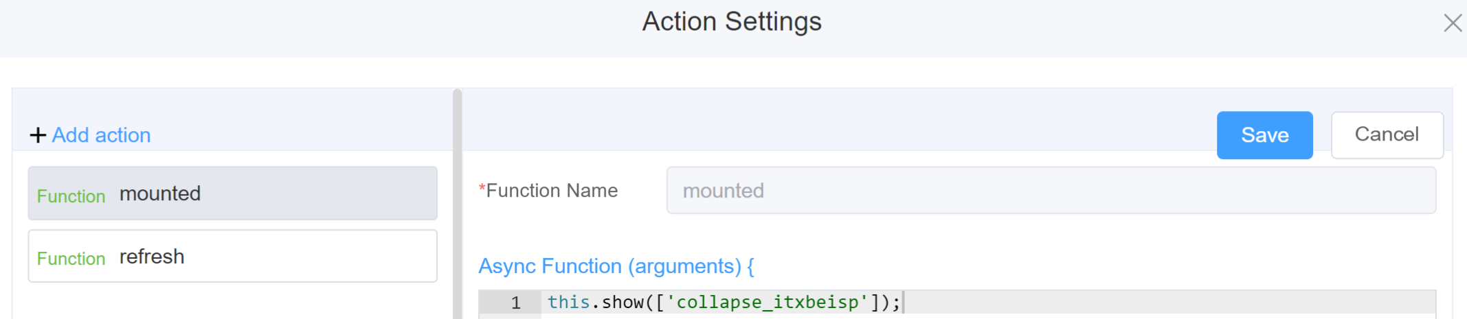
Example
-
this.addClassName(fields, className)- Go to Form Attribute Style Sheets add the class
.abc{ // abc is the class name background-color: red; } - Follow the steps mentioned above, under Steps to use the methods for the Page Builder components
this.addClassName('collapse_itxbeisp', 'abc')
- Go to Form Attribute Style Sheets add the class
-
this.removeClassName(fields, className)1this.removeClassName('collapse_itxbeisp', 'abc') -
this.hide(fields)1 2
var fields= ['collapse_itxbeisp'] this.hide(fields) -
this.show(fields)1 2
var fields= ['collapse_itxbeisp'] this.show(fields) -
this.getComponent('component_ID')1 2
var collapsename = this.getComponent('collapse_itxbeisp');
console.log('getComponent', collapsename);
Config
| Name | Description | Icon |
|---|---|---|
| ID | The collapse component's unique identifier |  |
| Collapse Options | Allows you to add/delete multiple Collapses | 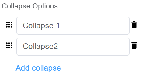 |
| Accordian Mode | Enable this mode if you want to display only one Collapse section at a time (this is helpful when you have to avoid clutter when you have multiple Collapse sections) |  |
| Custom Class | An HTML class attribute which allows further customisation See Form Attribute > Style Sheets |  |
| Attribute Action | Enable Hidden action to hide the field | 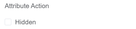 |
First time User?
If you are using the Page Builder components on the ConnexCS platform for the first time, we request you to use our guide on steps to use the Components.