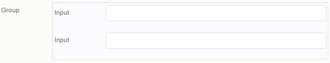
Group
Document Metadata
Category: Applications Platform / UI Components — Group Component
Audience: Developers, Engineers, UI/UX Designers
Difficulty: Intermediate
Time Required: Approximately 10–15 minutes
Prerequisites: Access to ConnexCS Apps Platform IDE (Page Builder), basic understanding of UI layout and form grouping concepts
Related Topics: Layout-related components (Grid, Divider, Card, Collapse) — Grid Component, Divider Component
Next Steps: Add Group container → bundle related elements → configure title/styling/collapsible → test layout and responsiveness
Description
A Group component in form making is a UI element that allows you to logically group related form fields together.
It provides a visual and organizational structure to the form, making it easier for users to understand the relationships between different fields and navigate through the form.
Use Case
-
Organize related form fields
-
Enhance visual hierarchy
-
Improve form navigation
-
Provide contextual feedback
Examples may include:
- Grouping Personal Information
- Organizing Address Details
- Separating Contact Information
- Grouping Conditional Fields
- Encapsulating Optional Fields
- Organizing Payment Information
- Grouping Order Details
- Separating Review and Submit Actions
- Grouping Error Messages
- Organizing Multi-Step Forms
API
Methods
| Name | Description | Parameters |
|---|---|---|
this.addClassName |
Add style class to a form item | (fields: String|String[], className: String) |
this.removeClassName |
Remove style class from a form item | (fields: String|String[], className: String) |
this.getComponent |
Returns a component whose id has been passed as a parameter | (component_ID: String) : Object |
this.getValue |
Get A Value From a component | (fieldName: String) |
this.hide |
Hides the field | (fields: String|String[]) |
this.show |
Displays the field | (fields: String|String[]) |
this.setData |
Set the data in the field. The Value object should be of type { componentId: componentValue } | (Value: Object) |
this.getValues |
Gets the current values of all fields | () : Object |
Info
- The show() and hide() methods can also be used to control the visibility of the group in response to user input.
- Fields refers to a component ID or a list of component IDs. You can fetch the ID from the Component Attribute panel in the Page Builder.
- Before using this.show(fields), make sure the component is hidden. This can be done using this.hide(fields) or by enabling the Hidden checkbox in the Component Attribute panel.
Steps to use the methods for the Page Builder components
- Go to Form Attribute Action Panel Setting (Mounted | refresh | click 'Add action').
- Write the method/code as shown in the Example below.
- Click on
Save. - On the main screen click on
Saveagain. - Click on
Previewto see the code in action.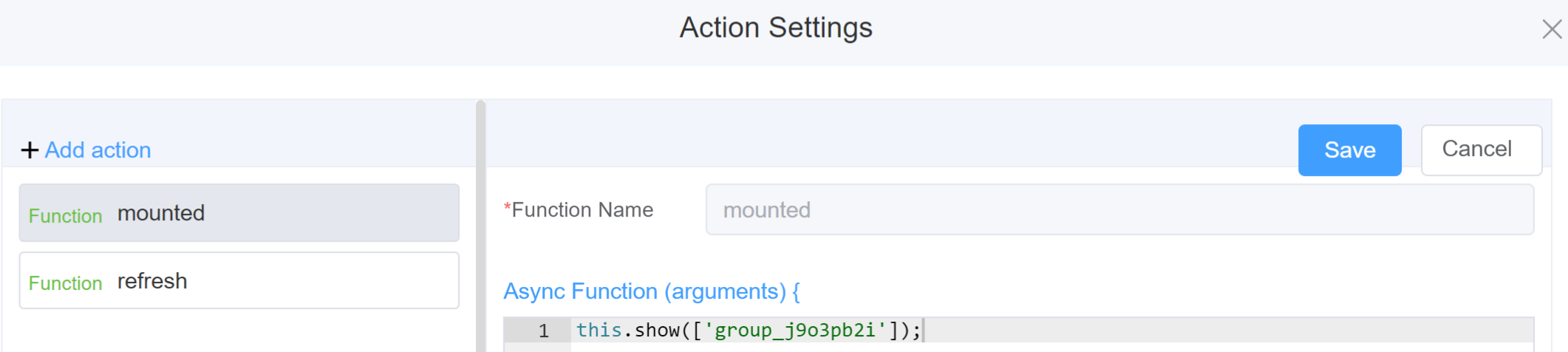
Example
-
this.addClassName(fields, className)- Go to Form Attribute Style Sheets add the class
.abc{ // abc is the class name background-color: red; } - Follow the steps mentioned above, under Steps to use the methods for the Page Builder components
this.addClassName('group_j9o3pb2i', 'abc')
- Go to Form Attribute Style Sheets add the class
-
this.removeClassName(fields, className)1this.removeClassName('group_j9o3pb2i', 'abc') -
this.getValue(fieldName)1 2
var groupname = this.getValue('group_j9o3pb2i'); console.log('getValue', groupname); -
this.hide(fields)1 2
var fields= ['group_j9o3pb2i'] this.hide(fields) -
this.show(fields)1 2
var fields= ['group_j9o3pb2i'] this.show(fields) -
this.getComponent('component_ID')1 2
var groupname = this.getComponent('group_j9o3pb2i'); console.log('getComponent', groupname); -
this.setData(Value)1 2 3 4 5
this.setData({ group : { input: 'hello' } }) -
this.getValues()1 2
var data = this.getValues();
console.log(data);
Info
Use the following syntax to add multiple classes to a component:
1 | |
Config
| Name | Description | Icon |
|---|---|---|
| ID | The group component's unique identifier |  |
| Name | [Optional] The display name of the grid |  |
| Width | [Optional] Width of the field |  |
| Label Width | Width of the label associated with an input field. It determines the horizontal space occupied by the label text |  |
| Label Wrap | If the label is longer than the allowed width the text will continue on another line |  |
| Hide Label | Hides the label on the form |  |
| Text Prompt | A description to aid the user when completing the field |  |
| Custom Class | An HTML class attribute which allows further customisation See Form Attribute > Style Sheets |  |
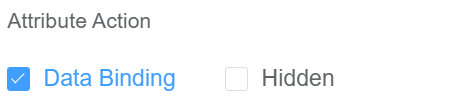
| Attribute Action | Enable Data Binding to connect the data to UI. Enable Hidden action to hide the field. |
 |
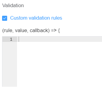
Validation
Form validation is the process of checking the data entered into a form to ensure that it's valid and complete.
This helps to prevent users from submitting forms with invalid data, which can cause problems for the application that's processing the form.
Form validation can be performed using a variety of methods, including:
| Name | Description |
|---|---|
| Custom Validation Rules | (rule, value, callback) => { |
| rule: Verification rule, you can view the verification configuration information through this parameter; rule.field can get the field identifier of the current verification |
First time User?
If you are using the Page Builder components on the ConnexCS platform for the first time, we request you to use our guide on steps to use the Components.