Layout Fields
Layout fields can be used to organize the various elements and enhance the form's overall design.
Collapse
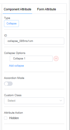
1. Collapse Options: The collapse options let you add and delete the collapse options for your form.
2. Accordion Mode: Accordion mode allows you to show or hide particular content for a collapsible option.
Inline
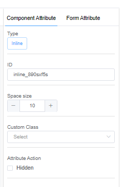
1. Space Size: The space size increases or decreases the space between the added fields.
Alert
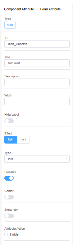
1. Title: The title gives a name to your Alert message.
2. Description: Describe your alert message in the description field.
3. Width: Width lets you decide the dimensions of the alert box.
4. Effect:
- Light: The light effect will display a light background with dark text in the alert box.
- Dark: The dark effect will display a dark background with light text in the alert box.
5. Type:
- Success: A success alert indicates a successful or positive action.
- Warning: A warning alert indicates a dangerous or potentially negative action.
- Info: An info alert is a simple message indicating an event, facts or an instruction.
- Error: An error alert occurs when an unforseen or invalid event takes place.
6. Closable: Closable allows you to close the alert box.
7. Center: Center allows you to position the alert text in the centre of the alert box.
8. Show Icon: Show Icon will display the alert icons corresponding to the type of alert.
Grid
1. Grid Spacing: Grid spacing allows you to add spaces between the added fields.
2. Flex Layout: Flex Layout helps you place your elements horizontally and vertically according to your requirements.
-
Horizontal Arrangement:
-
Start: Fields are placed toward the start line.
-
End: Fields are placed toward the end line.
-
Center: Fields are placed along the center of the line.
-
Space Around: Fields are evenly distributed in the line with equal space around them.
-
Space Between: Fields are evenly distributed in the line; the first item is on the start line, and the last item is on the end line.
-
Vertical Arrangement:
-
Top: Fields are placed at the top of the grid.
-
Middle: Fields are placed at the center of the grid.
-
Bottom: Fields are placed at the bottom of the grid.
Common Attribute of each field inside the Grid
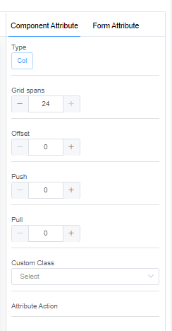
1. Grid Span: Grid span allows you to set the field size inside the grid.
2. Offset: Offset allows you to move all fields in the grid to the right side.
3. Push: Push allows you to move a specific field in the grid to the right side.
4. Pull: Pull allows you to move a specific field in the grid to the left side.
You can add a Graph and a corresponding Data Table which will give the information on raw data.
Table
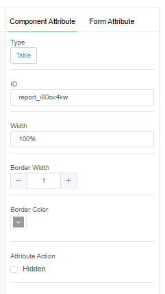
1. Border Width: Border width allows you to set the width of the rows and columns of the table.
2. Border Color: Border color allows you to set the color of the rows and columns of the table.
Common Attribute of each field inside the Table
1. Width: Width allows you to set the width of each cell in the table.
2. Height: Height allows you to set the height of each cell in the table.
Tabs
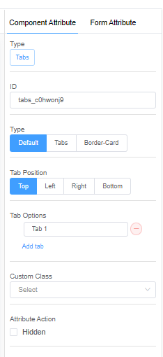
1. Type: Type lets you select the tab style from 3 options: Default, Tabs and Border-cards.
2. Tab Position: Tab Position lets you decide the position of the tabs: Top, Left, Right, and Bottom.
3. Tab Options: Tab Options let you increase and decrease the number of tabs.