Time
Document Metadata
Category: Applications & Components
Audience: Administrators, Engineers, App Developers
Difficulty: Beginner to Intermediate
Time Required: Approximately 15–30 minutes
Prerequisites: Active ConnexCS account, access to the Applications module, basic understanding of UI component configuration and time-input controls
Related Topics: Input Component, Number Component, Date Component, Sub-Form Components
Next Steps: Build a UI or form that uses the Time component to capture time values (e.g., scheduling or timestamp inputs); test with different time formats, default values, and validate user input correctness
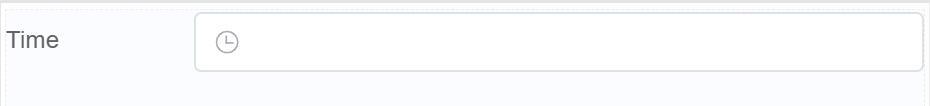
Description
Time element allows you to input the time in HH: mm :ss format.
Use Case
- Ideal for capturing specific times like appointment slots or deadlines.
- Event registration
- Delivery or service scheduling
- Time zone information
- Recurring events or reminders
Interactivity
- Interactive calendars
- Live preview timelines
- Countdown timers
- Shared calendars and booking
- Personal schedule integration
- User-defined time slots
- Time-sensitive rewards or discounts
API
Events
| Name | Description |
|---|---|
onChange (element) |
The onChange event occurs when the value of a field is changed |
onFocus (element) |
The onfocus event occurs when a field gets focus |
onBlur (element) |
The onblur event occurs when a field loses focus |
Methods
| Name | Description | Parameters |
|---|---|---|
this.addClassName |
Add style class to a form item | (fields: String|String[], className: String) |
this.removeClassName |
Remove style class from a form item | (fields: String|String[], className: String) |
this.hide |
Hides the field | (fields: String|String[]) |
this.show |
Displays the field | (fields: String|String[]) |
this.disable |
Disable time field from user interaction | (fields: String|String[]) |
this.enable |
Enable time field from user interaction | (fields: String|String[]) |
this.getValue |
Get A Value From a component | (fieldName: String) |
this.getValues |
Gets the current values of all fields | () : Object |
this.getComponent |
Returns a component whose id has been passed as a parameter | (component_ID: String) : Object |
this.setData |
Set the data in the field. The Value object should be of type { componentId: componentValue } | (Value: Object) |
Info
- The show() and hide() methods can also be used to control the visibility of the time component in response to user input.
- Fields refers to a component ID or a list of component IDs. You can fetch the ID from the Component Attribute panel in the Page Builder.
- Before using this.show(fields), make sure the component is hidden. This can be done using this.hide(fields) or by enabling the Hidden checkbox in the Component Attribute panel.
- Before using this.enable(fields), make sure the component is disabled. This can be done using this.disable(fields) or by enabling the Disabled checkbox in the Component Attribute panel.
Steps to use the methods for the Page Builder components
- Go to Form Attribute Action Panel Setting (Mounted | refresh | click 'Add action').
- Write the method/code as shown in the Example below.
- Click on
Save. - On the main screen click on
Saveagain. - Click on
Previewto see the code in action.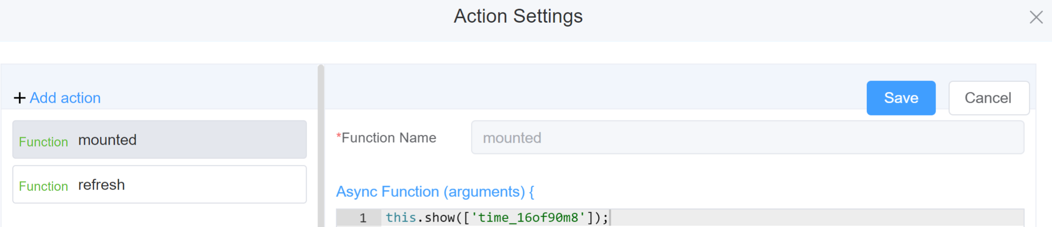
Example
-
this.addClassName(fields, className)- Go to Form Attribute Style Sheets add the class
.abc{ // abc is the class name background-color: red; } - Follow the steps mentioned above, under Steps to use the methods for the Page Builder components
this.addClassName('time_16of90m8', 'abc')
- Go to Form Attribute Style Sheets add the class
-
this.removeClassName(fields, className)1this.removeClassName('time_16of90m8', 'abc') -
this.hide(fields)1 2
var fields= ['time_16of90m8'] this.hide(fields) -
this.show(fields)1 2
var fields= ['time_16of90m8'] this.show(fields) -
this.disable(['fields'])1this.disable(['time_16of90m8']) -
this.enable(['fields'])1this.enable(['time_16of90m8']) -
this.getValue('fieldName')1 2
var timename = this.getValue('time_16of90m8'); console.log('getValue', timename); this.getValues()1 2
var data = this.getValues(); console.log(data);this.getComponent('component_ID')1 2
var timename = this.getComponent('time_16of90m8'); console.log('getComponent', timename);this.setData(Value)1 2 3 4
this.setData(
 {
 "time_16of90m8": "10",}
);
Config
| Name | Description | Icon |
|---|---|---|
| ID | The time component's unique identifier |  |
| Name | [Optional] The display name of the time field |  |
| Width | [Optional] Width of the field |  |
| Label Width | Width of the label associated with an input field. It determines the horizontal space occupied by the label text |  |
| Label Wrap | If the label is longer than the allowed width the text will continue on another line |  |
| Hide Label | Hides the label on the form |  |
| Text Prompt | A description to aid the user when completing the field |  |
| Range Time | Accept user input for a range of times, rather than a single point in time |  |
| Placeholder | The short hint is displayed in the input field before the user enters a value | 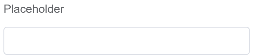 |
| Format | Define the time format HH: mm :ss | 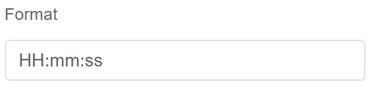 |
| Default Value | The default value which is filled in the field before the user changes it | 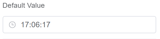 |
| Custom Class | An HTML class attribute which allows further customisation See Form Attribute > Style Sheets |  |
| Max Length | Limit the amount of characters the field supports | 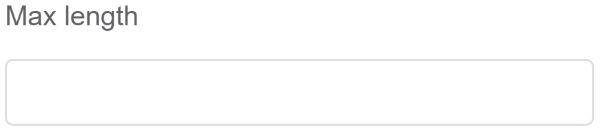 |
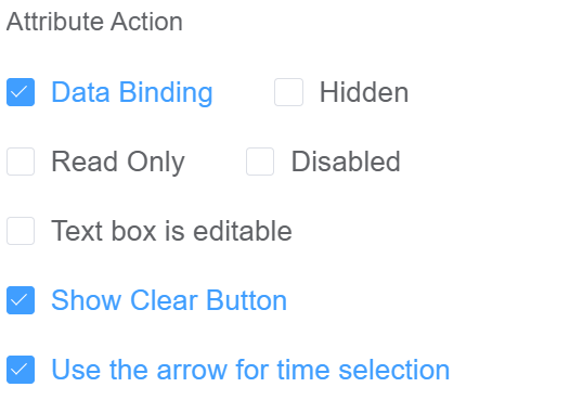
| Attribute Action | Enable Data Binding to connect the data to UI. Enable Hidden action to hide the field. Enable Read Only to for viewing and not editing the time Enable Disabled action to make the field unusable. Enable Text box is editable to modify the time text box. Enable Show Clear button action to make the clear button visible. |
 |
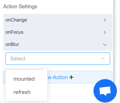
| Action Settings | Click on the drop-down to select the pre-defined methods you wish to apply to your component. In this case, you can choose either mounted or refresh for onChange, onFocus, or onBlur |
 |
Validation
Form validation is the process of checking the data entered into a form to ensure that it's valid and complete.
This helps to prevent users from submitting forms with invalid data, which can cause problems for the application that's processing the form.
Form validation can be performed using a variety of methods, including:
| Name | Description |
|---|---|
| Required | If enabled, then the field value can't be empty, otherwise an error message is emitted |
| Custom Validation Rules | (rule, value, callback) => { |
| rule: Verification rule, you can view the verification configuration information through this parameter; rule.field can get the field identifier of the current verification. | |
| value: Value of the current field | |
| callback: Callback function (must be called) upon completion of validation; callback('Error message')/ callback(new Error('Error message')). These are two ways to return an error message. |

Info
- The callback() function is also called to verify success in the custom validation method.
First time User?
If you are using the Page Builder components on the ConnexCS platform for the first time, we request you to use our guide on steps to use the Components.