Grid
Document Metadata
Category: Applications Platform / UI Components — Grid Component
Audience: Developers, Engineers, UI Designers, Data & Form Builders
Difficulty: Intermediate
Time Required: Approximately 15–25 minutes
Prerequisites: Access to the ConnexCS Apps IDE → Page Builder, familiarity with form & UI design, basic understanding of tabular data and form-based layouts
Related Topics: Page Builder – Layout & Component Usage
Next Steps: Add Grid for layout → configure rows/columns with components → use API for dynamic control → test responsiveness
Description
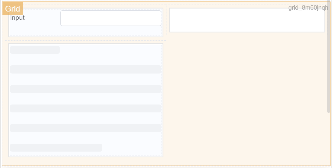
A Grid component in a form is a UI element that allows you to display and organize data in a tabular format within a form.
It typically consists of a set of rows and columns, each containing a specific data element or input field.
Grid components are commonly used to present structured data in a clear and organized manner, making it easier for users to understand and interact with the form.
Use Case
- Data Organization
- Visual Representation
- User Input Management
- Responsive Layout
Examples may include:
- Data Validation
- Product Order Forms
- Employee Management Forms
- Inventory Management Forms
- Data Collection Forms
API
Methods
| Name | Description | Parameters |
|---|---|---|
this.addClassName |
Add style class to a form item | (fields: String|String[], className: String) |
this.removeClassName |
Remove style class from a form item | (fields: String|String[], className: String) |
this.getComponent |
Returns a component whose id has been passed as a parameter | (component_ID: String) : Object) |
this.hide |
Hides the field | (fields: String|String[]) |
this.show |
Displays the field | (fields: String|String[]) |
this.getValues |
Gets the current values of all fields | () : Object |
Info
- The show() and hide() methods can also be used to control the visibility of the grid in response to user input.
- Fields refers to a component ID or a list of component IDs. You can fetch the ID from the Component Attribute panel in the Page Builder.
- Before using this.show(fields), make sure the component is hidden. This can be done using this.hide(fields) or by enabling the Hidden checkbox in the Component Attribute panel.
Steps to use the methods for the Page Builder components
- Go to Form Attribute Action Panel Setting (Mounted | refresh | click 'Add action').
- Write the method/code as shown in the Example below.
- Click on
Save. - On the main screen click on
Saveagain. - Click on
Previewto see the code in action.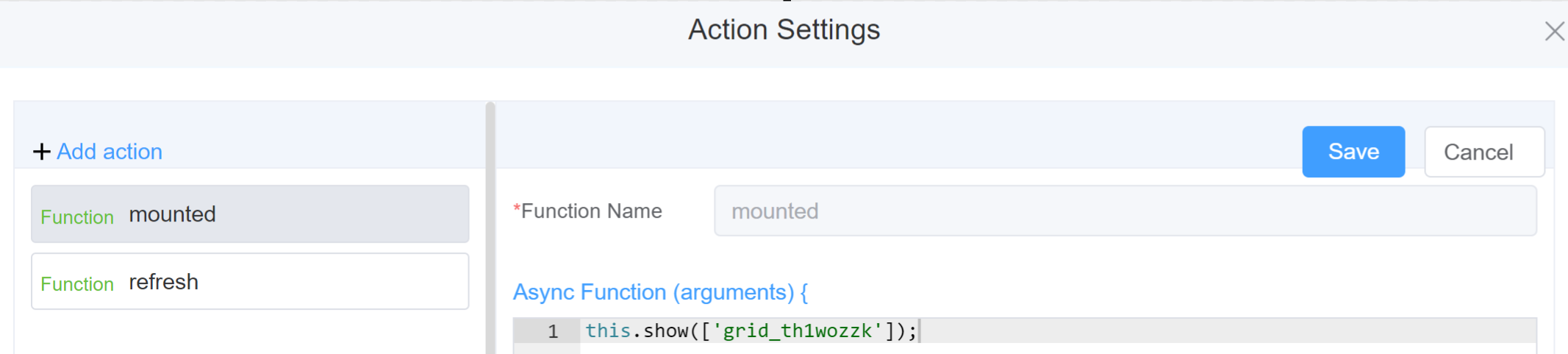
Example
-
this.addClassName(fields, className)- Go to Form Attribute Style Sheets add the class
.abc{ // abc is the class name background-color: red; } - Follow the steps mentioned above, under Steps to use the methods for the Page Builder components
this.addClassName('grid_th1wozzk', 'abc')
- Go to Form Attribute Style Sheets add the class
-
this.removeClassName(fields, className)1this.removeClassName('grid_th1wozzk', 'abc') -
this.hide(fields)1 2
var fields= ['grid_th1wozzk'] this.hide(fields) -
this.show(fields)1 2
var fields= ['grid_th1wozzk'] this.show(fields) -
this.getComponent('component_ID')1 2
var gridname = this.getComponent('grid_th1wozzk'); console.log('getComponent', gridname); -
this.getValues()1 2
var data = this.getValues();
console.log(data);
Info
Use the following syntax to add multiple classes to a component:
1 | |
Config
| Name | Description | Icon |
|---|---|---|
| ID | The grid component's unique identifier |  |
| Grid Spacing | [Optional] Space between various components inside the grid | 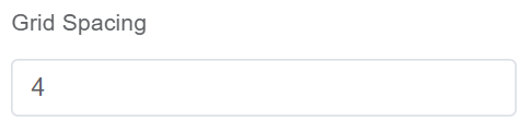 |
| Flex Layout | [Optional] Allows flexibility to arrange the various components inside the grid | 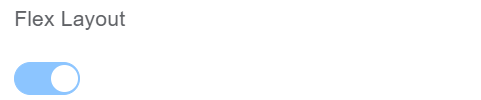 |
| Horizontal Arrangement | Select from various options Start, End, Center, Space Around, Space Between for horizontal arrangement of the components inside the grid | 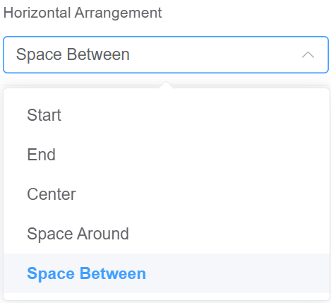 |
| Vertical Arrangement | Select from various options Top, Middle, Bottom for vertical arrangement of the components inside the grid | 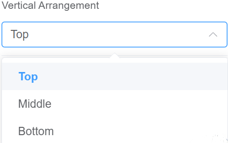 |
| Custom Class | An HTML class attribute which allows further customisation See Form Attribute > Style Sheets |  |
| Attribute Action | Enable Hidden action to hide the field | 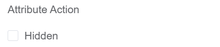 |
First time User?
If you are using the Page Builder components on the ConnexCS platform for the first time, we request you to use our guide on steps to use the Components.