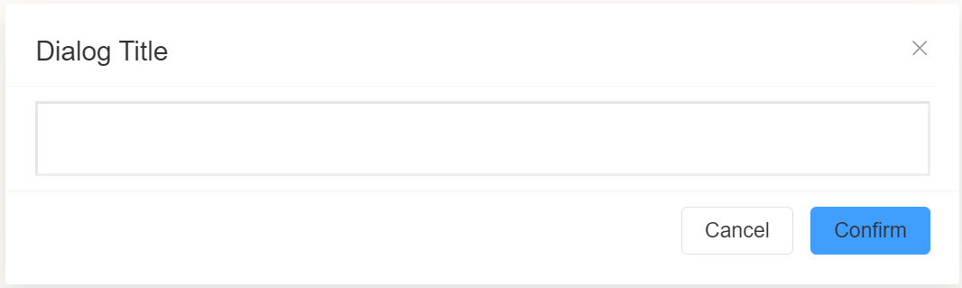
Dialog
Document Metadata
Category: Applications Platform / UI Components — Dialog Component
Audience: Developers, Engineers, UI/UX Designers, Support Team
Difficulty: Intermediate
Time Required: Approximately 15–25 minutes
Prerequisites: Access to the ConnexCS Apps Platform IDE (Page Builder), basic understanding of UI flows and user-interaction patterns (forms, modals)
Related Topics: Page Builder / UI Components Overview
Next Steps: Add Dialog → configure attributes/content → wire triggers → test behavior and accessibility
Description
A Dialog component in a page builder is a specialized element that allows you to create modal windows or pop-up forms within a larger form.
It typically provides a self-contained interface for collecting additional information or displaying contextual details without disrupting the main form flow.
Use Case
- Alerts: Quickly show simple alerts for messages, errors, warnings, etc.
- Confirmations:Get user confirmation before key actions like form submission.
- Additional Inputs: Prompt for additional details in a popup without cluttering the form.
- Contextual Help:Provide helpful information for a section in a popup overlay.
- Multi-Step Workflows:Break long forms into shorter modal workflows.
- Wizards:Guide users through a complex process step-by-step in modal wizard.
- Edit in Place: Allow quick inline editing of content in a modal without changing views.
- Terms & Conditions: Display legal agreements in a popup for users to review and accept.
- Surveys: Present follow-up surveys or questionnaires in a dialog overlay.
- Media Previews: Enlarge images and videos for closer inspection in a modal.
- Notifications: Communicate messages non-intrusively using popup notifications.
Interactivity
-
Responsive Inputs: Utilize input fields that respond to user actions, such as providing real-time validation or updating related form fields based on input changes.
-
Dynamic Content: Incorporate dynamic content that changes based on user input or dialog interactions. This could involve updating text, images, or other elements within the dialog.
-
Conditional Actions: Implement conditional actions that trigger based on specific user inputs or dialog events. For instance, enable or disable certain buttons or sections of the dialog based on user choices.
-
Progressive Disclosure: Employ progressive disclosure techniques to gradually reveal more information or options as the user interacts with the dialog. This helps to avoid overwhelming the user with too much information at once.
-
Error Handling: Implement proper error handling to gracefully inform the user of any errors or invalid inputs within the dialog. This could involve displaying error messages, highlighting invalid fields, or providing corrective suggestions.
-
User Feedback: Provide visual or auditory feedback to user actions within the dialog. This could include animations, transitions, or sound effects to enhance the interactive experience.
-
Accessibility: Ensure that the interactive elements within the dialog are accessible to users with disabilities. This may involve providing keyboard navigation, screen reader compatibility, and alternative input methods.
-
Cross-Platform Compatibility: Consider the compatibility of the interactive elements across different browsers and devices. Ensure that the dialog component functions consistently and responsively across various platforms.
API
Events
| Name | Description |
|---|---|
onCancel |
This event is fired when the user clicks the cancel button on a dialog. This event can be used to perform any necessary cleanup or to prevent any unwanted actions from occurring. |
onConfirm |
This event is fired when the user clicks the confirm button on a dialog. This event can be used to perform any desired actions, such as submitting a form, deleting a file, or making a change to the system |
Methods
| Name | Description | Parameters |
|---|---|---|
this.getComponent |
Returns a component whose id has been passed as a parameter | (component_ID: String) : Object |
this.getValue |
Get A Value From a component | (fieldName: String) |
myDialog.open() |
Opens the dialog box on the page | |
this.getValues |
Gets the current values of all fields | () : Object |
myDialog.close() |
Closes the dialog box on the page | |
this.$('dailogID.othercomponentID').disable() |
Disable dialog from user interaction | (fields: String|String[]) |
this.$('dailogID.othercomponentID').enable() |
Enable dialog from user interaction | (fields: String|String[]) |
Steps to use the methods for the Page Builder components
- Go to Form Attribute Action Panel Setting (Mounted | refresh | click 'Add action').
- Write the method/code as shown in the Example below.
- Click on
Save. - On the main screen click on
Saveagain. - Click on
Previewto see the code in action.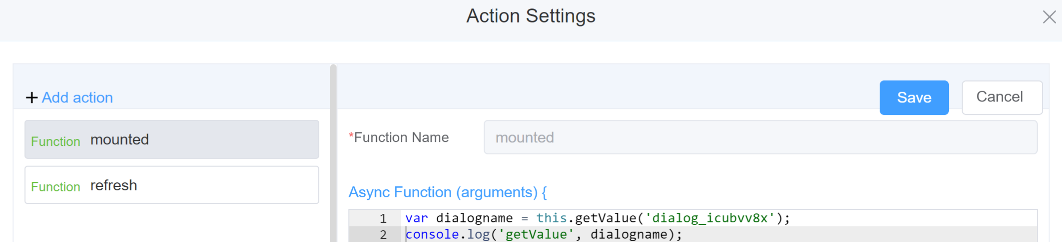
Example
-
this.getComponent('component_ID')1 2
var dialogname = this.getComponent('dialog_icubvv8x'); console.log('getComponent', dialogname); -
this.getValue('fieldName')1 2
var dialogname = this.getValue('dialog_icubvv8x'); console.log('getValue', dialogname); -
myDialog.open()1 2
var myDialog = this.getComponent('dialog_icubvv8x') myDialog.open() -
this.getValues()```js linenums="1" var data = this.getValues(); console.log(data); -
myDialog.close()1 2
var myDialog = this.getComponent('dialog_icubvv8x')
myDialog.close()
Config
| Name | Description | Icon |
|---|---|---|
| ID | The dialog component's unique identifier |  |
| Title | [Optional] The display name of the dialog field | 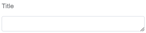 |
| Width | [Optional] Width of the field |  |
| Visible | Enable visible option to display the Dialog and disable to hide the dialog box |  |
| Center | Enable this option to make the components of the Dialog box centrally aligned | 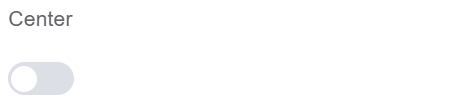 |
| Show Close | Enable this option for displaying the close button (for closing the dialog box) | 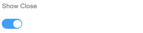 |
| Show Cancel Button | Enable this option for displaying the Cancel button (the button name is editable) | 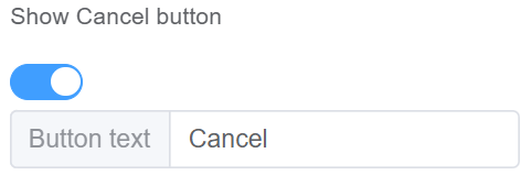 |
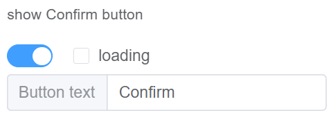
| Show Confirm Button | Enable this option for displaying the confirm button (the button name is editable) Enable Loading option to show the user that the dialog is busy. It prevents the user from interacting with the dialog until the operation is complete |
 |
| Margin Top | It defines the position of the dialog box from the top of the screen | 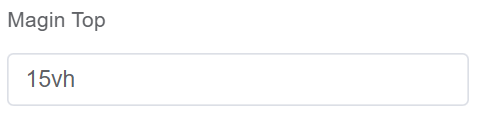 |
| Custom Class | An HTML class attribute which allows further customisation See Form Attribute > Style Sheets |  |
| Attribute Action | Enable Data Binding to connect the data to UI | 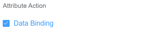 |
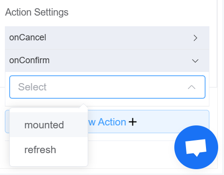
| Action Settings | Click on the drop-down to select the pre-defined methods you wish to apply to your component. In this case, you can choose either mounted or refresh for onCancel or onConfirm |
 |
First time User?
If you are using the Page Builder components on the ConnexCS platform for the first time, we request you to use our guide on steps to use the Components.