Tree-Select
Document Metadata
Category: Applications & Components
Audience: Administrators, Engineers, App Developers
Difficulty: Beginner to Intermediate
Time Required: Approximately 15–30 minutes
Prerequisites: Active ConnexCS account, access to the Applications module, basic understanding of UI component configuration and hierarchical / tree-structured selection controls (nested dropdowns or tree-select inputs)
Related Topics: Select Component, Transfer Component, Grid / Table Component, Sub-Form Components
Next Steps: Build a UI or form using the Tree-Select component — e.g., for choosing from nested categories, sub-items, or hierarchical data; test selection behavior (single/multiple), default values, and data binding for hierarchical structures
Description
Tree-select refers to a special type of dropdown menu element used in forms, presenting information in a hierarchical, tree-like structure.
Unlike a standard dropdown menu with a flat list of options, a tree-select organizes options into parent-child relationships, letting users navigate through nested categories to find the specific choice they need.

Use Case
- Nesting levels
- Multiple selection
- Improved organization
- Visual clarity
- User-friendly navigation
- Enhanced accessibility
- Project breakdown structure
- Issue categorization
- Resource allocation
- Data Aggregation and Filtering
Interactivity
- Integrate a search bar within the tree-select. As users type, highlight matching options across all levels, dynamically filtering the displayed nodes.
- Contextual suggestions
- Show previews of selected options or additional information when hovering over nodes.
- Based on the chosen branch or category in the tree, show or hide additional fields in the form.
- Perform calculations based on user selections within the tree-select.
- Enable multiple users to collaboratively choose options in the tree-select and leave annotations or comments on specific nodes.
API
Events
| Name | Description |
|---|---|
onChange (element) |
The onChange event occurs when the value of an field is changed |
onFocus (element) |
The onfocus event occurs when an field gets focus |
onBlur (element) |
The onblur event occurs when an field loses focus |
Methods
| Name | Description | Parameters |
|---|---|---|
this.addClassName |
Add style class to a form item | (fields: String|String[], className: String) |
this.hide |
Hides the field | (fields: String|String[]) |
this.show |
Displays the field | (fields: String|String[]) |
this.disable |
Disable tree-select field from user interaction | (fields: String|String[]) |
this.enable |
Enable tree-select field from user interaction | (fields: String|String[]) |
this.setData |
Set the data in the field. The Value object should be of type { componentId: componentValue } | (Value: Object) |
this.getValue |
Get A Value From a component | (fieldName: String) |
this.getValues |
Gets the current values of all fields | () : Object |
this.removeClassName |
Remove style class from a form item | (fields: String|String[], className: String) |
this.getComponent |
Returns a component whose id has been passed as a parameter | (component_ID: String) : Object |
this.hide |
Hides the field | (fields: String|String[]) |
this.refreshFieldDataSource |
Refresh the datasource data bound to the whole page |
Info
- The show() and hide() methods can also be used to control the visibility of the tree-select component in response to user input.
- Fields refers to a component ID or a list of component IDs. You can fetch the ID from the Component Attribute panel in the Page Builder.
- Before using this.show(fields), make sure the component is hidden. This can be done using this.hide(fields) or by enabling the Hidden checkbox in the Component Attribute panel.
- Before using this.enable(fields), make sure the component is disabled. This can be done using this.disable(fields) or by enabling the Disabled checkbox in the Component Attribute panel.
Steps to use the methods for the Page Builder components
- Go to Form Attribute Action Panel Setting (Mounted | refresh | click 'Add action').
- Write the method/code as shown in the Example below.
- Click on
Save. - On the main screen click on
Saveagain. - Click on
Previewto see the code in action.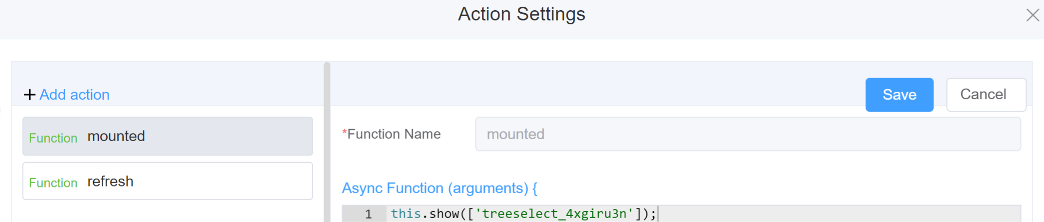
Example
-
this.addClassName(fields, className)- Go to Form Attribute Style Sheets add the class
.abc{ // abc is the class name background-color: red; } - Follow the steps mentioned above, under Steps to use the methods for the Page Builder components
this.addClassName('treeselect_4xgiru3n', 'abc')
- Go to Form Attribute Style Sheets add the class
-
this.hide(fields)1 2
var fields= ['treeselect_4xgiru3n'] this.hide(fields) -
this.show(fields)1 2
var fields= ['treeselect_4xgiru3n'] this.show(fields) -
this.disable(['fields'])1this.disable(['treeselect_4xgiru3n']) -
this.enable(['fields'])1this.enable(['treeselect_4xgiru3n']) -
this.setData(Value)1 2
this.setData( {"treeselect_4xgiru3n": "Option 2",}) -
this.getValue('fieldName')1 2
var fields = this.getValue('treeselect_4xgiru3n'); console.log('getValue', fields); -
this.getValues()1 2
var data = this.getValues(); console.log(data); -
this.removeClassName(fields, className)1this.removeClassName('treeselect_4xgiru3n', 'abc') -
this.getComponent('component_ID')1 2
var fields = this.getComponent('treeselect_4xgiru3n'); console.log('getComponent', fields); -
this.refreshFieldDataSourcemake the function or data as dynamic
Config
| Name | Description | Icon |
|---|---|---|
| ID | The tree-select component's unique identifier |  |
| Name | [Optional] The display name of the Tree-select field |  |
| Width | [Optional] Width of the field |  |
| Label Width | Width of the label associated with an input field. It determines the horizontal space occupied by the label text |  |
| Label Wrap | If the label is longer than the allowed width the text will continue on another line |  |
| Hide Label | Hides the label on the form |  |
| Placeholder | The short hint is displayed in the input field before the user enters a value | 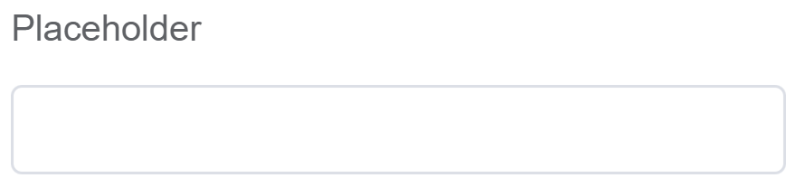 |
| Text Prompt | A description to aid the user when completing the field |  |
| Multiple | Allows users to choose multiple options from different branches or levels within the tree-select structure |  |
| Searchable | Allows users to search the from the options |  |
| Optional any Node | users can choose any node from any level within the tree, including child nodes |  |
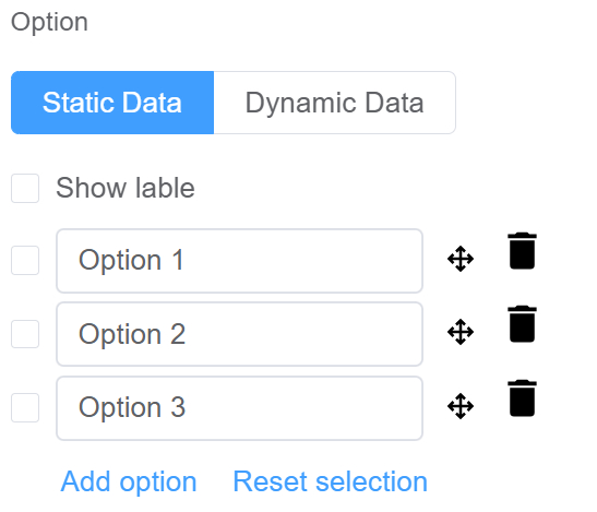
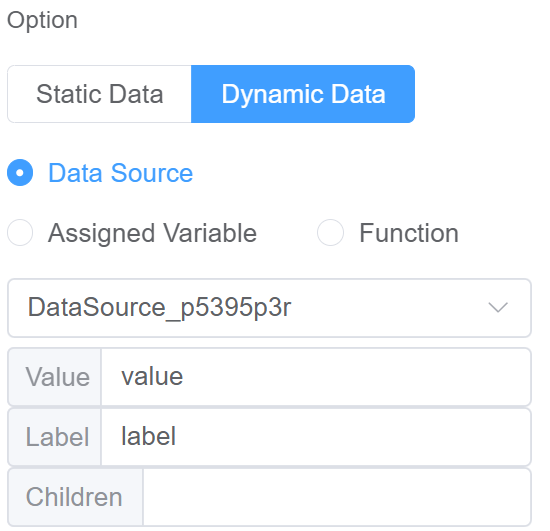
| Option | Choose either Static or Dynamic way of adding data to the options of the Tree Select Static data refers to a fixed set of options that are pre-defined and loaded into the Tree Select at the time of initialization Dynamic data are options fetched as needed from sources like databases or APIs. The Tree Select updates choices based on user selections. You select from Data source which refers to the origin of the data; Function which refers to the code that manipulates the data, and Assigned Value which refers to the specific value stored or associated with a data element |
  |
| Default Value | The default value which is filled in the field before the user changes it | 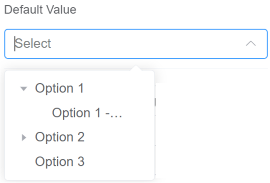 |
| Custom Class | An HTML class attribute which allows further customisation See Form Attribute > Style Sheets |  |
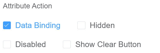
| Attribute Action | Enable Data Binding to connect the data to UI. Enable Hidden action to hide the field. Enable Disabled action to make the field unusable. Enable Show Clear button action to make the clear button visible. |
 |
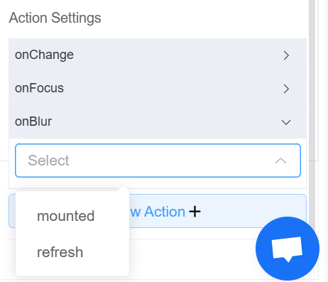
| Action Settings | Click on the drop-down to select the pre-defined methods you wish to apply to your component. In this case, you can choose either mounted or refresh for onChange, onFocus, or onBlur |
 |
First time User?
If you are using the Page Builder components on the ConnexCS platform for the first time, we request you to use our guide on steps to use the Components.