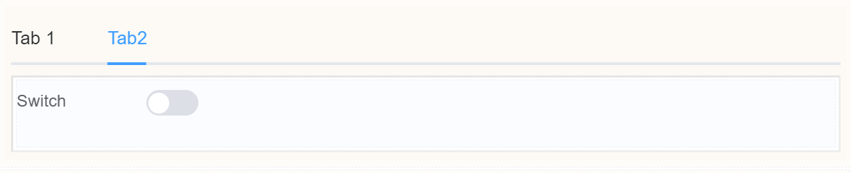
Tabs
Document Metadata
Category: Applications & Components
Audience: Administrators, Engineers, App Developers
Difficulty: Beginner to Intermediate
Time Required: Approximately 15–30 minutes
Prerequisites: Active ConnexCS account, access to the Applications module, basic understanding of UI component configuration and layout/navigation components (tabbed interfaces)
Related Topics: Page Layout Component, Table Component, Input Component, Select Component
Next Steps: Design a UI screen using the Tabs component to organize multiple sections or views; embed other components (forms, tables, charts) into separate tabs; test tab switching behavior and data persistence between tabs
Description
The Tabs component acts as a conductor, orchestrating information flow and streamlining user interaction.
It's like having multiple forms within a single interface, allowing you to organize complex tasks and data into logical, bite-sized chunks.
Tabs visually categorize different sections of a form, preventing users from being overwhelmed by a large, monolithic data entry interface.
Each tab acts as a dedicated space for specific information, guiding users through the form step-by-step and preventing them from getting lost in a maze of fields.
Use Case
- Enhanced User Experience
- Data Management and Efficiency
- Organize similar sections under one tab
Interactivity
- Show or hide specific tabs based on user choices in other sections of the form. For example, displaying advanced options only after basic information is filled out.
- Progressive disclosure
- Contextual relevance
- Drag-and-drop reordering
- Trigger actions like calculations, validations, or data submission upon clicking on specific tabs
- Tab highlighting based on data
- Tab-specific validation rules
- Dynamic content within tabs
API
Events
| Name | Description |
|---|---|
onChange (element) |
The onChange event occurs when the value of a field is changed |
onFocus (element) |
The onfocus event occurs when a field gets focus |
onBlur (element) |
The onblur event occurs when a field loses focus |
Methods
| Name | Description | Parameters |
|---|---|---|
this.addClassName |
Add style class to a form item | (fields: String|String[], className: String) |
this.removeClassName |
Remove style class from a form item | (fields: String|String[], className: String) |
this.getComponent |
Returns a component whose id has been passed as a parameter | (component_ID: String) : Object |
this.hide |
Hides the field | (fields: String|String[]) |
this.show |
Displays the field | (fields: String|String[] |
this.getValues |
Gets the current values of all fields | () : Object |
this.disable |
Disable time field from user interaction | (fields: String|String[]) |
Info
- The show() and hide() methods can also be used to control the visibility of tabs in response to user input.
- Fields refers to a component ID or a list of component IDs. You can fetch the ID from the Component Attribute panel in the Page Builder.
- Before using this.show(fields), make sure the component is hidden. This can be done using this.hide(fields) or by enabling the Hidden checkbox in the Component Attribute panel.
Steps to use the methods for the Page Builder components
- Go to Form Attribute Action Panel Setting (Mounted | refresh | click 'Add action').
- Write the method/code as shown in the Example below.
- Click on
Save. - On the main screen click on
Saveagain. - Click on
Previewto see the code in action.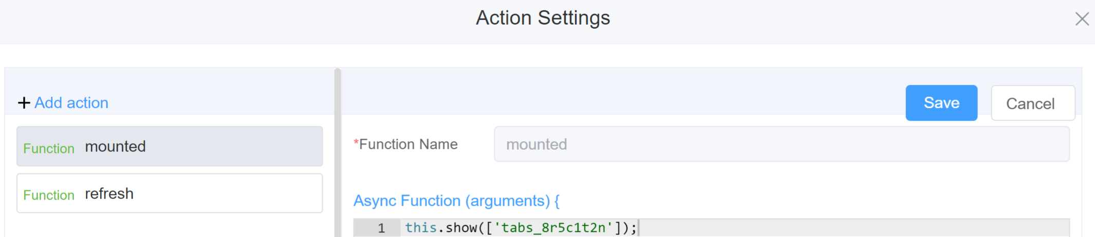
Example
-
this.addClassName(fields, className)- Go to Form Attribute Style Sheets add the class
.abc{ // abc is the class name background-color: red; } - Follow the steps mentioned above, under Steps to use the methods for the Page Builder components
this.addClassName('tabs_8r5c1t2n', 'abc')
- Go to Form Attribute Style Sheets add the class
-
this.removeClassName(fields, className)1this.removeClassName('tabs_8r5c1t2n, 'abc') -
this.hide(fields)1 2
var fields= ['tabs_8r5c1t2n'] this.hide(fields) -
this.show(fields)1 2
var fields= ['tabs_8r5c1t2n'] this.show(fields) -
this.disable(['fields'])1this.disable(['tabs_8r5c1t2n']) -
this.enable(['fields'])1this.enable(['tabs_8r5c1t2n']) -
this.getValues()1 2
var data = this.getValues(); console.log(data); -
this.getComponent('component_ID')1 2
var tabsname = this.getComponent('tabs_8r5c1t2n');
console.log('getComponent', tabsname);
Config
| Name | Description | Icon |
|---|---|---|
| ID | The tab component's unique identifier |  |
| Type | Choose the arrangement of tabs from Default, Tabs or Border-Card | 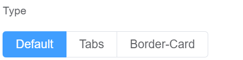 |
| Tab Position | Choose the tabs from Top, Left or Right or Bottom | 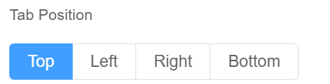 |
| Tab Options | Choose the number of tabs you wish to have in the form | 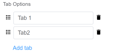 |
| Custom Class | An HTML class attribute which allows further customisation See Form Attribute > Style Sheets |  |
| Attribute Action | Enable Hidden action to hide the field | 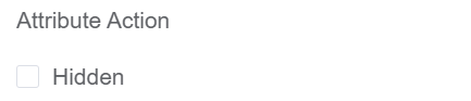 |
First time User?
If you are using the Page Builder components on the ConnexCS platform for the first time, we request you to use our guide on steps to use the Components.