Advance Field
You can further enhance your form with Advance Fields
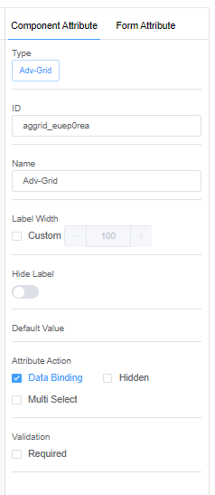
You can organise your data using Advanced Grid fields and DataTables.
You can create data with effective visual effects by using options like Graphs and Dialog.
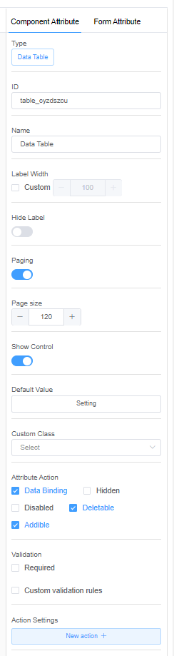
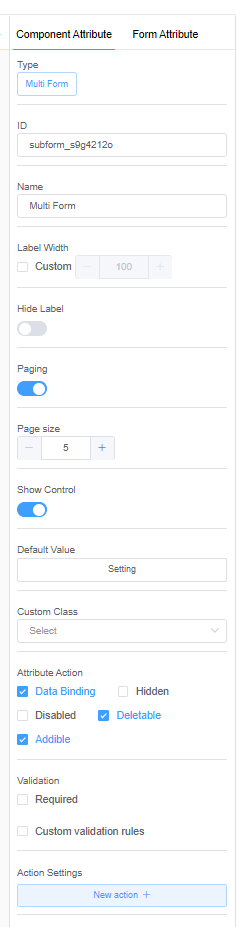
Data Table, Advanced Grid and Multi-Form
-
Paging: DataTables can split the rows in tables into individual pages, which is an efficient method of showing several records in a small space.
The minimum value of a page is 5.
-
Page Size: Page size defines the number of rows to display on a single page when using paging.
-
Show Control: The show control either lets you hide or display the serial number column.
-
Default Value: A default value is a value that's automatically assigned to the column when you create a DataRow.
-
Attribute Action:
-
Deletable: Deletable option will remove the selected row from the DataTable entirely.
-
Addible: Addible option will add a row to the DataTable.
-
Action Settings:
| Event Name | Description |
|---|---|
| onChange | This option allows users to define custom functionality that should occur whenever a change to the selection within a Datatable occurs. For example, when the selected user changes, you can update the selected user's phone number or email. |
| onRowAdd | Triggers when a new row adds to the Datatable. You can call a function to perform any operation. |
| onRowRemove | Triggers when a new row adds to the Datatable. You can call a function to perform any operation after the row gets deleted. |
| onPageChange | Triggers each time you navigate to a new page from the pagination control. |
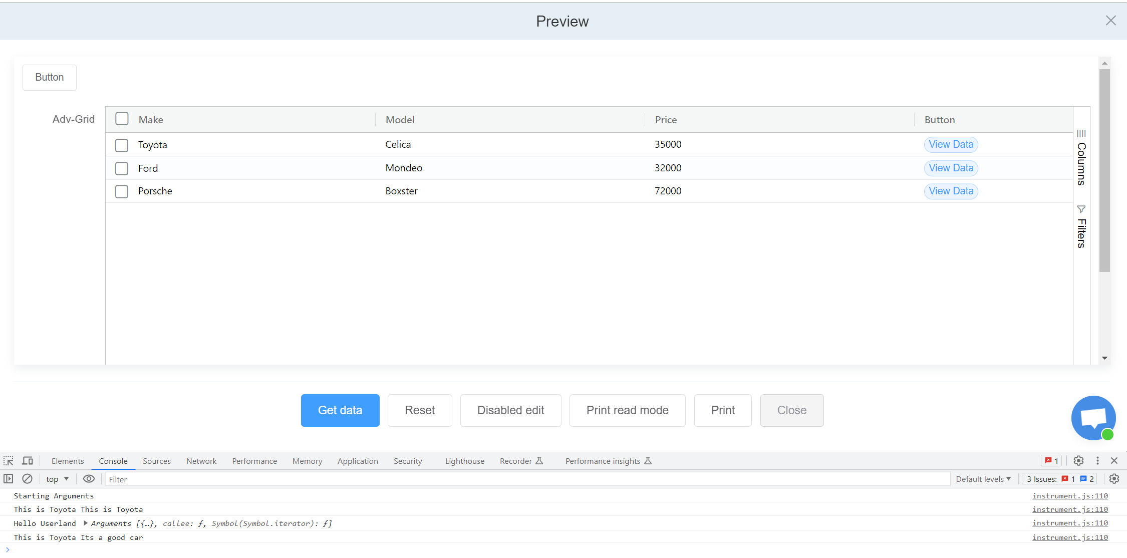
Example of creating an Advanced Grid (Cars Information)
- Drag and Drop a Button from the Basic Field.
- Drag and Drop the Advanced Grid from the Advance Field.
- Drag and Drop 3 Input fields from the Basic Field to the Advanced Gird field.
- Rename the Input fields as Make, Model, and Price.
- Drag and Drop a Button from the Basic Field to the Advanced Gird field and rename the button to View Data.
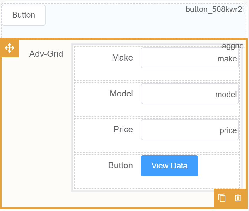
- Now we will add some actions when we click the button.
- The first thing is that the data should load when we click the
Previewbutton. - Click on Form Attribute > Action Panel > Setting > Function refresh. Then add the code.
1 2 3 4 5 6 7 | |
viewButton. For this function, when we click the it will show you some details in the Console Log.
1 2 3 4 5 6 7 8 9 10 | |
- Click on the Preview button to view the output.
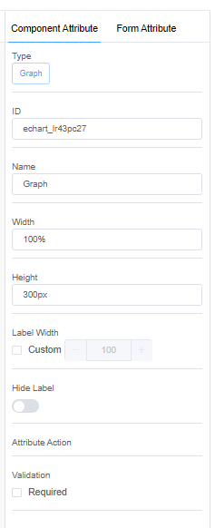
Graph
-
Width: Width allows you to decide the horizontal width of the graph.
-
Height: Width allows you to decide the vertical height of the graph.
-
Label Width: Label width helps you change the dimensions of the Name of the graph.
Click here for API documentation for Graphs actions with examples for more examples on graphs.
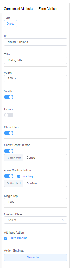
Dialog
-
Width: Width allows you to set the dimension of the Dialog box.
-
Visible: The visible option decides whether to display or hide the Dialog box.
-
Show Close: Whether to show a close button for closing the dialog box.
-
Show Cancel button: Whether to show a cancel button on the dialog box.
-
Button Text: Button text lets you rename the cancel button.
-
Show Confirm button: Whether to show a confirm button on the dialog box.
-
Button Text: Button text lets you rename the confirm button.
-
Loading: Check the loading option to show animation while loading data before the customer clicks on the confirm button.
-
Center: Center option lets you place the confirm and cancel buttons in the center of the dialog box.
-
Margin Top: Margin Top lets you decide the position of the dialog box from the top of the form.
-
Action Settings:
| Event Name | Description |
|---|---|
| onConfirm | You can write custom code for what will happen when the customer clicks the onConfirm button. |
| onCancel | You can write a custom code for what will happen when the customer clicks the onCancel button. |
The dialog can be manipulated by calling the method of the component instance:
- show dialog: this.getComponent('dialog field identifier').open()
- close dialog: this.getComponent('dialog field identifier').close()
- validate data in dialog: this.getComponent('dialog field identifier').validate()
- dialog fields show hidden: this.getComponent('dialog field identifier').hide([name]). this.getComponent('dialog field identifier').display(['name'])
Click here for the API documentation on Dialog for more methods and examples on dialog.