IDE
Document Metadata
Category: Developer & Application Platform / IDE (Integrated Development Environment)
Audience: Administrators, Engineers, Developers
Difficulty: Intermediate to Advanced
Time Required: Approximately 1–2 hours
Prerequisites: Active ConnexCS account with platform-access; familiarity with application scripting, UI components, database concepts, and workflow logic.
Related Topics: Apps Platform Architecture
Next Steps: Navigate to the IDE module, explore key components (Applications, Page Builder, Script Forge, Query Builder, etc.), start a new Project, define environment variables and data sources, then build and deploy your workflow or application within the ConnexCS ecosystem.
Overview
The ConnexCS IDE is a centralized workspace that enables you to build, customize, and manage applications within the ConnexCS platform.
It provides developers and administrators with all the tools required to create workflows, integrate services, and automate processes—without needing to switch between multiple systems.
The IDE is designed to support both visual configuration and custom scripting, making it flexible for a wide range of use cases.
Key Components
Applications
Manage all applications built within ConnexCS. Click here for more information.
Button Builder
Create and customize UI buttons to trigger defined actions. Click here for more information.
Databases
Define and manage structured data storage for your applications. Click here for more information.
Domain
Configure domain-level settings, including application-level mappings. Click here for more information..
Key Value Store
Store configuration parameters or dynamic values in a key-value format. Click here for more information. for more information. for more information.
Page Builder
Build custom web pages and interfaces with a visual editor. Click here for more information. for more information.
Various drag and drop components of the page builder help you build the UI.
ScriptForge
Write and manage scripts to add advanced logic, automation, and integrations. Click here for more information.
Template
Create reusable templates. Click here for more information.
Query Builder
This tool helps developers construct database queries. Click here for more information.
Project
Organize related applications, scripts, and resources into projects. Click here for more information.
Pub / Sub Bus
Set up event-driven communication using the publish–subscribe messaging model. Click here for more information.
Environmental Variables
Define and manage environment-specific variables, such as API keys or system configurations. Click here for more information.
For detailed usage instructions and comprehensive guidance, please refer to our Apps Platform documentation.
Benefits of Using the ConnexCS IDE
-
All-in-One Environment: Access everything you need for development in one place.
-
Flexibility: Combine visual tools with code-based scripting for full customization.
-
Scalability: Build from simple workflows to complex telecom applications.
-
Efficiency: Reduce context switching by managing applications, logic, and configurations centrally.
Step-by-Step IDE Guide
- Login to your account.
- Navigate to the IDE section. Click on the
+(Create Resource) button.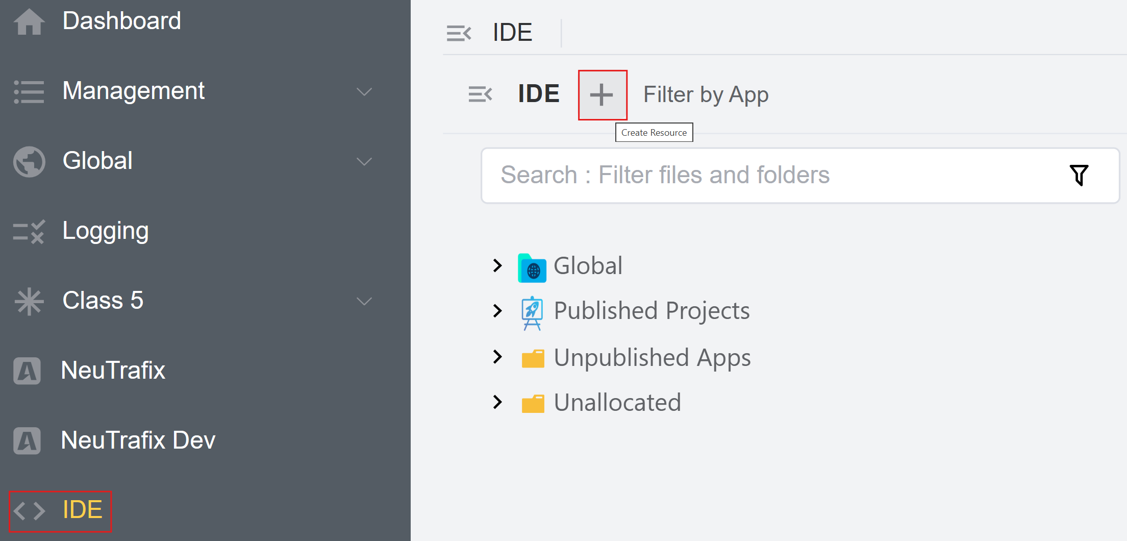
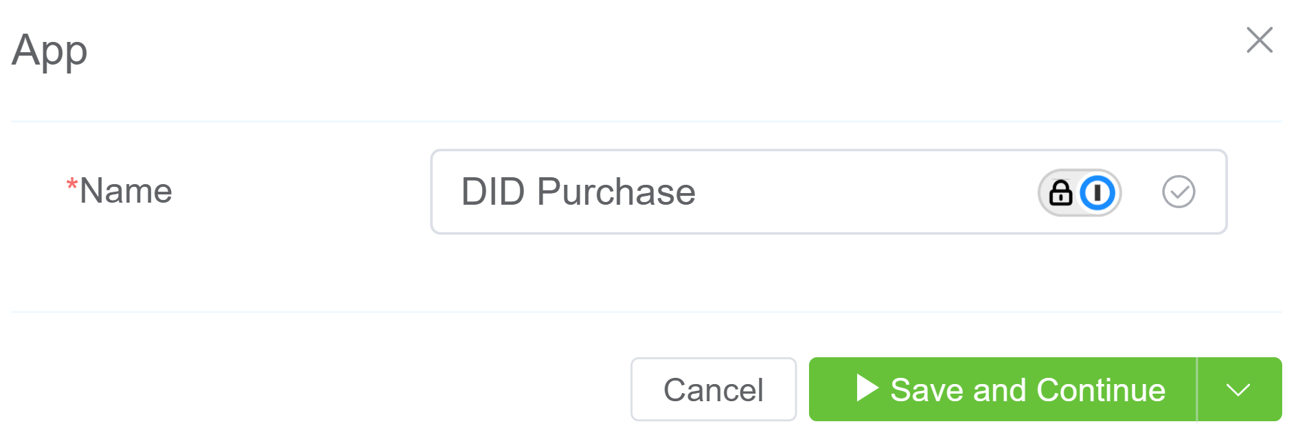
- Click on
Appand enter theApp Name. Click onSave and Continue.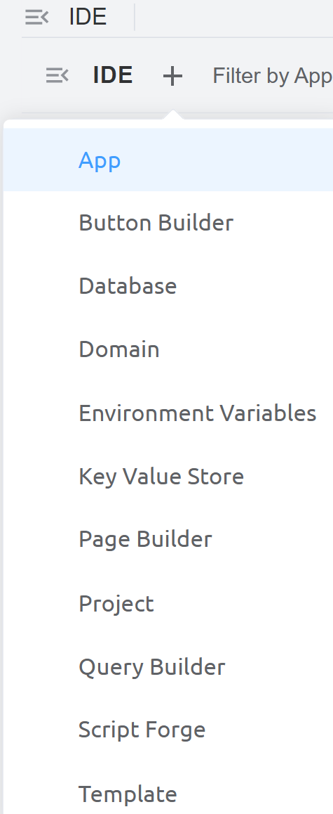
- The application is created under
Unpublished Apps.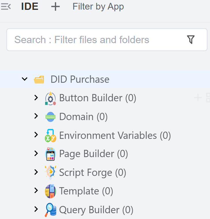
- Create a Config Button: Create and configure a button that appears in your application UI and performs specific actions.
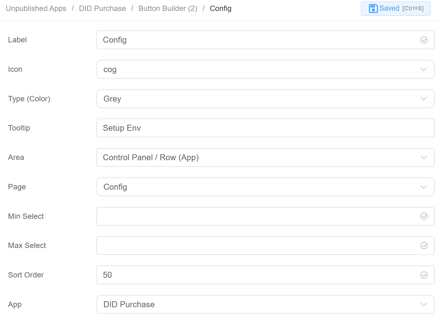
Label: The display name of the button.Icon: The icon shown alongside the button label.Type (Color): Defines the button color/style.Tooltip: A short description shown when users hover over the button.Area: Determines where the button will appear in the UI.Page: Specifies which page opens when the button is clicked.Min Select: Minimum number of items a user must select before the button becomes active.Max Select: Maximum number of items allowed for selection when using the button.Sort Order: Controls the position of the button relative to other buttons.App: Specifies which application this button belongs to.
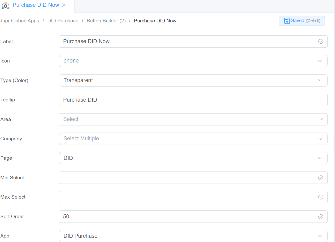
- Create a Purchase DID Now Button.
- Create Environmental Variables: This section is used to define configurable key–value pairs that can be used across the application for dynamic behavior and environment-specific settings.
App: Specifies the application where the variable is used.Key: The name/identifier of the variable. Used in code or configuration to reference the value.Value: The actual value assigned to the key.Flags: These control how the variable behaves:- Protected: Prevents accidental modification or deletion.
- Private: Hides the value from general visibility (used for sensitive data like API keys).
- Locked: Restricts editing completely.
- Default: Marks this as the default value (used when no override is provided).
-
Create
Environmental Variablesfor the following:- The
currencyenvironmental variable is a configuration setting that defines which currency the application should use by default.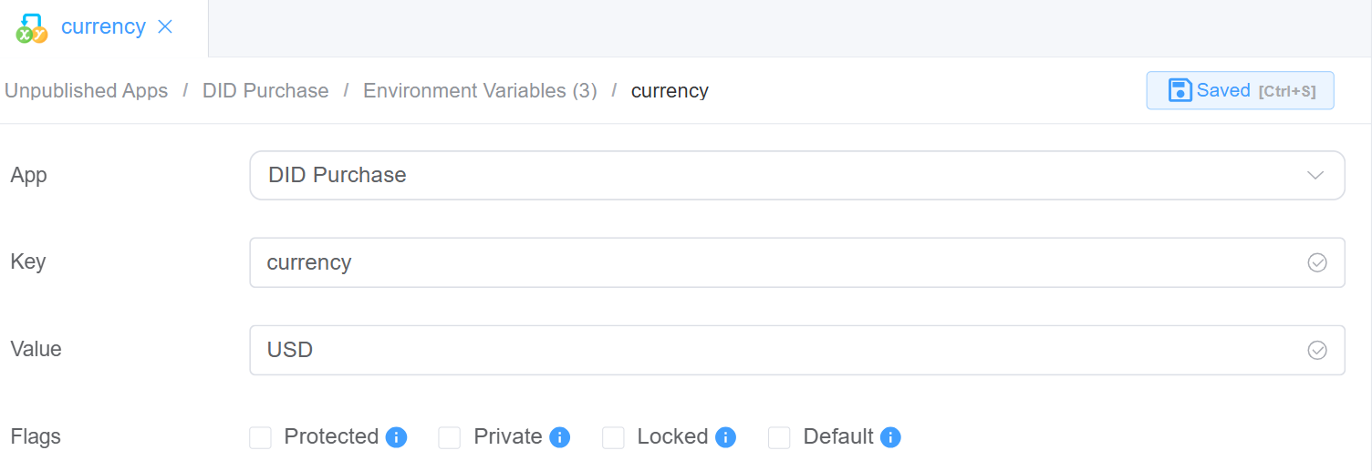
- The
cx_api_userenvironmental variable is used to store the username (or identifier) for API authentication within the application.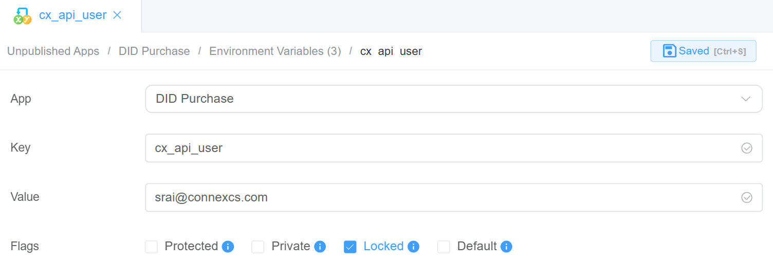
- The
did_mask_sizeenvironmental variable defines how many digits of a DID (phone number) should be masked/hidden.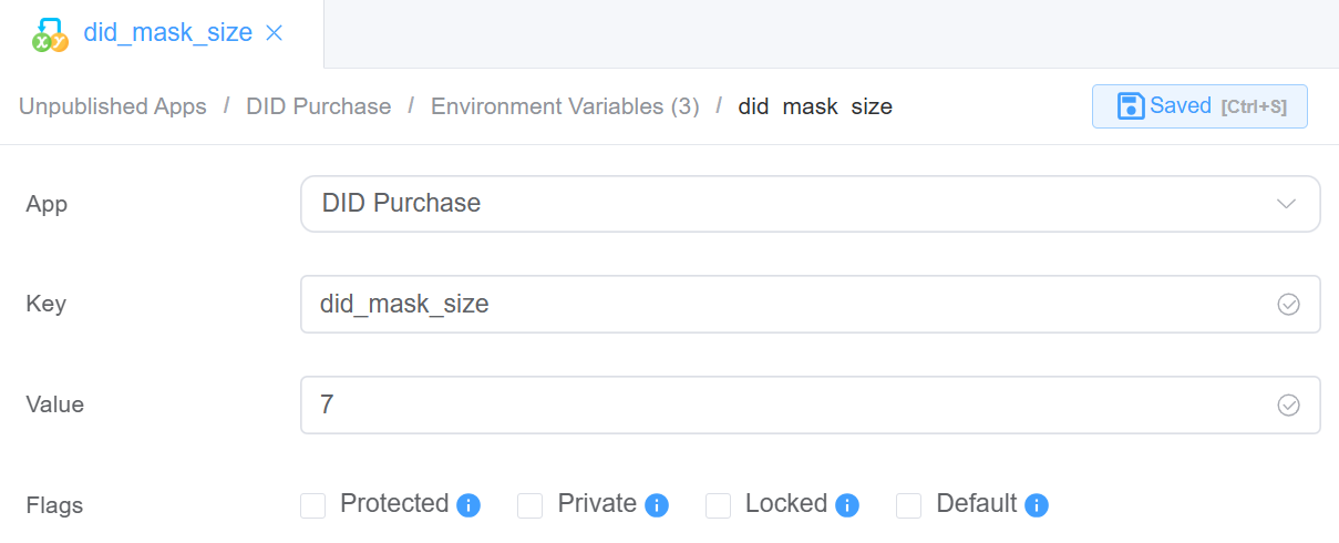
- The
-
ScriptForge Settings: DID ENV Setup
/** * Asynchronously saves environment variables based on the provided data. * * @param {Object} data - The data object containing environment variable values. * @param {string} data.api_user - The API user value to be set. * @param {string} data.class4_server - The Class 4 server value to be set. * @param {string} data.class5_server - The Class 5 server value to be set. * @returns {Promise<Object>} A promise that resolves to an object with a status property indicating the result. */ async function saveEnv({ envValue }) { try { for (const [key, value] of Object.entries(envValue)) { await setEnvVar(key, `${value}`) } return { status: 'OK' } } catch (error) { throw new Error(error.message) } } /** * Asynchronously loads environment variables and returns an object containing specific server and user values. * * @async * @function loadEnvValues * @returns {Promise<Object>} An object containing the following properties: * - class4_server {string}: The value of the C4SERVER environment variable. * - api_user {string}: The value of the cx_api_user environment variable. * - class5_server {string}: The value of the C5SERVER environment variable. */ async function loadEnvValues() { const vars = await getEnvVars() return { api_user: vars.cx_api_user, currency: vars.currency, did_mask_size: vars.did_mask_size, } } -
Next step is to build the
UIusingPage Builder. This is for config screen to save infomation inENV. This UI is a form built using Page Builder components to allow users to view and update environment variables for the application.- Container (env_card): A layout/card component that groups all fields together. Provides structure and visual separation.
- Field: API User:
- Component Type: Dropdown / Select
- Purpose: Select the API user (
cx_api_user). Dynamically populated from available users
-
Field: Currency:
- Component Type: Text Input
- Purpose: Set the default currency (
currency)
-
Field: DID Mask Size:
- Component Type: Number / Text Input
- Purpose: Define how many digits to mask (
did_mask_size)
-
Actions
- Confirm Button: Saves updated values to environment variables.
- Cancel Button: Closes the form without saving changes
-
How It Works (Behind the Scenes)
- Each field is mapped to an environment variable key
- On Confirm, values are:
- Stored in the Environment Variables module
- Used dynamically across the app
-
Dialog Component Attributes
Field Description Type Defines the component type (here, a Dialog popup). ID Unique identifier used to reference this dialog in logic or actions ( env_config).Title The heading displayed at the top of the dialog. Width Controls the width of the dialog (e.g., 35rem).Visible Toggles whether the dialog is shown or hidden. Center Aligns the dialog to the center of the screen if enabled. Show Close Displays a close (X) button on the dialog. Show Cancel Button Enables the Cancel button at the bottom. Button Text (Cancel) Defines the label for the Cancel button. Show Confirm Button Enables the Confirm button. Loading (Confirm) Shows a loading state on the Confirm button during processing. Margin Top Adds spacing from the top of the screen (e.g., 15vh).Prevent Escape Key Close Disables closing the dialog using the Escape key. Custom Class Allows applying custom CSS styling to the dialog. Attribute Action (Data Binding) Enables binding the dialog data dynamically to variables or state. Action Settings
Action Description onCancel Defines what happens when the Cancel button is clicked (e.g., close dialog or reset state). onConfirm Defines what happens when the Confirm button is clicked (e.g., save environment variables). Configure the Form Attributes, which are applied at the file level and affect all components within the form, ensuring consistent layout, styling, and behavior across the entire UI.
Field Description UI (Element / Ant Design / Vuetify) Selects the UI framework used for form components and styling. Form Width Defines the overall width of the form (e.g., 100%for full width).Label Position Controls where labels appear relative to input fields (Left, Right, Top). Label Width Sets the fixed width of labels (e.g., 100px).Label Suffix Adds a suffix (like :) after labels when enabled.Size Defines the size of form components (Large, Default, Small). Style Sheets Allows applying custom styling or themes to the form. Custom Class Assigns a custom CSS class for additional styling or control. Log Level Sets the logging level for debugging (e.g., Warn, Info, Error). Data Source Configures where the form gets or sends its data (binding/API). Action Panel Defines actions like submit, reset, or custom operations for the form. Javascript CDN Library Allows adding external JS libraries via CDN for extended functionality.
-
ScriptForge Settings: DID ENV Setup: DID Query
const cxRest = require('cxRest') const api = cxRest.auth(process.env.cx_api_user) const didMaskSize = process.env.did_mask_size const currency = process.env.currency async function main(data) { const res = await query(data) console.log('current time', new Date().toLocaleString()) return JSON.stringify(res) } async function updatePaymentRecords(record) { const packages = await api.post('/payment', record) return packages } async function checkoutCart (order) { let customer = null try { customer = await getCustomer(order) } catch (e) { throw e } const failedOrders = [] // Update DID ownership to the provided customer order.cart.forEach(async cartItem => { try { const res = await api.put(`did/${cartItem.did_id}`, { customer_id: customer.id }) if (res.status !== 'OK') { failedOrders.push(cartItem) throw new Error(`Failed to Complete orders.${JSON.stringify(failedOrders)}--- ${JSON.stringify(e)}`) } const didDetails = (await api.get(`did?id=${cartItem.did_id}`)) await updatePaymentRecords({ company_id: customer.id, currency: cartItem.currency, description: `DID ordered: (${didDetails[0].did})`, status: 'Completed', total: - cartItem?.setup_cost }) } catch (e) { failedOrders.push(cartItem) throw new Error(`Failed to Complete orders.${JSON.stringify(failedOrders)}--- ${JSON.stringify(e)}`) } }) return { status: 'OK' } } /** * Check if the customer can afford all the items in the cart * @return {Boolean} - Whether the customer can afford the cart or not */ async function isOrderAffordable (order) { const customer = await getCustomer(order) const accountBalance = Number(customer.credit) + Number(customer.debit_limit) const cartTotalCost = order.cart.reduce((totalCost, cartItem) => { // Get the total cost of items in the cart return totalCost + cartItem.setup_cost }, 0) return accountBalance >= cartTotalCost } async function getCustomer (order) { const vars = await getEnvVars() if(!vars.cx_api_user) throw new Error('API User is not selected. Please select one from the config') return await api.get(`customer/${order._company.company_id}`) } async function query(qry) { const vars = await getEnvVars() if(!vars.cx_api_user) throw new Error('API User is not selected. Please select one from the config') const packages = await api.get('setup/package') // return packages // return packages const dids = (await api.get(`did?s=${qry.prefix}&_startRow=0&_endRow=10000&_pivotMode=false&customer_id=[null]`)) .filter(did => did.package_id) .map(did => { const packageDets = packages.find(pack => pack.id === did.package_id) if (!packageDets) throw new Error('DID must be assigned to a package.') // Mask DIDs // Setup Charge, Recurring Charge, Charge Interval, // currency: USD, mask_digits: 6 // Max basket size - do later did.did = hideEndCharacters(did.did, didMaskSize) // FIX SETUP_COST // ============= return { did_id: did.id, did: did.did, setup_cost: packageDets.setup_retail, recurring_cost: packageDets.retail, charge_interval: packageDets.frequency.charAt(0).toUpperCase() + packageDets.frequency.slice(1), currency, package_id: packageDets.package_id } }) return dids } function hideEndCharacters(inputString, numToHide) { // Create a new string with 'x' repeated for the last numToHide characters const maskedPart = 'x'.repeat(numToHide) // Append the remaining characters from the original string const result = inputString.slice(0, -numToHide) + maskedPart return result } async function main () { const abc = (await api.get(`did?id=3557782`)) return abc // const order = { // _company: { // company_id: 49051 // } // } // const customer = await getCustomer(order) // return customer // const accountBalance = Number(customer.credit) // return accountBalance } -
Define the
Data source settingsunderForm Attributes.saveEnv: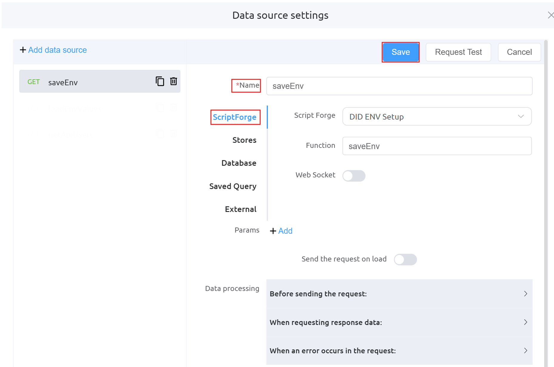
loadEnvValues: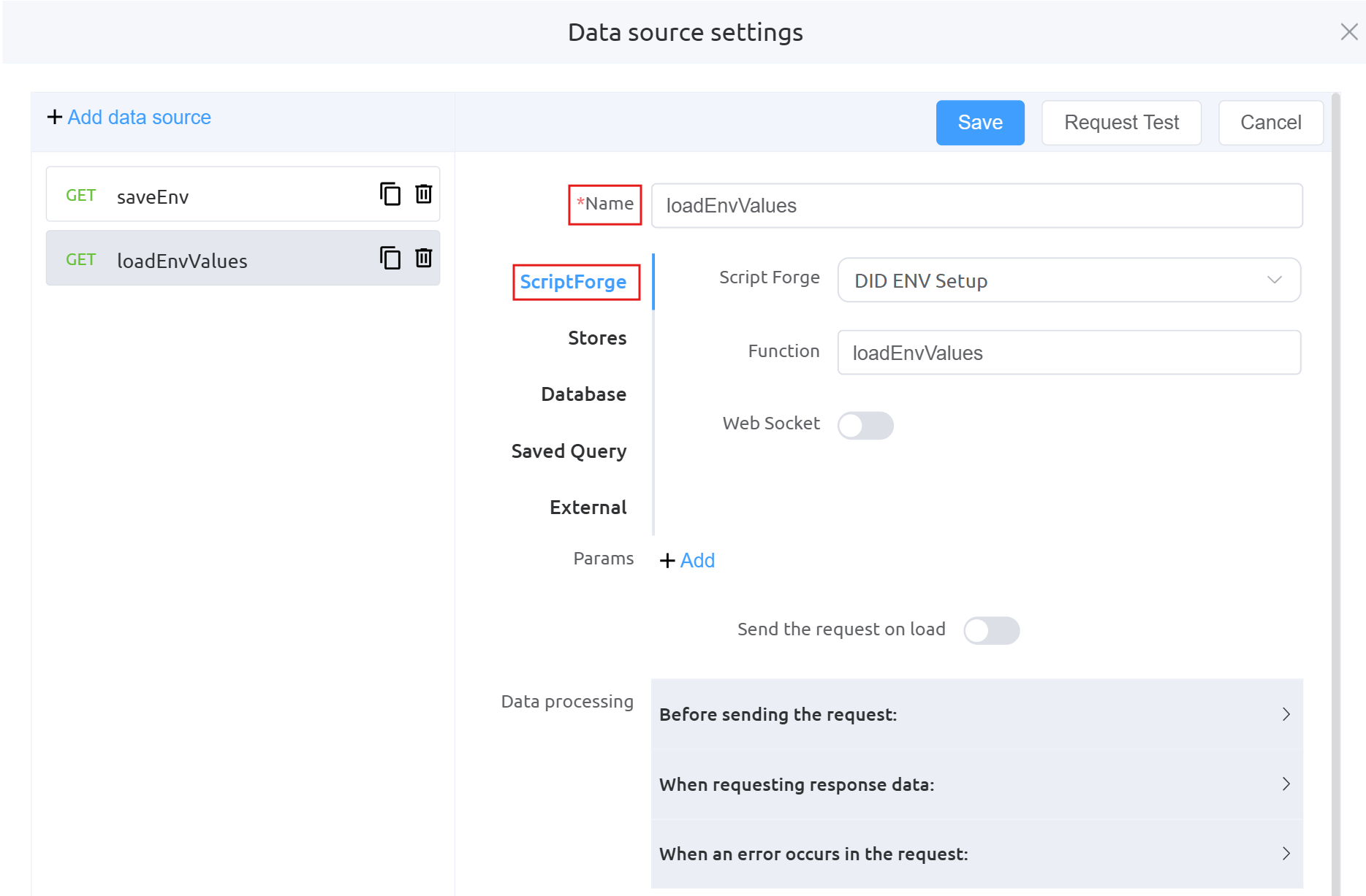
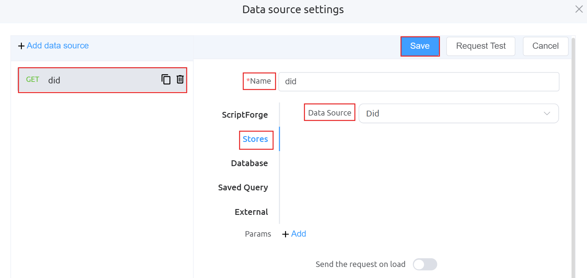
getApiUsers: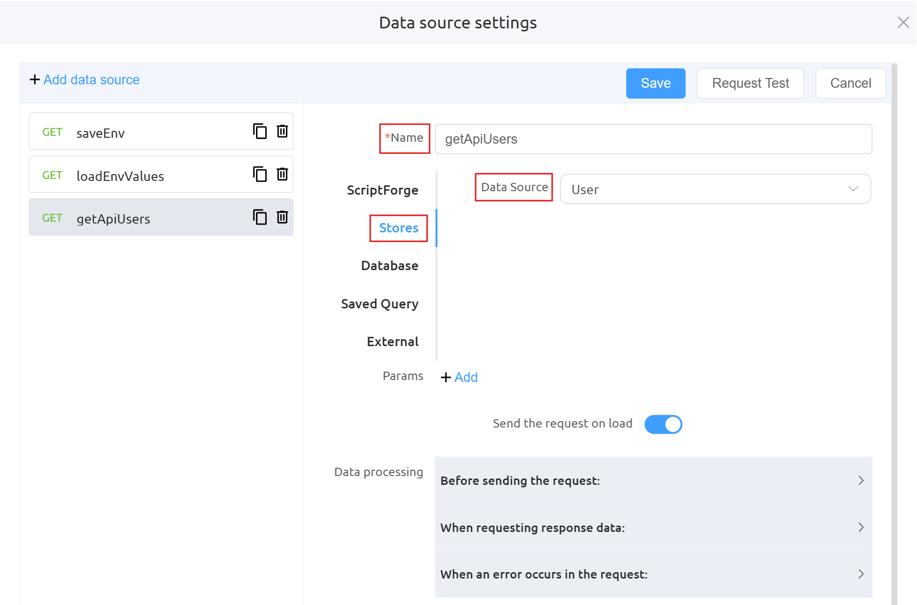
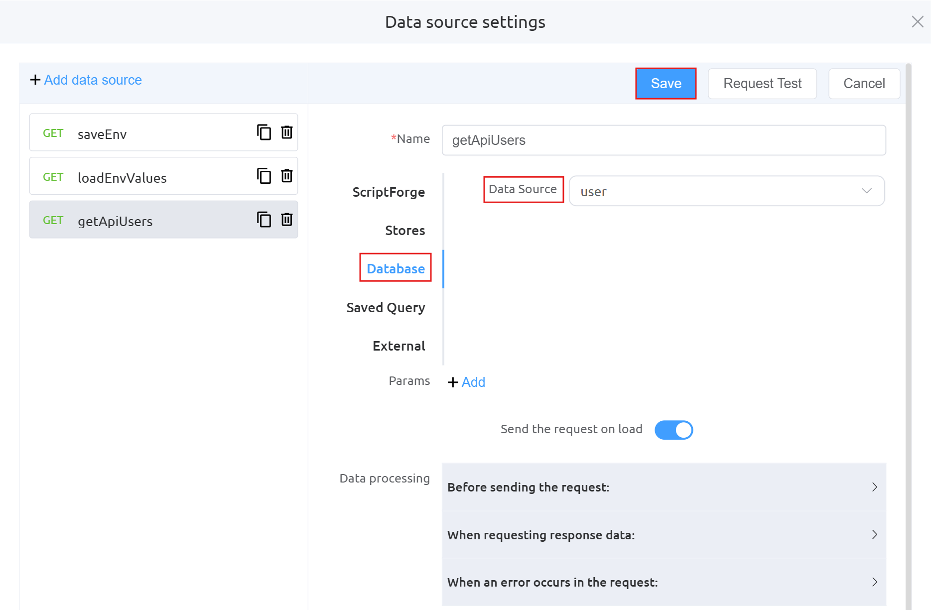
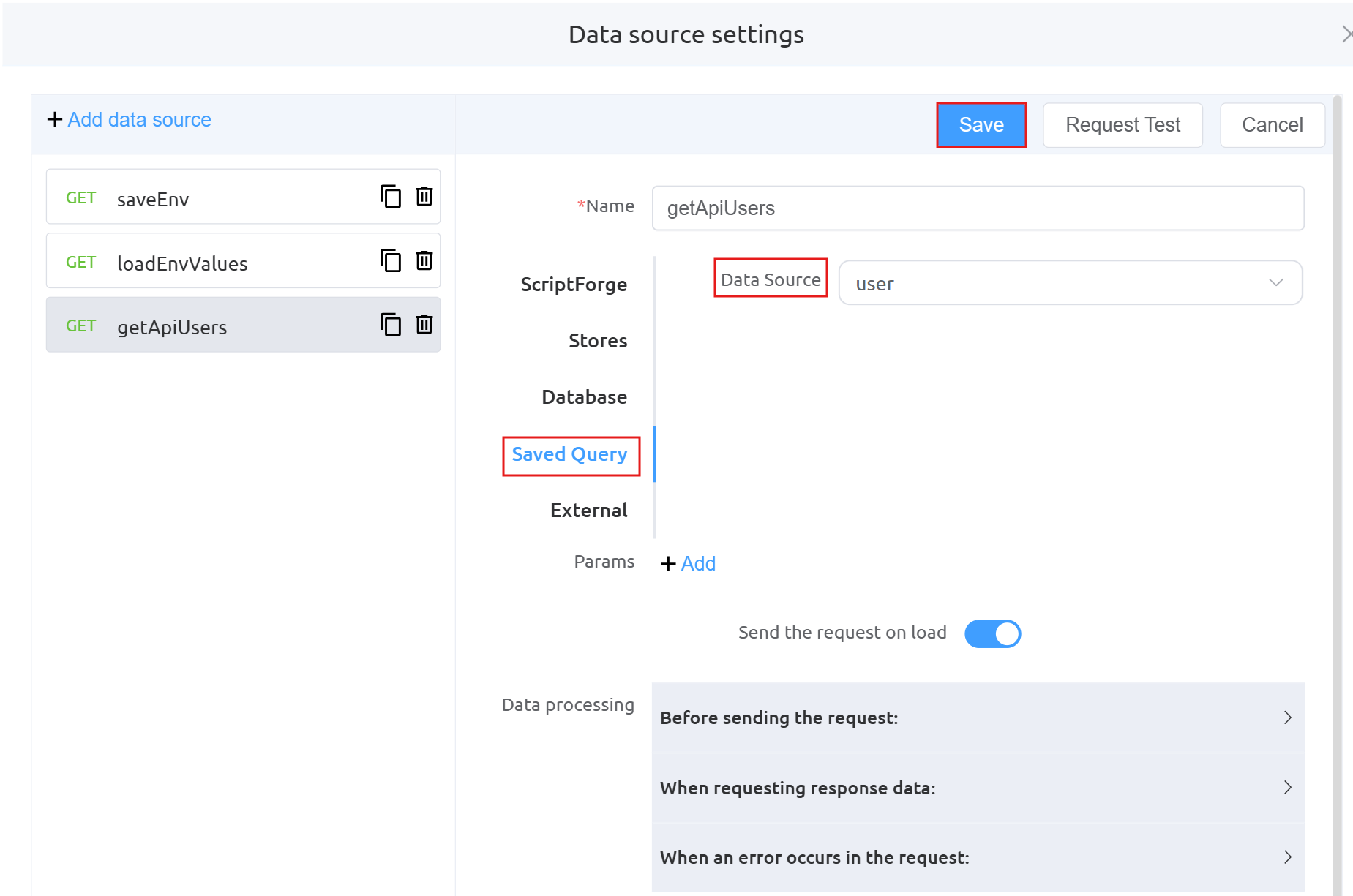 There are two additional images (Database and Query) under
 getAPIUserbecause the API user data is being fetched dynamically from a database using a query, rather than being hardcoded.Data Processing: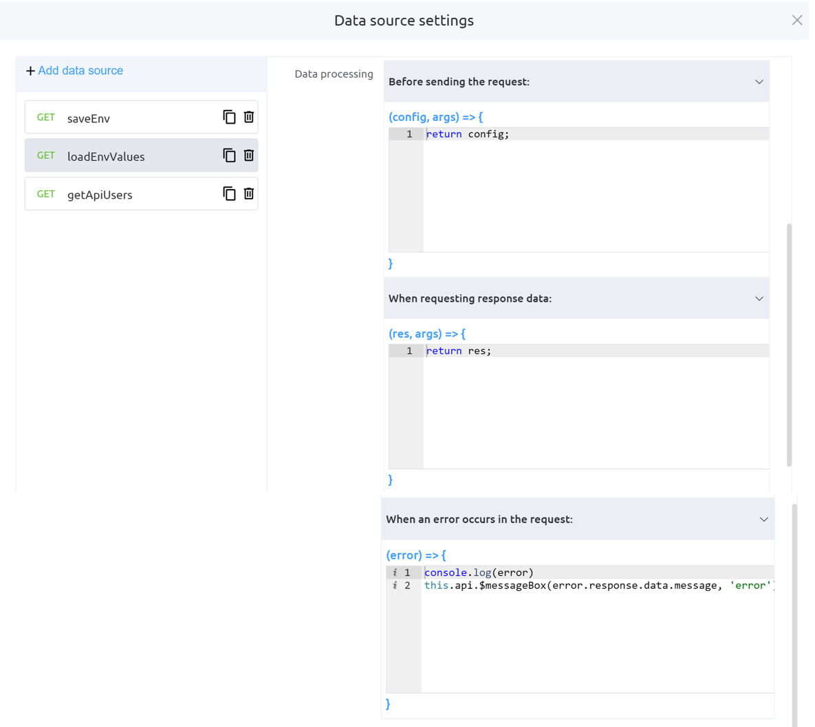
-
Define the
Action Panel settingsunderForm Attributes.Function mounted: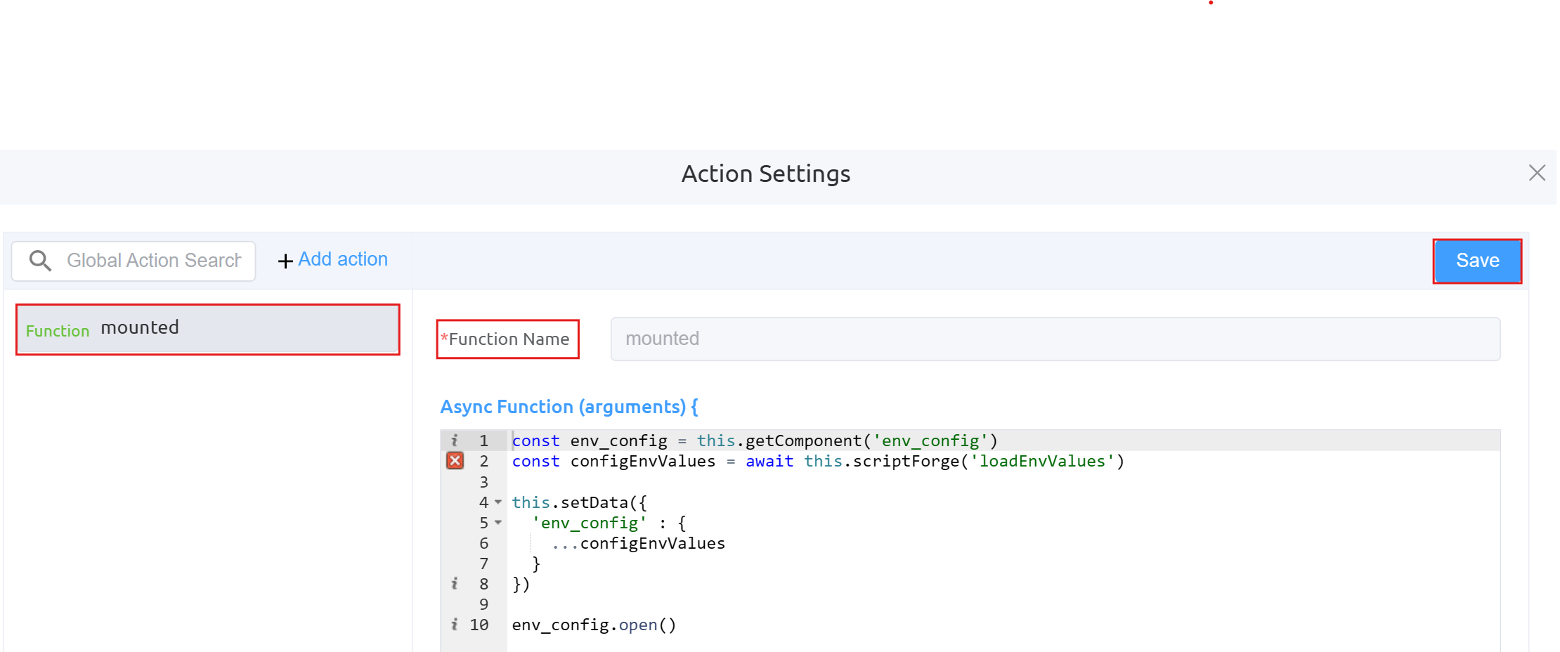
Function onConfirm_env: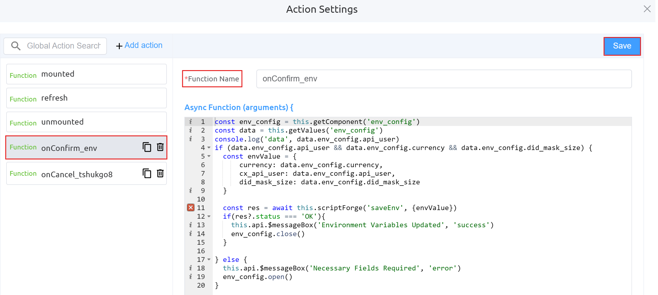
Function onCancel_tshukgo8: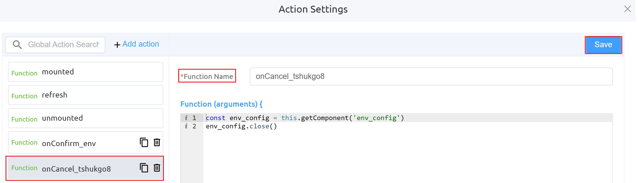
-
Next step is to configure the Button component using Page Builder. This button (
Start Purchasing DIDs) is an action trigger that allows users to initiate the DID purchasing workflow** by executing the configuredonClickaction (startPurchasingDids).Dialog Component Attributes
Field Description Type Defines the component type (here, a Dialog popup). ID Unique identifier used to reference this dialog in logic or actions ( env_config).Title The heading displayed at the top of the dialog. Width Controls the width of the dialog (e.g., 35rem).Visible Toggles whether the dialog is shown or hidden. Center Aligns the dialog to the center of the screen if enabled. Show Close Displays a close (X) button on the dialog. Show Cancel Button Enables the Cancel button at the bottom. Button Text (Cancel) Defines the label for the Cancel button. Show Confirm Button Enables the Confirm button. Loading (Confirm) Shows a loading state on the Confirm button during processing. Margin Top Adds spacing from the top of the screen (e.g., 15vh).Prevent Escape Key Close Disables closing the dialog using the Escape key. Custom Class Allows applying custom CSS styling to the dialog. Attribute Action (Data Binding) Enables binding the dialog data dynamically to variables or state. Action Settings Action Description onCancel Defines what happens when the Cancel button is clicked (e.g., close dialog or reset state). onConfirm Defines what happens when the Confirm button is clicked (e.g., save environment variables). Form Attributes: Same as defined above
-
Define the
Data source settingsunderForm Attributes.GET did: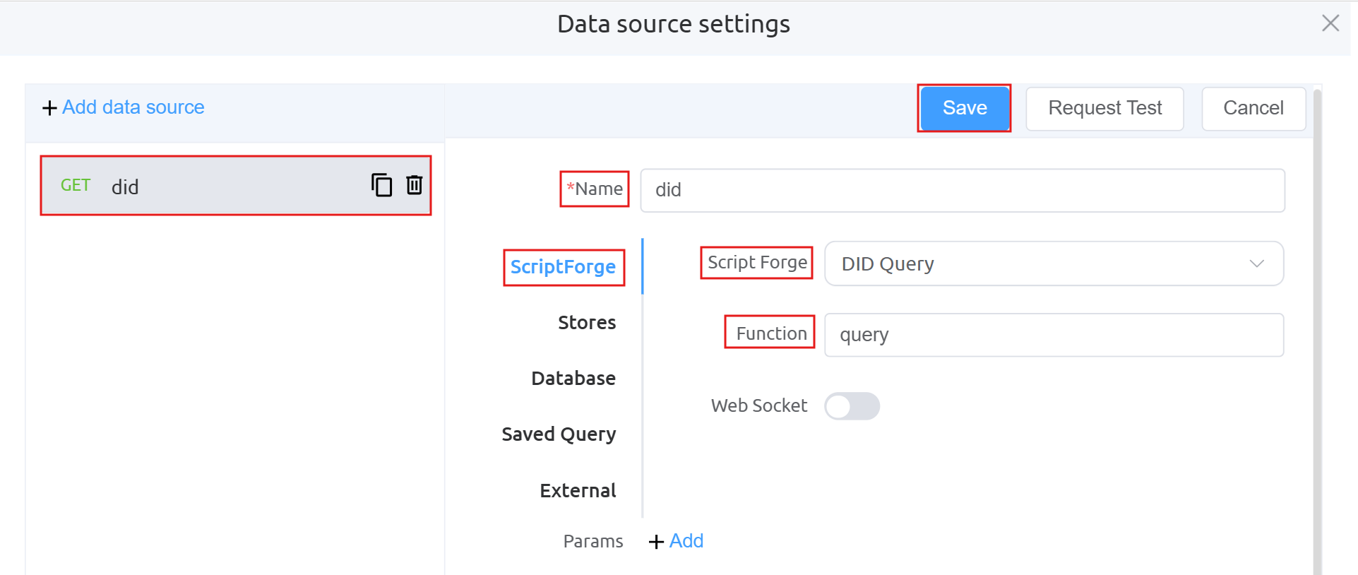
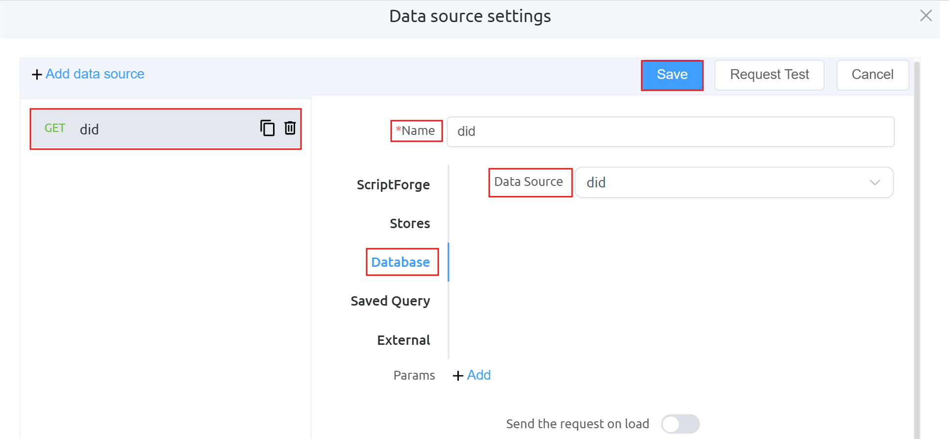
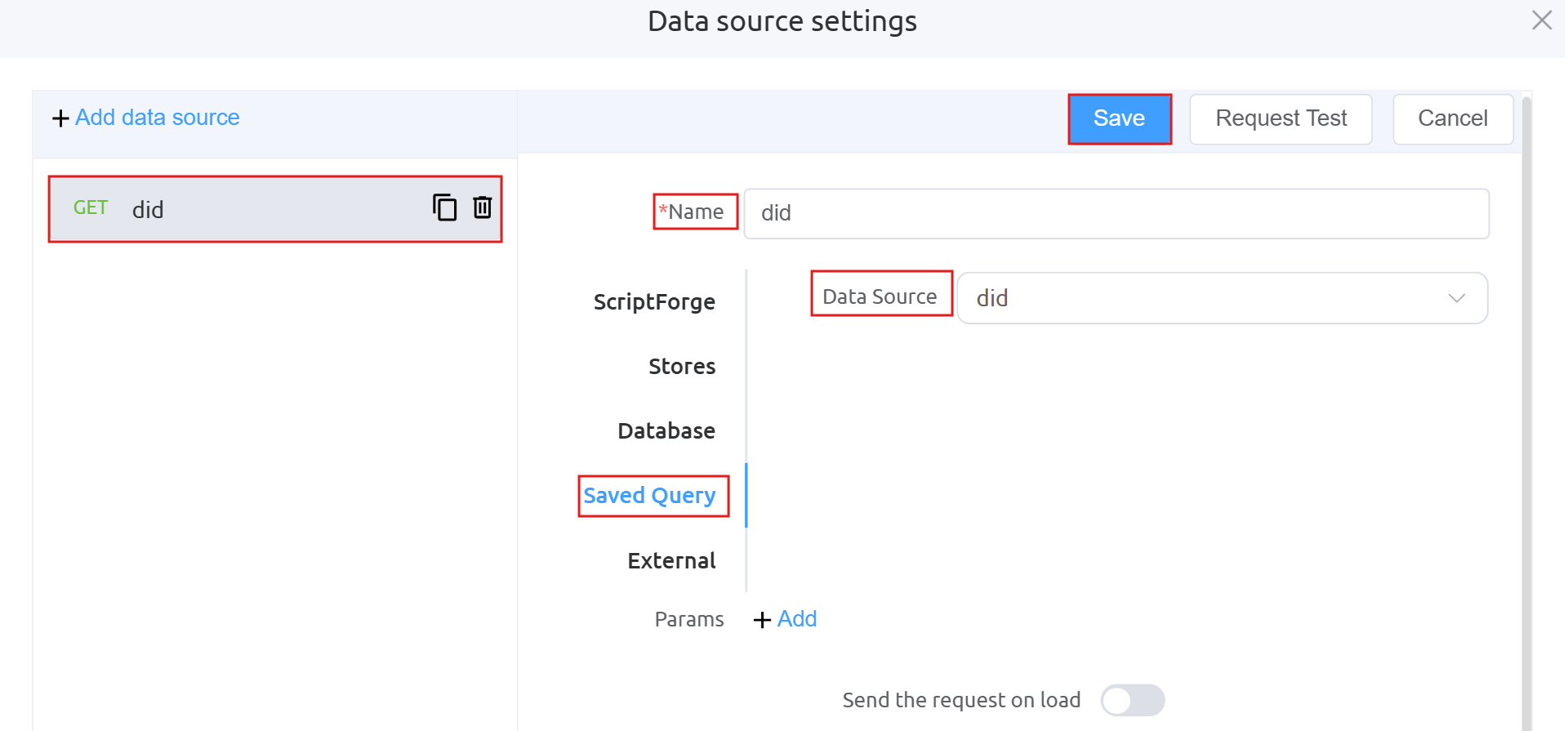 There are two additional images (Database and Query) under
 getDIDbecause the DID data is being fetched dynamically from a database using a query, rather than being hardcoded.GET isOrderAffordable: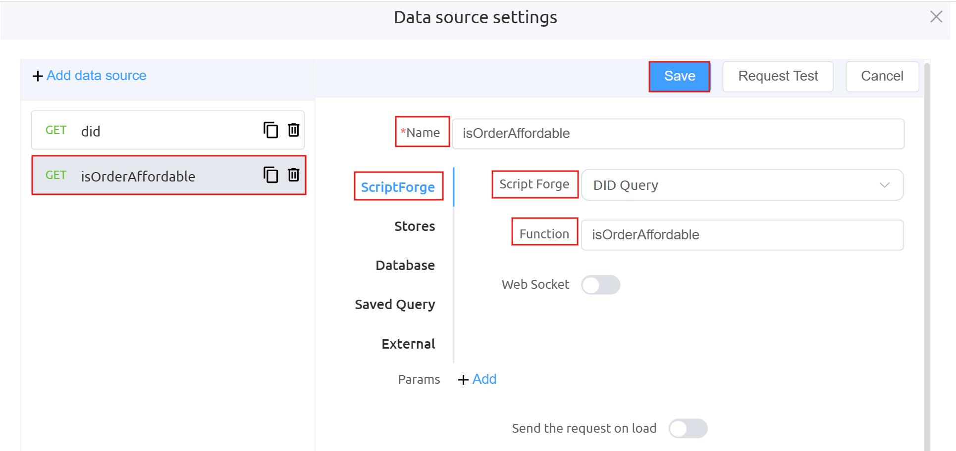
GET checkout: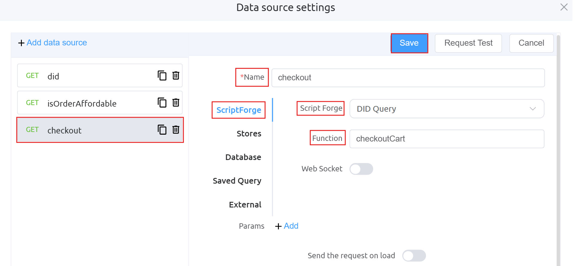
Data Processing:
-
Define the
Action Panel settingsunderForm Attributes.Function mounted: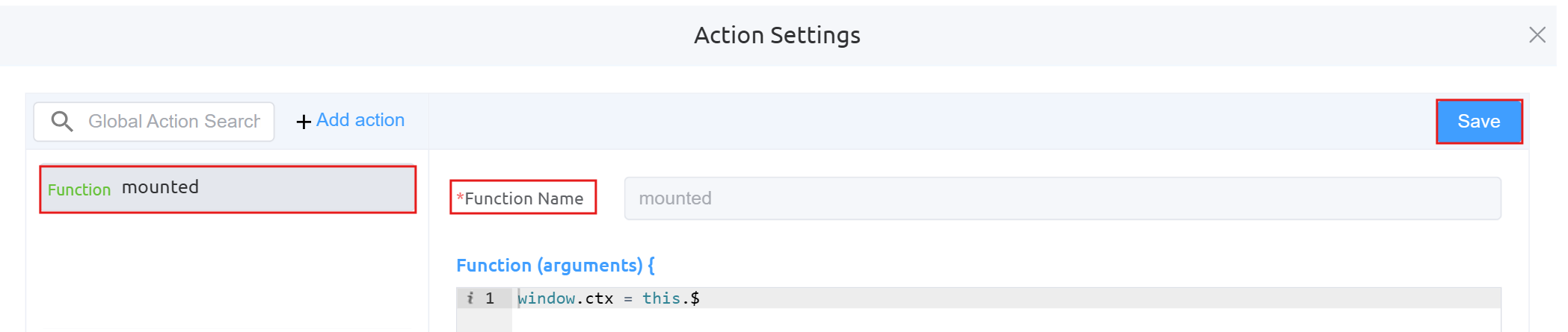
Function btnSearch: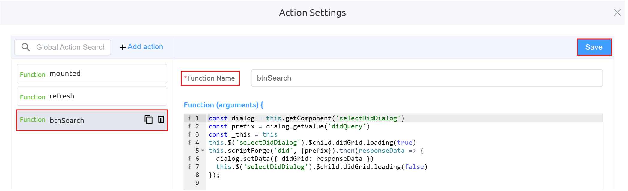
Function proceedToCart: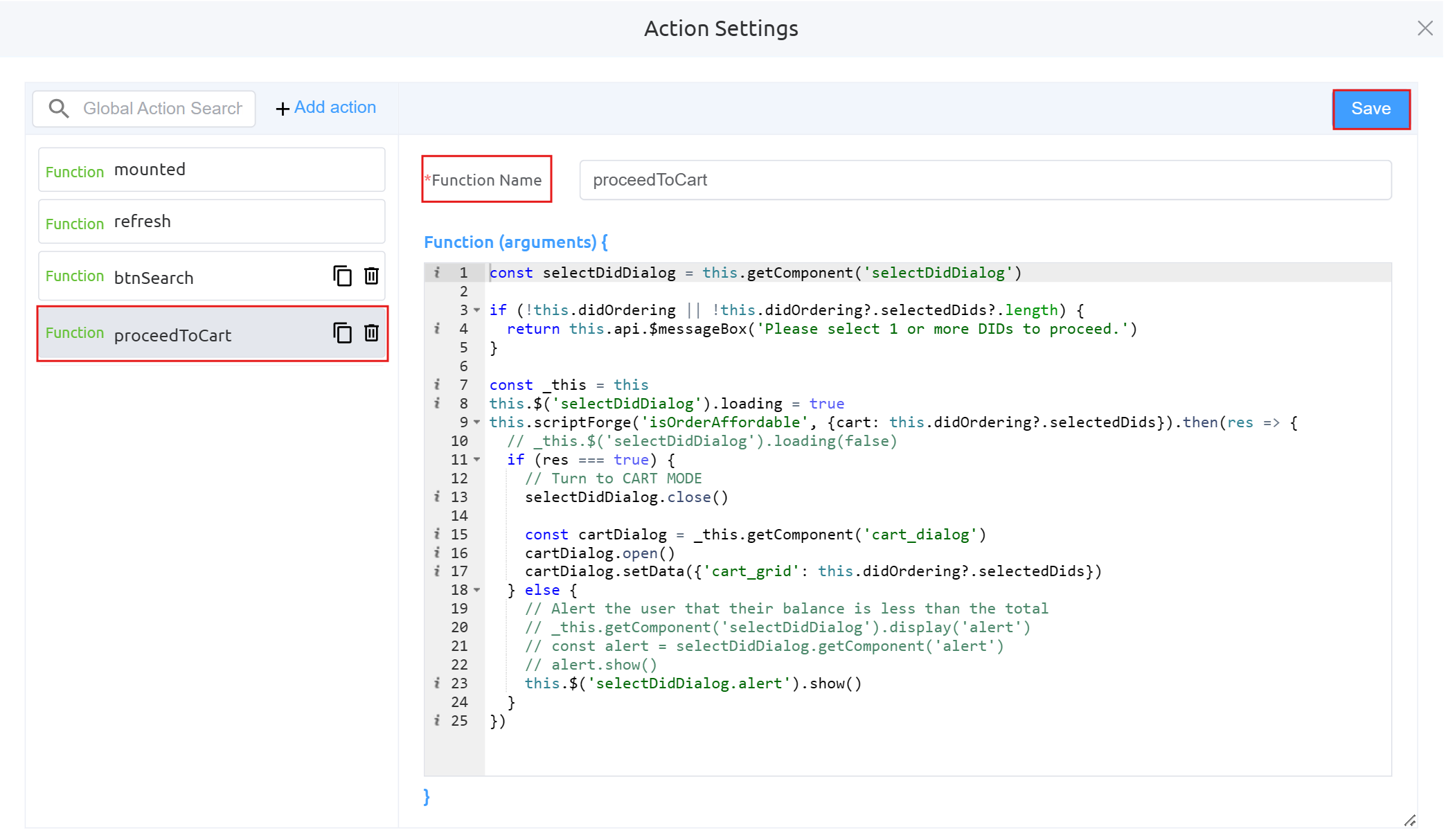
Function addSelectedDidsToCart: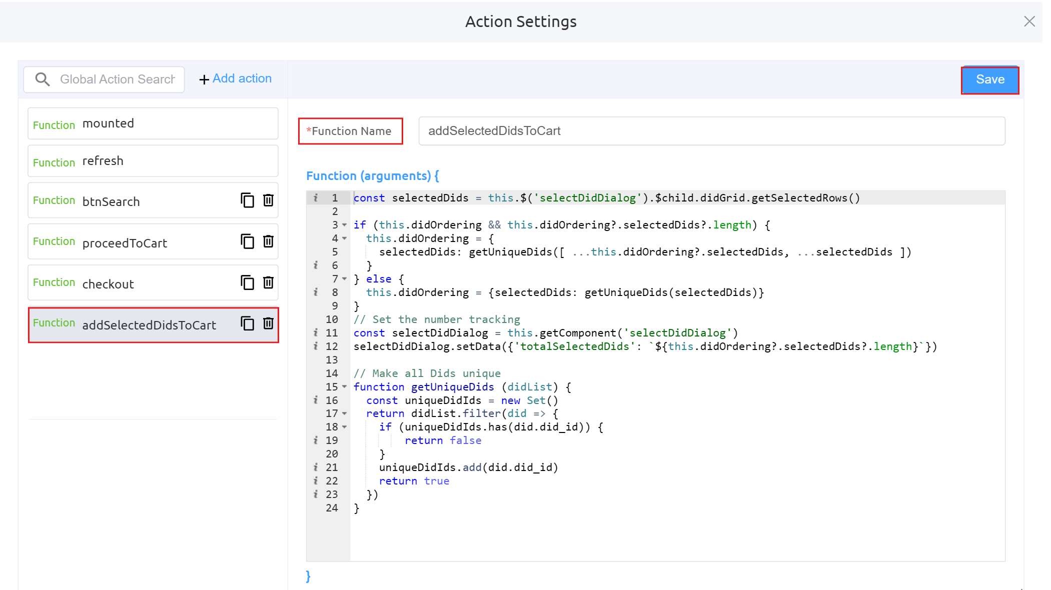
Function startPurchasingDids: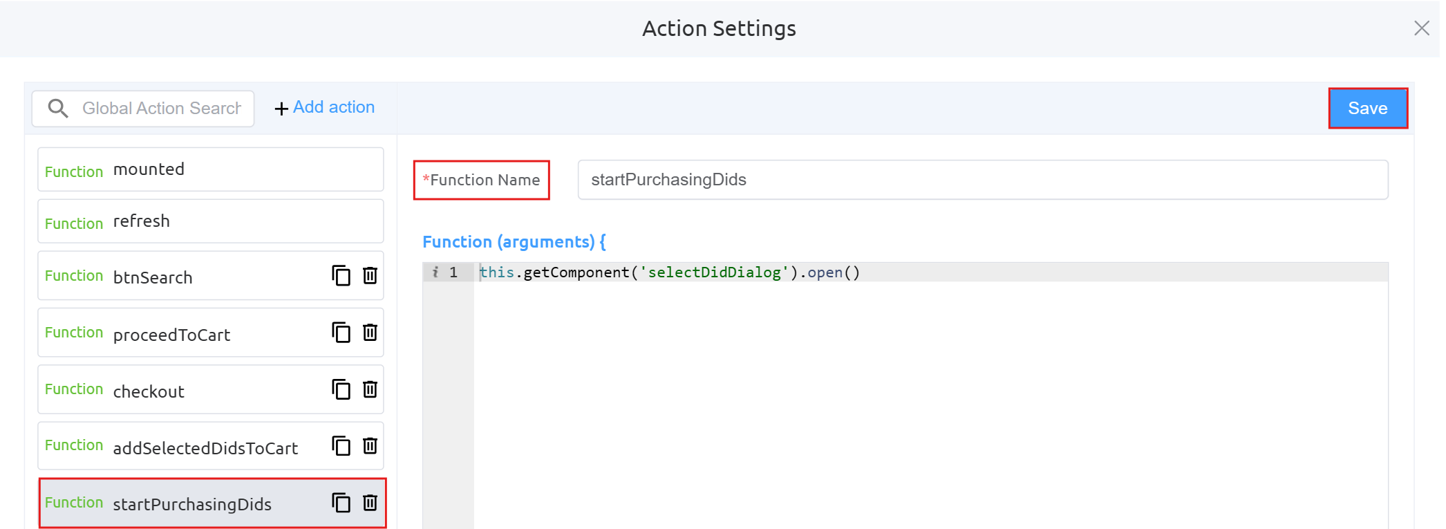
-
Next step is to configure the Cart Dialog UI.
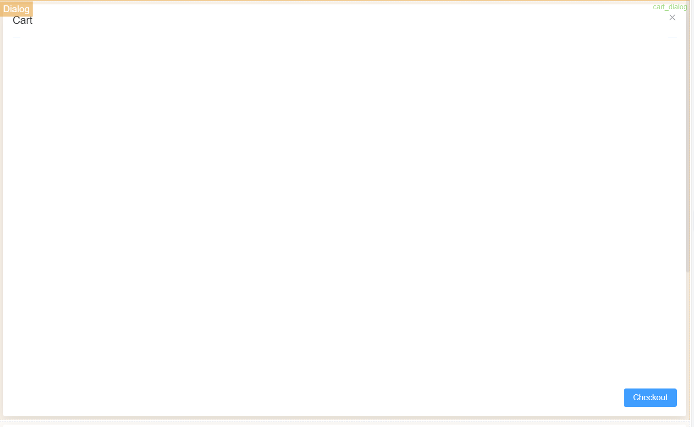
Dialog Component Attributes
Field Description Type Defines the component type (here, a Dialog popup). ID Unique identifier used to reference this dialog in logic or actions ( env_config).Title The heading displayed at the top of the dialog. Width Controls the width of the dialog (e.g., 35rem).Visible Toggles whether the dialog is shown or hidden. Center Aligns the dialog to the center of the screen if enabled. Show Close Displays a close (X) button on the dialog. Show Cancel Button Enables the Cancel button at the bottom. Button Text (Cancel) Defines the label for the Cancel button. Show Confirm Button Enables the Confirm button. Loading (Confirm) Shows a loading state on the Confirm button during processing. Margin Top Adds spacing from the top of the screen (e.g., 15vh).Prevent Escape Key Close Disables closing the dialog using the Escape key. Custom Class Allows applying custom CSS styling to the dialog. Attribute Action (Data Binding) Enables binding the dialog data dynamically to variables or state. Action Settings Action Description onCancel Defines what happens when the Cancel button is clicked (e.g., close dialog or reset state). onConfirm Defines what happens when the Confirm button is clicked (e.g., save environment variables). -
Form Attributes, Data Soure Settings and Action Panel Settings are same as Button component using Page Builder (point number 12).
-
Next step is to configure the Card (Text Component) inside the Cart Dialog UI. This component (
cart_text) is used to display informational text within the dialog, helping users understand the purpose of the data shown (selected DIDs).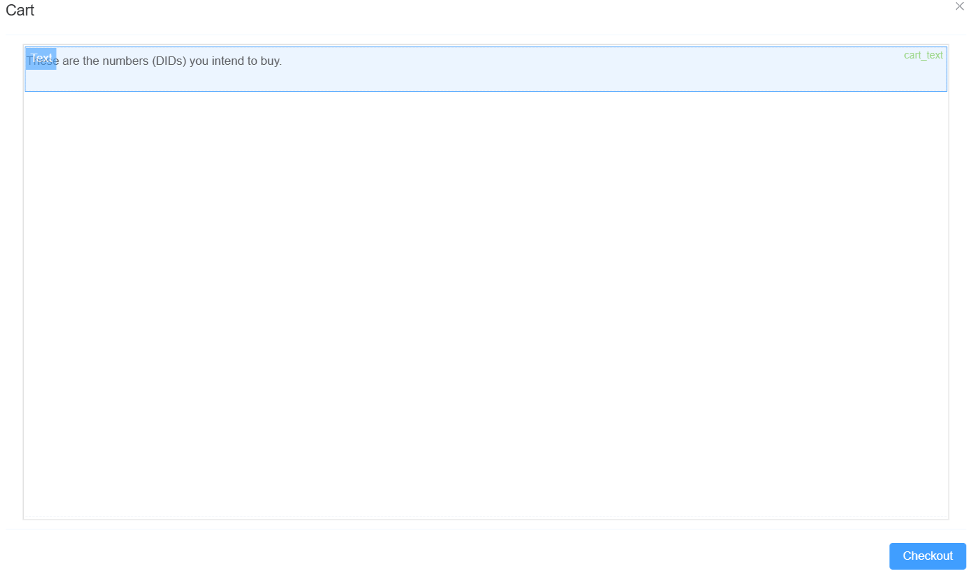
Text Component Attributes
Field Description Type Defines the component type (Text). ID Unique identifier used to reference this component ( cart_text).Name Internal reference name (optional). Width Controls the width of the text component. Label Width Defines label width (custom set to 40).Label Wrap Allows the label text to wrap onto multiple lines. Hide Label Toggles visibility of the label. Text Prompt Optional helper or descriptive text. Default Value The default text displayed (e.g., "These are the numbers (DIDs) you intend to buy."). Custom Class Applies custom CSS styling. Attribute Action (Data Binding) Enables dynamic binding of text content to variables or state. Hidden Controls visibility dynamically when enabled. Validation (Required) Marks the field as required (not typically used for static text). Action Settings Action Description onChange Defines behavior when the text value changes (rarely used for static text components). -
Form Attributes, Data Source Settings, and Action Panel Settings are the same as the Button component using Page Builder (point number 12).
-
Next step is to configure the Data Grid Component inside the Cart Dialog UI. This component (
cart_grid) is used to display selected DIDs in a tabular format, including pricing and billing details, enabling users to review items before checkout.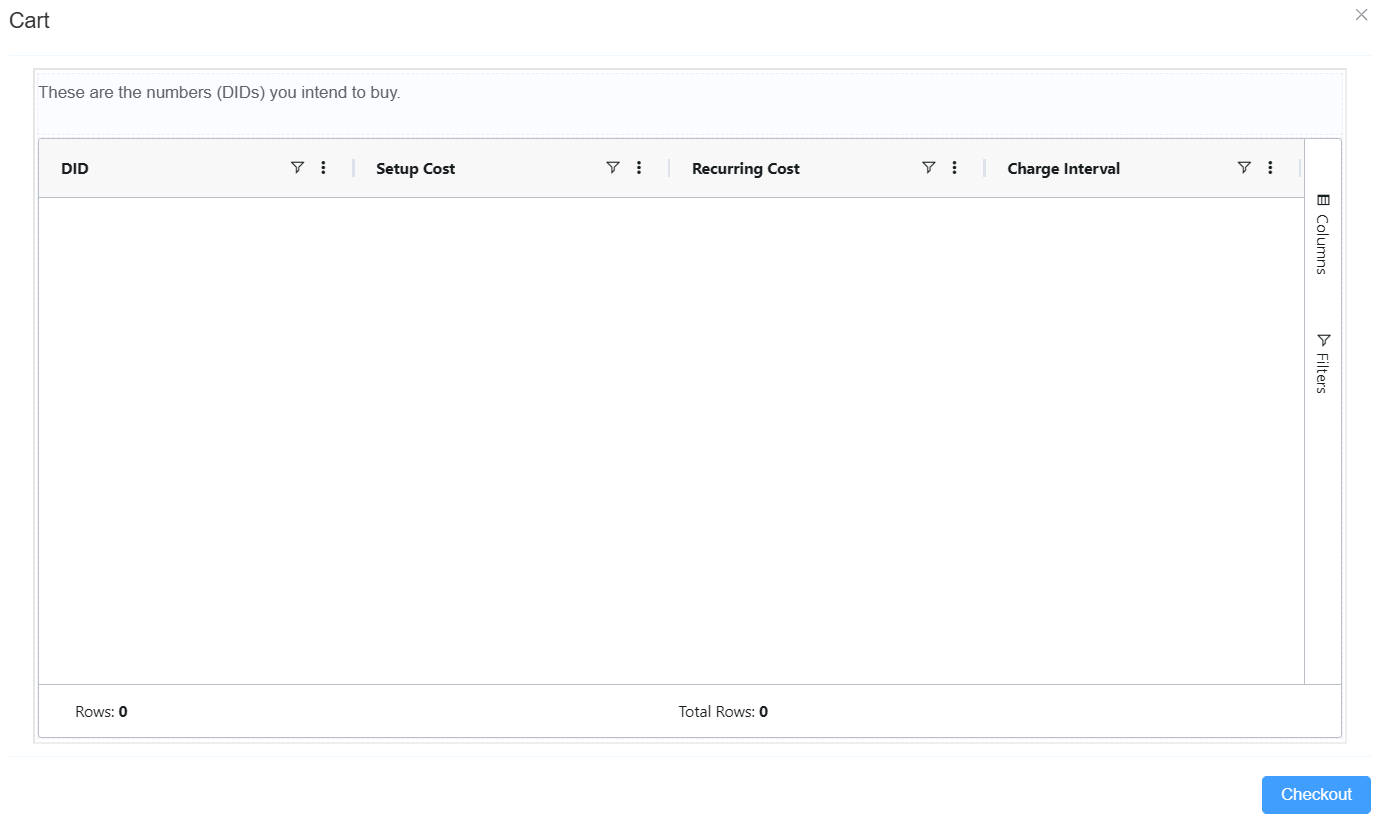
Data Grid Component Attributes
Field Description Type Defines the component type (Data Grid). ID Unique identifier used to reference this grid ( cart_grid).Width Controls the width of the grid. Height Sets the height of the grid (e.g., 500px).Status Bar Displays status information like row count or summaries. Side Bar Enables additional options like column visibility and filters. Row Selection Defines selection type (None, Single, Multiple). Enable Range Selection Allows selecting a range of cells. Suppress Context Menu Disables right-click menu if enabled. Context Menu Configures options available on right-click (e.g., Copy). Data Source Defines where the grid fetches its data (API, variable, etc.). Default Sets default/static data if no data source is provided. Column Config Defines columns (e.g., DID, Setup Cost, Recurring Cost, Charge Interval). Attribute Action (Data Binding) Enables binding grid data dynamically to application state. Hidden Controls visibility dynamically. Action Settings onCellClicked Defines behavior when a cell is clicked (e.g., select, trigger action). -
Form Attributes, Data Source Settings, and Action Panel Settings are the same as the Button component using Page Builder (point number 12).
-
Next step is to configure the DID Ordering UI using Page Builder. This interface is a composite UI built using multiple Page Builder components that allows users to search, select, and add DIDs to cart, while handling validation (e.g., insufficient balance).
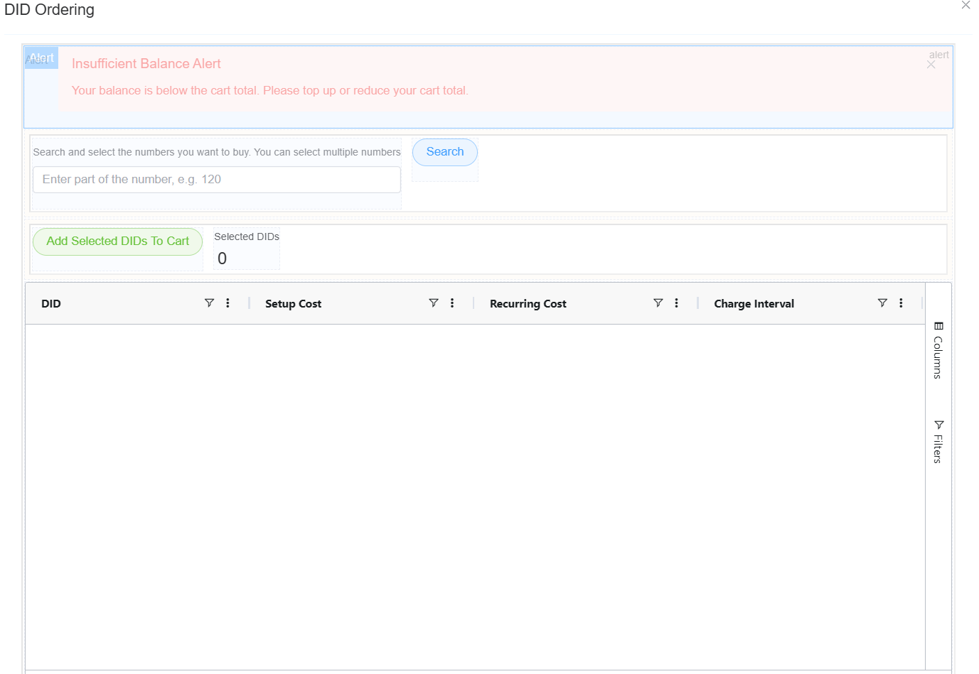
Alert Component (Insufficient Balance)
Field Description Type Defines the component as an Alert message. Message Displays warning (Insufficient Balance Alert). Description Provides details (balance is below cart total). Type/Style Styled as an error/warning (red). Closable Allows user to dismiss the alert. Visibility Triggered dynamically based on balance validation. Search Input + Button
Field Description Input Field Accepts partial DID input (e.g., 120).Placeholder Guides user input (Enter part of the number). Search Button Triggers DID search action. onClick (Search) Executes logic to fetch available DIDs. Action Button (Add Selected DIDs to Cart)
Field Description Button Name Add Selected DIDs To Cart. Type Styled as success (green). onClick Adds selected rows from grid to cart. Functionality Updates cart state and selected DID count. Selected Count Display
Field Description Label Displays Selected DIDs. Value Dynamically shows count (e.g., 0).Data Binding Updates based on grid selection. Data Grid Component (Available DIDs)
Field Description Columns DID, Setup Cost, Recurring Cost, Charge Interval. Filters Allows filtering of available numbers. Column Settings Enables column visibility customization. Row Selection Allows selecting multiple DIDs. Data Source Populated via search/API. Interaction Selected rows used for cart actions. Action Flow
Action Description Search Fetches DID data based on input. Select Rows User selects DIDs from grid. Add to Cart Adds selected DIDs to cart. Validation Checks balance before checkout and shows alert if insufficient. -
Form Attributes, Data Source Settings, and Action Panel Settings are consistent with other components configured using Page Builder (e.g., Button component in point 12).
-
Click on
App Settingsand thenPublishit.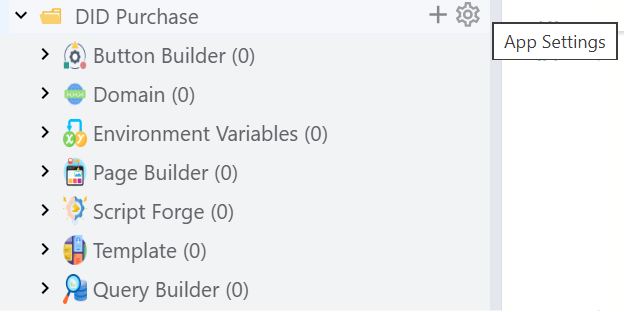
-
After publishing it will appear under Setup Appstore. You can install the app and use it at your own convenience.