Design Your Webphone: User Guide
Document Metadata
Category: Setup & Configuration → Integrations → WebPhone → Design Your Webphone
Audience: Administrators, Resellers, Support Team
Difficulty: Beginner (no code needed; Custom CSS is optional and advanced)
Time Required: 15–30 minutes for basic branding; 45–60 minutes for a full custom layout
Prerequisites: ConnexCS account with WebPhone enabled; at least one SIP server with a secure WebSocket URL (wss://); custom domain configured (optional); logo file, ideally 256 × 256 px PNG or SVG
Related Topics: Certificates & Domain Setup (for SIP servers and custom domains), API & SDK Integrations (for embedding WebPhone)
Next Steps: WebPhone App Platform
Overview
Design Your Webphone is where you set up the webphone for everyone who uses it. You can:
- add your logo and brand colours
- choose where the navigation sits and which tabs it has
- style the dialpad, call screens and login page
- add your own links or embed another web page
- add custom CSS
You don't need to write any code. Every change shows up straight away in a live preview, so you can see the result before your users do.
Contents
- Design Your Webphone: User Guide
- Overview
- Contents
- 1. Before you start
- 2. Finding your way around the Studio
- 3. Saving, resetting and closing
- 4. Settings
- 5. Branding
- 6. Colours \& Theme
- 7. Typography \& Shape
- 8. Layout \& Navigation
- 9. Header \& Actions
- 10. Dialpad Keys
- 11. Call Button
- 12. Number Input
- 13. Calls
- 14. Call Results
- 15. Troubleshooting Logs
- 16. Workspace Panel
- 17. Embedded Page
- 18. Call History
- 19. Login Screen
- 20. Advanced
- 21. Limits at a glance
- 22. Troubleshooting \& FAQ
1. Before you start
- Your changes apply to every user. Once you save, everyone sees the new design the next time they open or refresh the webphone.
- Nothing reaches users until you click Save design. You can experiment freely.
- The defaults are the standard look. If you never touch a setting, it looks exactly like the standard webphone. You can always go back with Reset section or Reset to basics.
- Use Custom Design must be on. It's in the Settings section. Saving a design turns it on automatically.
2. Finding your way around the Studio
The Studio has four areas:
| Area | Where | What it does |
|---|---|---|
| Top bar | Top | Shows the title, the Unsaved changes badge and the design size meter (for example 12 / 56 KB), plus the Reset to basics, Close and Save design buttons. |
| Section list | Left | The sections, from Settings to Advanced. Click one to open it. |
| Controls | Middle | The options for the section you picked. Each section has a short description at the top and a Reset section link. |
| Live preview | Right | Shows your design as you change it. |
Using the live preview
The bar above the preview has three sets of controls:
- Screen picker: Dialpad, Call Logs, Contacts, Profile, In call, Incoming, Call failed, Logs or Login.
- Device: 🖥 Desktop or 📱 Mobile.
- Theme: ☀ / 🌙 switches the preview between light and dark mode.
The preview also jumps to the screen your change affects. For example, opening Calls shows the in-call screen, and changing an Incoming call option shows the incoming popup. The preview uses the same settings as the real webphone. Fonts load from Google Fonts on users' devices.
Kinds of controls
| Control | How to use it |
|---|---|
| Switch | Turns something on or off. |
| Button group / dropdown | Pick one option. Hover over a button to see a hint, if it has one. |
| Slider | Drag it. The value and unit are shown on the right. |
| Text box | Type text. A counter (for example 8/40) shows the character limit. |
| Colour | Use the colour picker or type a hex code (#1a2b3c, or the short form #abc). Optional colours have a Use default link to clear them. |
| Icon picker | Click an icon from the set. |
Some options only appear when they apply. For example, Side navigation width only appears when the navigation is on the left or right.
3. Saving, resetting and closing
| Action | What happens |
|---|---|
| Save design | Publishes the design to all users and turns Use Custom Design on. The button is disabled while something blocks the save, and a red banner explains what's wrong (see Limits). Spaces at the start and end of text fields are removed when you save. |
| Reset section | Puts only the open section back to its defaults. It isn't saved until you click Save design. |
| Reset to basics | Puts everything back to the standard look: logo, name, colours, layout, tabs, custom links, dialpad, login screen and custom CSS. You confirm first with Yes, reset everything or Keep my design. Nothing changes for users until you save. |
| Close / Esc | Closes the Studio. If you have unsaved changes, you're asked to Keep editing or Discard them. |
Note: The Settings section is different. Its changes (servers, general options, domains) save as soon as you make them. Save design only applies to the design sections.
4. Settings
These are the webphone's main settings: servers, behaviour and domains. Changes here save immediately.
Navigate to the Control Panel Webphone Config Settings. 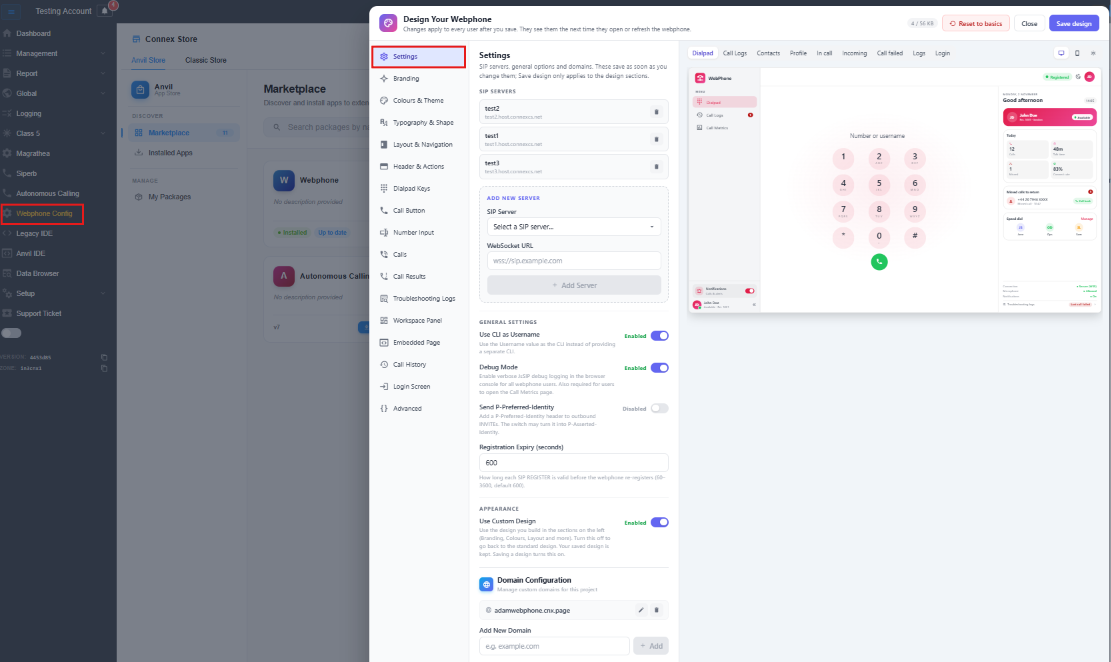
SIP Servers
This lists the servers users can sign in to. Each server shows its alias and host, with a 🗑 button to remove it.
To add a server, fill in Add New Server:
| Field | Description |
|---|---|
| SIP Server | Pick one of your active ConnexCS servers (<alias>.host.connexcs.net), or Custom. |
| Custom SIP Server | Appears when you pick Custom. Enter the host, for example sip.example.com. |
| WebSocket URL | The secure WebSocket address the webphone connects to, for example wss://sip.example.com. |
Then click Add Server. The button stays disabled until both a server and a WebSocket URL are filled in.
General Settings
| Setting | What it does |
|---|---|
| Use CLI as Username | Uses the Username as the caller ID (CLI), so users don't enter a separate CLI. |
| Debug Mode | Writes detailed SIP logs to the browser console for every user. Users also need this on to open the Call Metrics page. |
| Send P-Preferred-Identity | Adds a P-Preferred-Identity header to outbound calls. The switch may turn it into P-Asserted-Identity. |
| Registration Expiry (seconds) | How long each registration lasts before the webphone registers again. It can be 60 to 3600 seconds, and the default is 600. |
Appearance
| Setting | What it does |
|---|---|
| Use Custom Design | On shows users the design you built in the other sections. Off shows the standard design, but your saved design is kept, so you can turn it back on. Saving a design turns this on automatically. |
Domain Configuration
This lists the custom domains the webphone can be reached on.
- Add: type a domain (for example
example.com) under Add New Domain and click Add, or press Enter. - Edit: click ✏, change the name, then click ✔ or press Enter to save. Click ✖ or press Esc to cancel.
- Delete: click 🗑.
5. Branding
Your logo, product name and the title in the browser tab.
Navigate to the Control Panel Webphone Config Branding OR Click on Open Desginer. 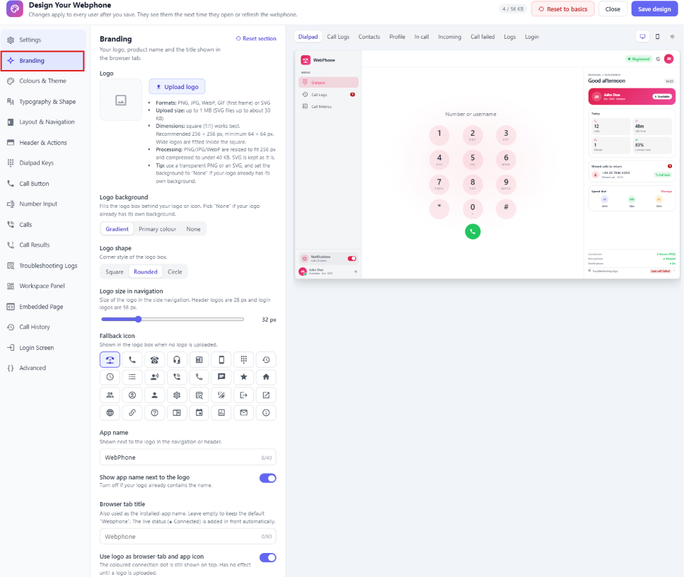
| Option | Description | Default |
|---|---|---|
| Logo | Upload your logo, then use Replace logo or Remove to change it. See Logo requirements below. | None (an icon is used instead) |
| Logo background | Fills the box behind the logo or icon: Gradient, Primary colour or None. Pick None if your logo has its own background. Uploading a logo switches Gradient to None automatically. | Gradient |
| Logo shape | Corner style of the logo box: Square, Rounded or Circle. | Rounded |
| Logo size in navigation | 24–56 px. Only affects the side navigation. The header logo is always 28 px and the login logo 56 px. | 32 px |
| Fallback icon | The icon shown when no logo is uploaded. This option is only visible when there's no logo. | Phone (VoIP) icon |
| App name | Shown next to the logo. Up to 40 characters. | WebPhone |
| Show app name next to the logo | Turn this off if your logo already contains the name. | On |
| Browser tab title | The name in the browser tab, also used as the installed-app name. Up to 60 characters. Leave it empty to use "Webphone". The live status (for example ● Connected) is added in front automatically. | Empty |
| Use logo as browser-tab and app icon | Uses your logo as the browser tab icon and the installed-app icon. A coloured connection dot still shows on top. Has no effect until you upload a logo. | On |
Logo requirements
- Formats: PNG, JPG, WebP, GIF (only the first frame is used) or SVG.
- Upload size: up to 1 MB. SVG files can be up to about 30 KB.
- Dimensions: square images work best. 256 × 256 px is recommended and 64 × 64 px is the minimum. Wide logos are fitted inside the square.
- Processing: PNG, JPG and WebP images are resized to fit 256 px and compressed to under 40 KB. If they're still too big, they're made smaller. SVGs are kept as they are.
- Tip: use a transparent PNG or an SVG, and set Logo background to None.
After you upload a logo, a message shows the original and stored size. You'll also see a warning if the image is under 64 px (it may look blurry), or a tip if it isn't square.
6. Colours & Theme
Your brand colours and how light and dark mode work. Every coloured part of the webphone uses these colours.
Navigate to the Control Panel Webphone Config Colours & Theme OR Click on Open Desginer. 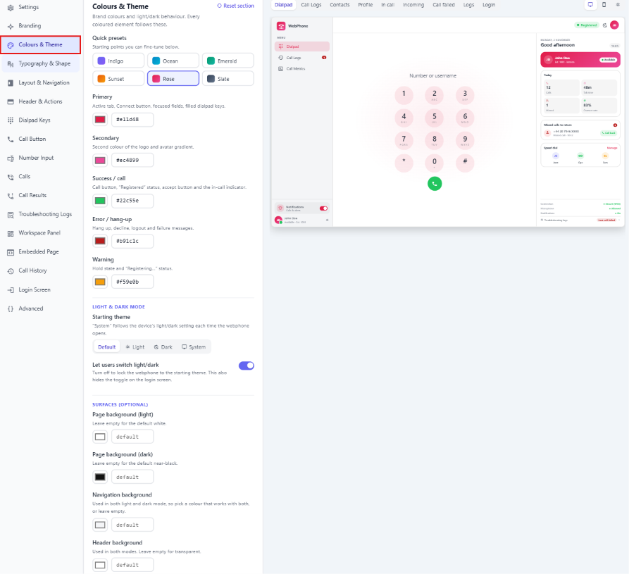
Quick presets
Click a preset to start from it, then change any colour below.
| Preset | Primary | Secondary |
|---|---|---|
| Indigo (default) | #6366f1 |
#8b5cf6 |
| Ocean | #0284c7 |
#06b6d4 |
| Emerald | #059669 |
#14b8a6 |
| Sunset | #ea580c |
#f59e0b |
| Rose | #e11d48 |
#ec4899 |
| Slate | #334155 |
#64748b |
Presets also set the Success and Error colours. Once you change Primary, Secondary, Success or Error yourself, the preset is no longer shown as selected.
Brand colours
| Colour | Where it's used | Default |
|---|---|---|
| Primary | The active tab, the Connect button, the selected field and filled dialpad keys. | #6366f1 |
| Secondary | The second colour in the logo and avatar gradients. | #8b5cf6 |
| Success / call | The Call button, the "Registered" status, the Accept button and the in-call indicator. | #22c55e |
| Error / hang-up | Hang up, Decline, Logout and failure messages. | #ef4444 |
| Warning | The on-hold state and the "Registering…" status. | #f59e0b |
Light & dark mode
| Option | Description | Default |
|---|---|---|
| Starting theme | Default, Light, Dark or System. System follows the device's light or dark setting each time the webphone opens. | Default |
| Let users switch light/dark | Turn this off to lock the webphone to the starting theme. This also hides the light/dark toggle on the login screen and in the webphone. | On |
Surfaces (optional)
Leave any of these empty to use the default.
| Option | Description |
|---|---|
| Page background (light) | The page background in light mode. Empty means white. |
| Page background (dark) | The page background in dark mode. Empty means near-black. |
| Navigation background | Used in both light and dark mode, so pick a colour that works in both. |
| Header background | Used in both modes. Empty means transparent. |
7. Typography & Shape
Navigate to the Control Panel Webphone Config Typography & Shape OR Click on Open Desginer. 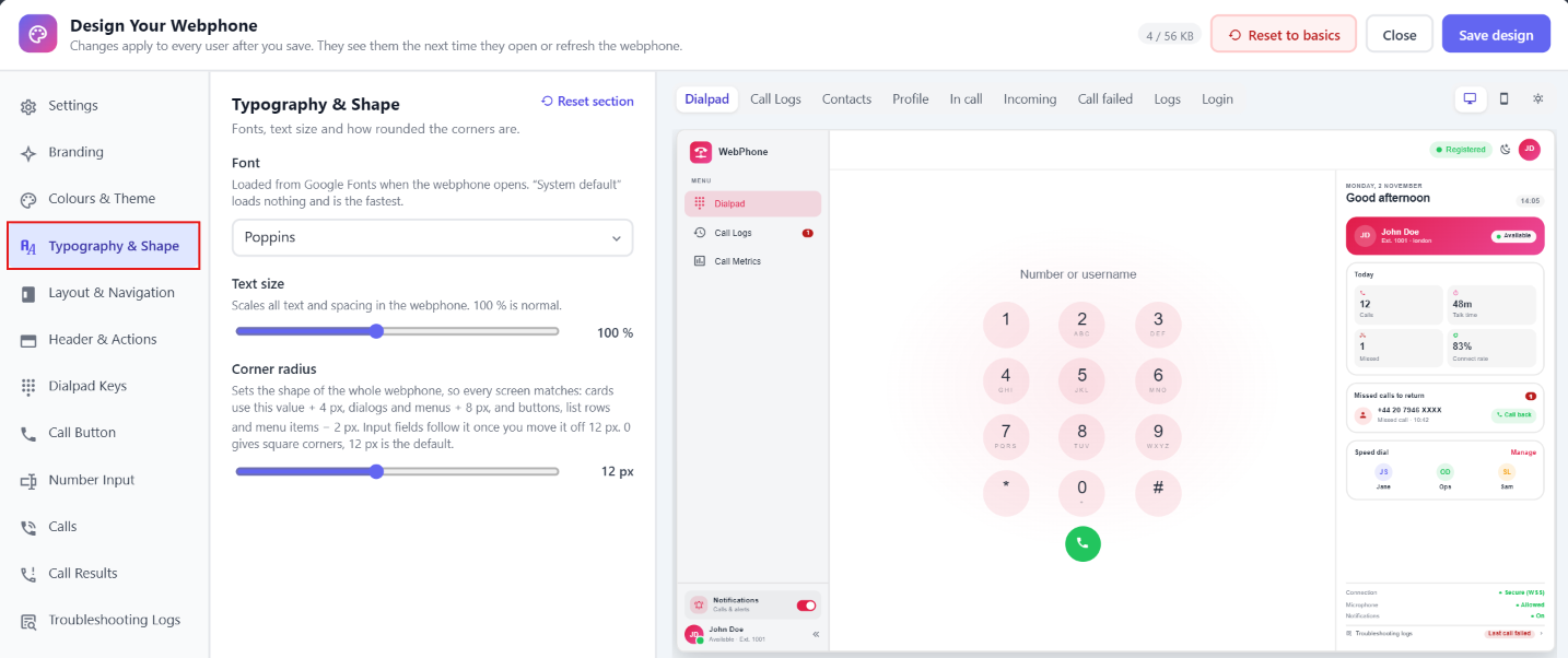
| Option | Description | Default |
|---|---|---|
| Font | System default, Inter, Roboto, Poppins, Open Sans, Lato, Montserrat, Nunito, Source Sans or Monospace. Fonts load from Google Fonts. System default loads nothing, so it's the fastest. | System default |
| Text size | 85–120 % in 5 % steps. Changes the size of all text and spacing. | 100 % |
| Corner radius | 0–28 px. Sets the corner shape across the whole webphone: cards use this value + 4 px, dialogs and menus + 8 px, and buttons, list rows and menu items − 2 px. Input fields follow it once you change it from 12 px. 0 gives square corners. | 12 px |
8. Layout & Navigation
Where the navigation sits, what it shows and which tabs it has.
Navigate to the Control Panel Webphone Config Layout & Navigation OR Click on Open Desginer. 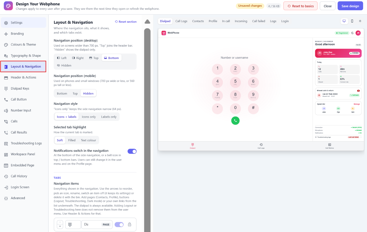
Navigation
| Option | Description | Default |
|---|---|---|
| Navigation position (desktop) | For screens wider than 700 px: Left, Right, Top (joins the header bar), Bottom or Hidden (only the dialpad is shown). | Left |
| Navigation position (mobile) | For phones and small windows (700 px wide or less, or 560 px tall or less): Bottom, Top or Hidden. | Bottom |
| Navigation style | Icons + labels, Icons only (keeps the side navigation 64 px wide) or Labels only. | Icons + labels |
| Selected tab highlight | How the current tab is shown: Soft, Filled or Text colour. | Soft |
| Side navigation width | 160–320 px. Only for left or right navigation, and not with Icons only. | 220 px |
| Users can collapse the side navigation | Shows a collapse arrow at the bottom. Only for left or right navigation with Icons + labels. | On |
| Start collapsed | The side navigation starts in its narrow, icons-only form. Same conditions as above. | Off |
| Notifications switch in the navigation | A switch at the bottom of the side navigation, or a 🔔 bell in top or bottom bars. Users can still change notifications in the user menu and on the Profile page. | On |
| User card in the side navigation | Initials, name, extension and presence at the bottom. Only for left or right navigation. | On |
Tabs (navigation items)
This list is everything that appears in the navigation. For each item, you can:
- Reorder it with the ▲ ▼ arrows.
- Pick an icon from the dropdown.
- Rename it. Labels can be up to 20 characters.
- Show or hide it with the switch. A hidden item keeps its settings.
- Delete it with 🗑.
Each item also has a tag showing what kind it is:
- Page opens a screen in the webphone.
- Button does something when clicked.
- Link · new tab or Link · opens inside is a custom link.
The Dialpad is required. It's locked 🔒 and can't be hidden or removed.
Items you can add
Click an item under Add to navigation to add it:
| Item | Kind | What it does |
|---|---|---|
| Dialpad | Page | The keypad for placing calls. Always shown. |
| Call Logs | Page | Recent incoming, outgoing and missed calls. (Included by default.) |
| Contacts | Page | A personal phonebook, saved in the user's browser. |
| Profile | Page | The user's account (SIP server, username, password, CLI), dark mode, auto-answer and logout. |
| Call Metrics | Page | Live call quality stats: quality score, delay, jitter, packet loss, codec, network path and encryption. It keeps the last 5 calls that had audio. ⚠ Users can only open it while Debug Mode is on (Settings). (Included by default.) |
| Troubleshooting | Button | Opens the troubleshooting logs window. |
| Dark mode | Button | Switches between light and dark mode. |
| Logout | Button | Signs the user out. |
| Custom link | Link | Any https:// address, such as a help page, CRM or status page. Up to 8 links. |
Adding Logout or Troubleshooting here doesn't remove them from the user menu. To move or hide them, use Header & Actions.
Custom link settings
- Address: must start with
https://. You can't save while a link has a missing or invalid address. - Open in:
- New browser tab opens the address in a new tab.
- Inside the webphone shows it as a page in the webphone. Many sites (Google, Microsoft and others) block this, so test it. If the page shows blank, use New browser tab instead.
Opens on
Choose the page users see right after they log in. You can only choose visible pages and links that open inside the webphone. If you hide or delete the chosen page, this goes back to the Dialpad automatically.
Content area
| Option | Description | Default |
|---|---|---|
| Workspace panel beside the dialpad | On screens 1000 px and wider, shows a panel next to the keypad (see Workspace Panel). Phones and narrow windows always show only the dialpad. | On |
| Workspace panel position | Left or Right of the keypad. | Right |
| Show header bar | The top bar with the status and user menu. If the navigation is hidden, the header stays visible anyway, so users can always log out. | On |
| Max content width | 480–1200 px. The widest the main area gets on large screens. | 720 px |
| Content alignment | Centered or Left. | Centered |
Page titles (Call Logs, Contacts, Profile)
| Option | Description | Default |
|---|---|---|
| Title alignment | Left or Center. With Center, the back button sits on one side and the page actions (such as Clear all or Add contact) on the other. | Left |
| Back button | Returns to the previous page, or to the "Opens on" page. | On |
| Back button position | Before title, Above title (a small "← Back" link above the title) or Right side (after the page actions). | Before title |
| Back button style | Arrow only or Arrow + "Back". Not available with Above title. | Arrow only |
9. Header & Actions
Choose where the status, theme toggle, troubleshooting logs and logout appear. If a location doesn't exist in your current layout, the item moves to the nearest one.
Navigate to the Control Panel Webphone Config Header & Actions OR Click on Open Desginer. 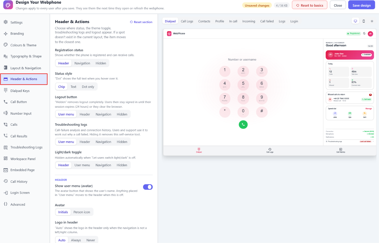
| Option | Choices | Description | Default |
|---|---|---|---|
| Registration status | Header · Navigation · Hidden | Shows whether the phone is registered and can receive calls. | Header |
| Status style | Chip · Text · Dot only | With Dot only, users see the full text when they hover over the dot. | Chip |
| Logout button | User menu · Header · Navigation · Hidden | ⚠ Hidden removes logout completely. Users stay signed in until their session expires (24 hours) or they clear their browser data. | User menu |
| Troubleshooting logs | User menu · Header · Navigation · Hidden | Shows why calls failed and the connection history. Hiding it takes this self-help tool away from users and support. | User menu |
| Light/dark toggle | Header · User menu · Navigation · Hidden | Hidden automatically when Let users switch light/dark is off. | Header |
Header
| Option | Description | Default |
|---|---|---|
| Show user menu (avatar) | The avatar button with the user's name. If you turn it off, anything set to "User menu" moves to the header. | On |
| Avatar | Initials or Person icon. | Initials |
| Logo in header | Auto shows the logo in the header only when the navigation isn't a left or right column. You can also choose Always or Never. | Auto |
10. Dialpad Keys
How the 12 dialpad keys look. On phones the keys automatically shrink to 42 px and the letters are hidden.
Navigate to the Control Panel Webphone Config Dial Pads OR Click on Open Desginer. 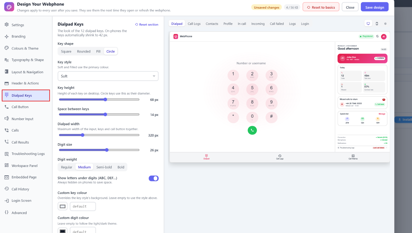
| Option | Description | Default |
|---|---|---|
| Key shape | Square, Rounded, Pill or Circle. | Circle |
| Key style | Outlined, Soft, Filled, Grey, Raised or Plain. Soft and Filled use the Primary colour. | Soft |
| Key height | 40–88 px on desktop. Circle keys use this as their diameter. | 68 px |
| Space between keys | 0–24 px. | 14 px |
| Dialpad width | 240–520 px. The maximum width of the number field, keys and Call button together. | 320 px |
| Digit size | 14–34 px. | 26 px |
| Digit weight | Regular, Medium, Semi-bold or Bold. | Medium |
| Show letters under digits (ABC, DEF…) | Always hidden on phones. | On |
| Custom key colour | Replaces the key style's background colour. Leave it empty to use the key style. | Empty |
| Custom digit colour | Leave it empty to follow light or dark mode. | Empty |
11. Call Button
The main button under the dialpad.
Navigate to the Control Panel Webphone Config Call Button OR Click on Open Desginer. 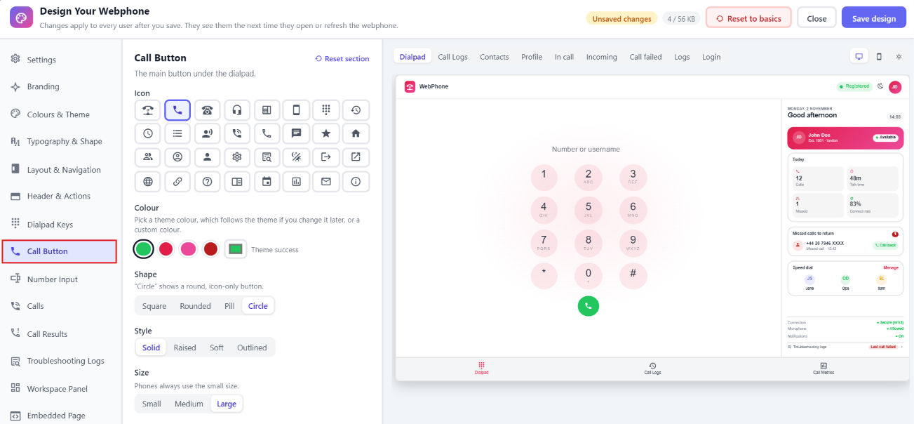
| Option | Description | Default |
|---|---|---|
| Label | The button text, up to 20 characters. Not available with the Circle shape. | Call |
| Show icon next to label | Not available with the Circle shape. | On |
| Icon | Pick from the icon set. | Phone |
| Colour | Pick a theme colour (Success, Primary, Secondary or Error), which updates if you change the theme later, or a custom colour. | Success |
| Shape | Square, Rounded, Pill or Circle. Circle is a round, icon-only button. | Circle |
| Style | Solid, Raised, Soft or Outlined. | Solid |
| Size | Small, Medium or Large. Phones always use Small. | Large |
| Full width | Stretches the button across the dialpad. Not available with Circle. | On |
12. Number Input
The field where users type or paste a number.
Navigate to the Control Panel Webphone Config Number Input OR Click on Open Desginer. 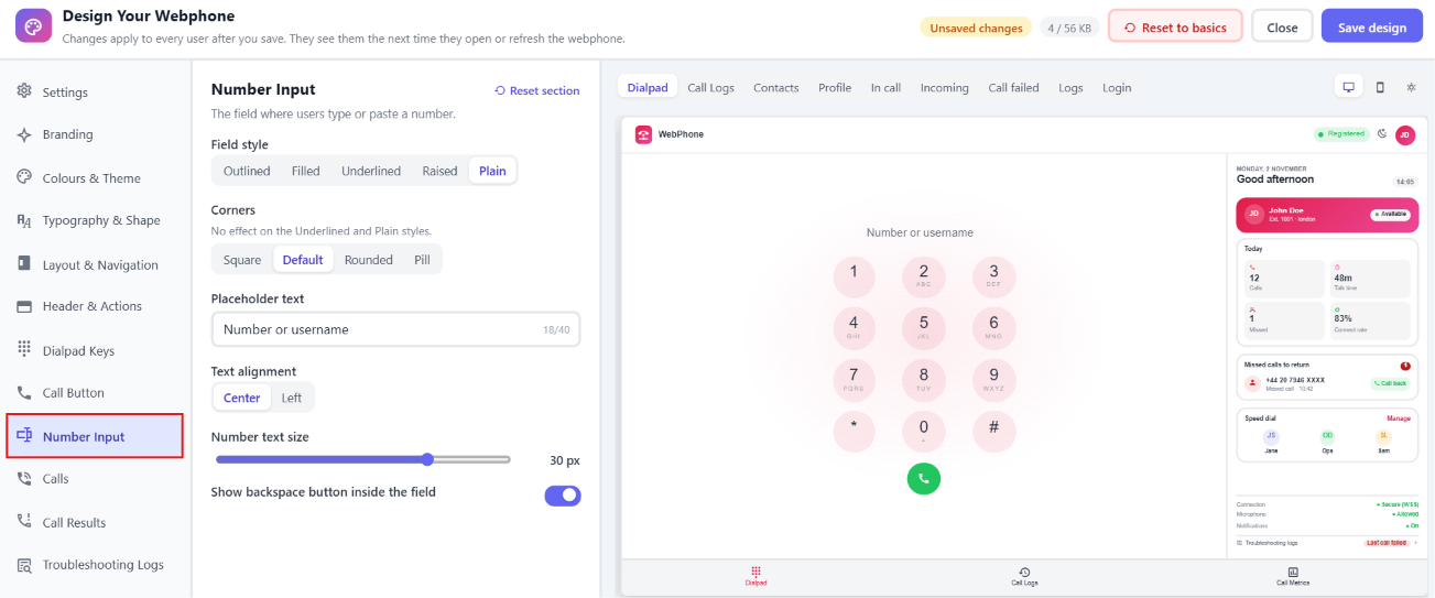
| Option | Description | Default |
|---|---|---|
| Field style | Outlined, Filled, Underlined, Raised or Plain. | Plain |
| Corners | Square, Default, Rounded or Pill. Has no effect with the Underlined and Plain styles. | Default |
| Placeholder text | Up to 40 characters. | Number or username |
| Text alignment | Center or Left. | Center |
| Number text size | 14–36 px. | 30 px |
| Show backspace button inside the field | Shows a ⌫ button at the end of the field. | On |
13. Calls
The outgoing and in-call card, and the incoming call popup.
Navigate to the Control Panel Webphone Config Calls OR Click on Open Desginer. 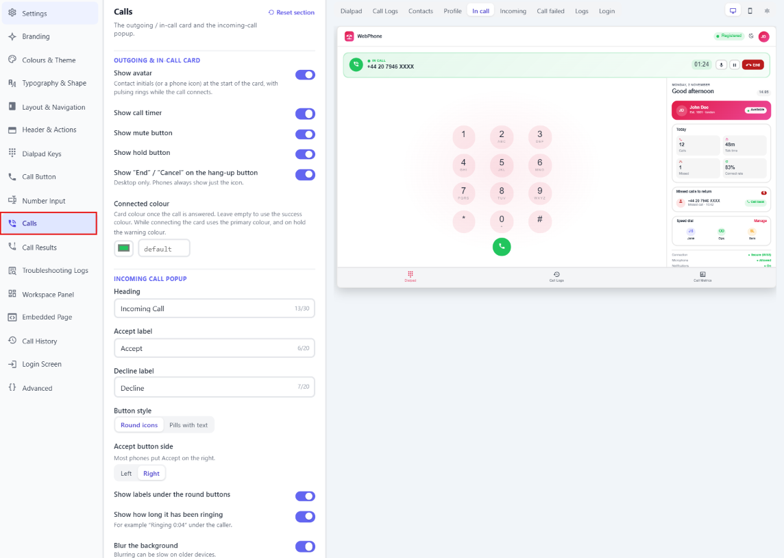
Outgoing & in-call card
| Option | Description | Default |
|---|---|---|
| Show avatar | The contact's initials (or a phone icon) at the start of the card, with pulsing rings while the call connects. | On |
| Show call timer | On | |
| Show mute button | On | |
| Show hold button | On | |
| Show "End" / "Cancel" on the hang-up button | Desktop only. Phones always show only the icon. | On |
| Connected colour | The card's colour once the call is answered. Empty means the Success colour. While the call is connecting, the card uses Primary, and while it's on hold, Warning. | Empty |
Incoming call popup
| Option | Description | Default |
|---|---|---|
| Heading | Up to 30 characters. | Incoming Call |
| Accept label | Up to 20 characters. | Accept |
| Decline label | Up to 20 characters. | Decline |
| Button style | Round icons or Pills with text. | Round icons |
| Accept button side | Left or Right. Most phones put Accept on the right. | Right |
| Show labels under the round buttons | Only with Round icons. | On |
| Show how long it has been ringing | For example "Ringing 0:04" under the caller. | On |
| Blur the background | Can be slow on older devices. | On |
14. Call Results
These settings control the "Call failed" popup and the Call details view in Call History. Both use the same card, so each setting applies to both.
Navigate to the Control Panel Webphone Config CallResults OR Click on Open Desginer. 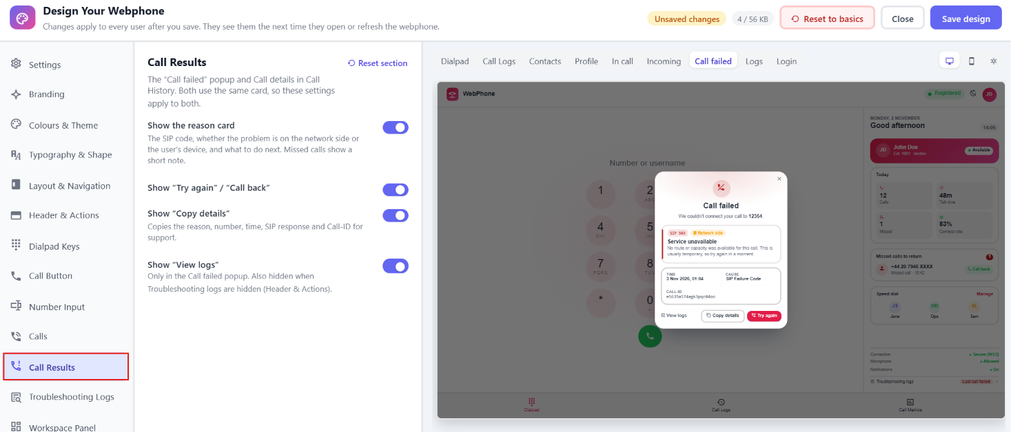
| Option | Description | Default |
|---|---|---|
| Show the reason card | Explains the failure in plain language: the SIP code, whether the problem is on the network side or the user's device, and what to do next. Missed calls show a short note instead. | On |
| Show "Try again" / "Call back" | On | |
| Show "Copy details" | Copies the reason, number, time, SIP response and Call-ID to send to support. | On |
| Show "View logs" | Only in the Call failed popup. Also hidden when Troubleshooting logs are hidden under Header & Actions. | On |
15. Troubleshooting Logs
The window that explains why a call failed and shows the connection history. You choose where it can be opened from in other sections: Header & Actions (user menu, header, navigation or hidden), Call History and Workspace Panel.
Navigate to the Control Panel Webphone Config Troubleshooting Logs OR Click on Open Desginer. 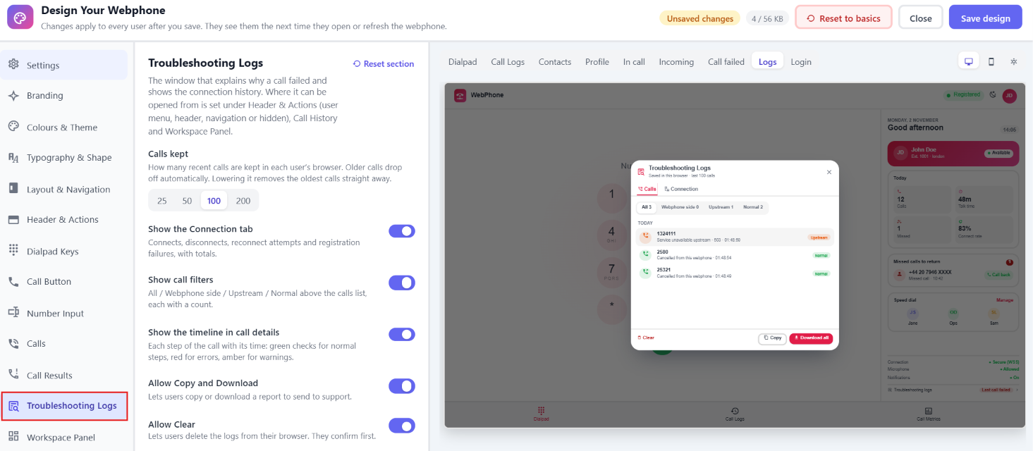
| Option | Description | Default |
|---|---|---|
| Calls kept | 25, 50, 100 or 200. How many recent calls are kept in each user's browser. Older calls are removed automatically, and lowering the number removes the oldest calls straight away. | 100 |
| Show the Connection tab | Connects, disconnects, reconnect attempts and registration failures, with totals. | On |
| Show call filters | All / Webphone side / Upstream / Normal above the calls list, each with a count. | On |
| Show the timeline in call details | Each step of the call with its time: green ✔ for normal steps, red for errors and amber for warnings. | On |
| Allow Copy and Download | Lets users copy or download a report to send to support. | On |
| Allow Clear | Lets users delete the logs from their browser. They're asked to confirm first. | On |
16. Workspace Panel
The panel next to the dialpad on wide screens. You choose which side it's on under Layout & Navigation.
Navigate to the Control Panel Webphone Config Workspace Panel OR Click on Open Desginer. 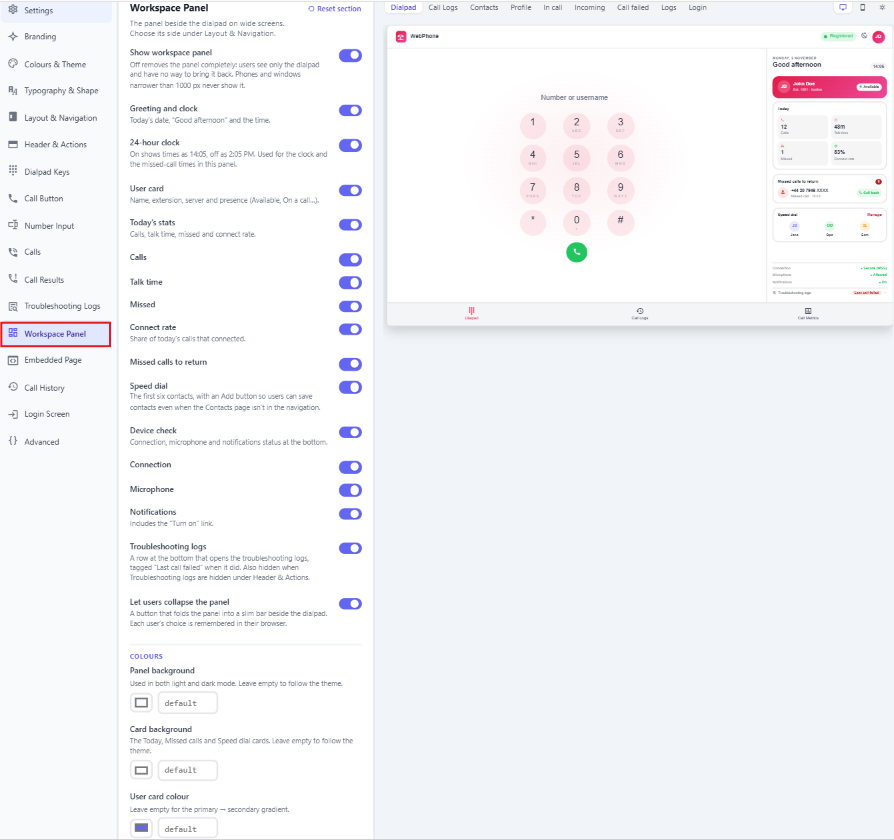
| Option | Description | Default |
|---|---|---|
| Show workspace panel | ⚠ Off removes the panel completely, and users have no way to bring it back. This is the same setting as "Workspace panel beside the dialpad" under Layout & Navigation. Phones and windows narrower than 1000 px never show it. | On |
| Greeting and clock | Today's date, a greeting (such as "Good afternoon") and the time. | On |
| 24-hour clock | On shows times as 14:05, off as 2:05 PM. Used for the clock and the missed-call times in this panel. | On |
| User card | Name, extension, server and presence (Available, On a call…). | On |
| Today's stats | Today's calls, talk time, missed calls and connect rate. You can turn each one on or off: Calls, Talk time, Missed and Connect rate (the share of today's calls that connected). | On (all) |
| Missed calls to return | Missed calls waiting for a call back. | On |
| Speed dial | The first six contacts, with an Add button so users can save contacts even when Contacts isn't in the navigation. | On |
| Device check | Connection, microphone and notification status at the bottom. You can turn each check on or off: Connection, Microphone and Notifications (which includes a "Turn on" link). | On (all) |
| Troubleshooting logs | A row at the bottom that opens the logs. It's tagged "Last call failed" when the last call failed. Also hidden when Troubleshooting logs are hidden under Header & Actions. | On |
| Let users collapse the panel | A button that folds the panel into a slim bar. Each user's choice is remembered in their browser. | On |
Colours
Leave any of these empty to follow the theme.
| Option | Description |
|---|---|
| Panel background | Used in both light and dark mode. |
| Card background | The Today, Missed calls and Speed dial cards. |
| User card colour | Empty means a gradient from Primary to Secondary. |
All options except Show workspace panel only appear while the panel is on.
17. Embedded Page
Shows another web page, such as a second dialer or your CRM, next to the dialpad. The dialpad, calls and every tab keep working next to it.
Navigate to the Control Panel Webphone Config Embedded Page OR Click on Open Desginer. 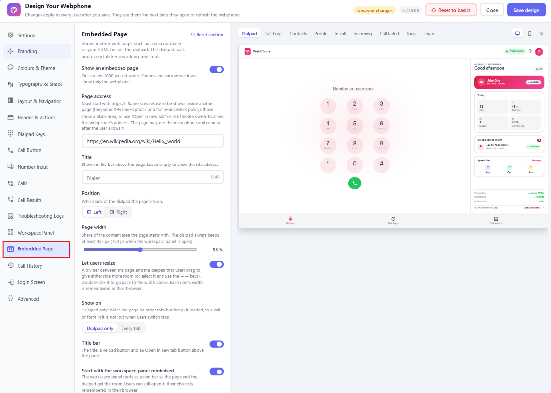
| Option | Description | Default |
|---|---|---|
| Show an embedded page | Shown on screens 1000 px and wider. Phones and narrow windows show only the webphone. | Off |
| Page address | Must start with https://. The page may use the microphone and camera once the user allows it. See the note below about sites that block embedding. |
Empty |
| Title | Shown in the bar above the page, up to 40 characters. Empty shows the site address. | Empty |
| Position | Left or Right of the dialpad. | Left |
| Page width | 35–75 %. How much of the content area the page starts with. The dialpad always keeps at least 420 px, or 760 px when the workspace panel is open. | 55 % |
| Let users resize | Adds a divider users can drag to give either side more room. They can also select it and use the ← → keys, or double-click it to go back to the starting width. Each user's width is remembered in their browser. | On |
| Show on | Dialpad only or Every tab. With Dialpad only, the page is hidden on other tabs but stays loaded, so a call or form in it isn't lost when users switch tabs. | Dialpad only |
| Title bar | Shows the title, a Reload button and an Open in new tab button above the page. | On |
| Start with the workspace panel minimised | The workspace panel starts as a slim bar to make room for the page and dialpad. Users can still open it, and their choice is remembered. Only shown while the workspace panel is on. | On |
Pages that won't embed: some sites refuse to be shown inside another page. They send an
X-Frame-Optionsheader or aframe-ancestorspolicy, and the area shows blank. Use Open in new tab, or ask the site owner to allow the webphone's address.
18. Call History
The Call Logs tab.
Navigate to the Control Panel Webphone Config Call History OR Click on Open Desginer. 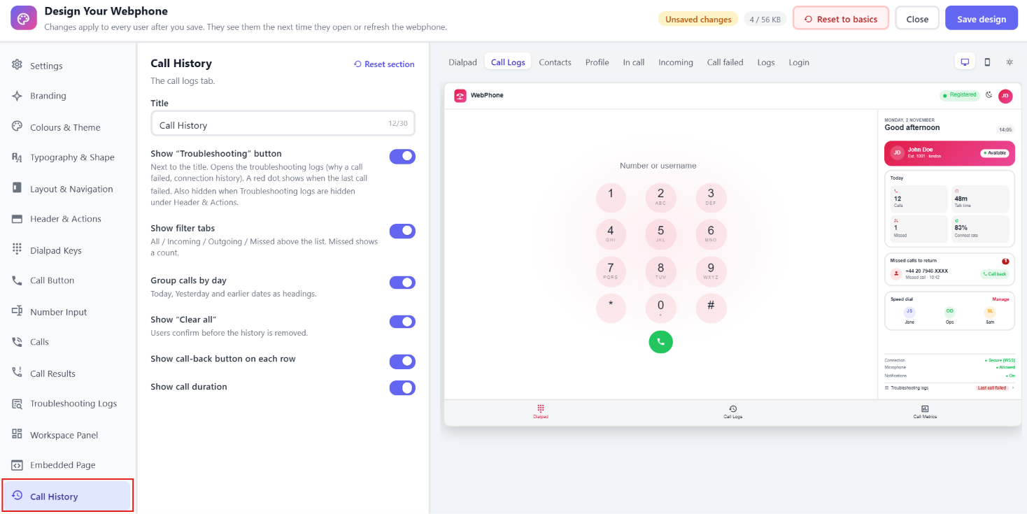
| Option | Description | Default |
|---|---|---|
| Title | Up to 30 characters. | Call History |
| Show "Troubleshooting" button | Next to the title. Opens the troubleshooting logs, with a red dot when the last call failed. Also hidden when Troubleshooting logs are hidden under Header & Actions. | On |
| Show filter tabs | All / Incoming / Outgoing / Missed. Missed shows a count. | On |
| Group calls by day | Today, Yesterday and earlier dates as headings. | On |
| Show "Clear all" | Users confirm before their history is removed. | On |
| Show call-back button on each row | On | |
| Show call duration | On |
19. Login Screen
What users see before they sign in.
Navigate to the Control Panel Webphone Config Login Screen OR Click on Open Desginer. 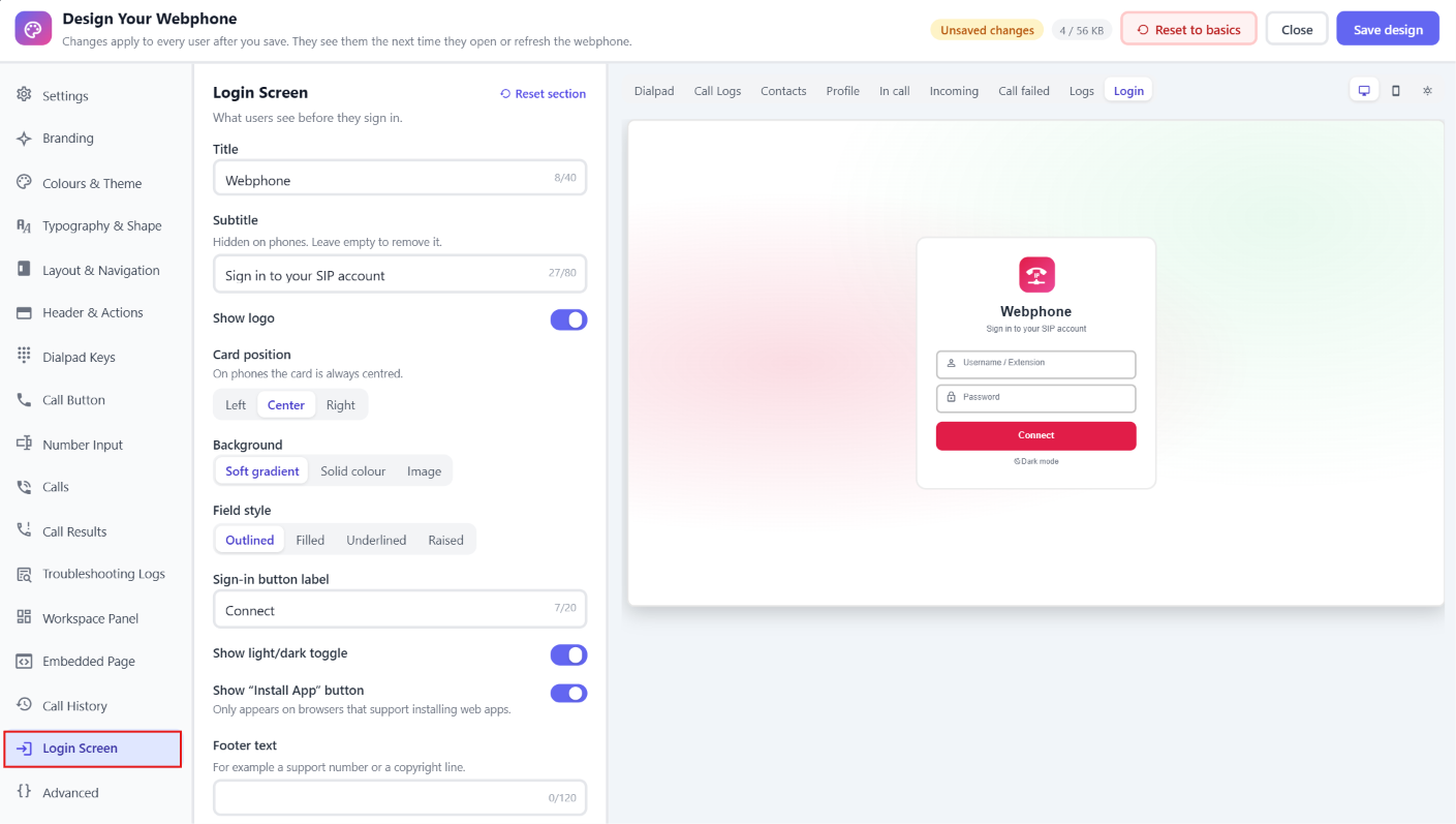
| Option | Description | Default |
|---|---|---|
| Title | Up to 40 characters. | Webphone |
| Subtitle | Up to 80 characters. Hidden on phones. Leave it empty to remove it. | Sign in to your SIP account |
| Show logo | On | |
| Card position | Left, Center or Right. Always centered on phones. | Center |
| Background | Soft gradient, Solid colour or Image. | Soft gradient |
| Background colour | Only with Solid colour. | Empty |
| Background image URL | Only with Image. A public https:// link to a JPG or WebP image, at least 1920 × 1080 px and under 500 KB if possible. Users' browsers load it from that address, so it has to stay online. |
Empty |
| Field style | Outlined, Filled, Underlined or Raised. | Outlined |
| Sign-in button label | Up to 20 characters. | Connect |
| Show light/dark toggle | Also hidden if users aren't allowed to switch light/dark. | On |
| Show "Install App" button | Only appears on browsers that can install web apps. | On |
| Footer text | For example a support number or a copyright line. Up to 120 characters. | Empty |
20. Advanced
Navigate to the Control Panel Webphone Config Advanced OR Click on Open Desginer. 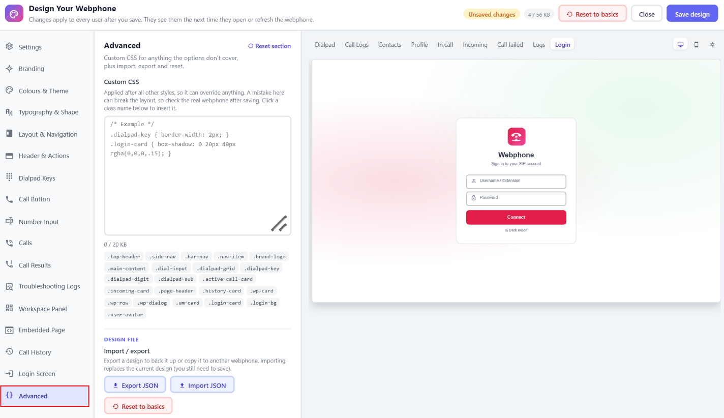
Custom CSS
Use this for anything the options don't cover. Your CSS is applied after all other styles, so it can override anything.
- Size limit: 20 KB. A counter appears under the box.
- Class shortcuts: click a class name under the box to insert it:
| Class | What it styles |
|---|---|
.top-header |
The top header bar |
.side-nav |
The left or right navigation column |
.bar-nav |
The top or bottom navigation bar |
.nav-item |
An item in the side navigation |
.brand-logo |
The logo container |
.main-content |
The main content area |
.dial-input |
The number input field |
.dialpad-grid |
The grid that holds the keys |
.dialpad-key |
Each dialpad key |
.dialpad-digit |
The digit text on a key |
.dialpad-sub |
The letters under a digit |
.active-call-card |
The in-call bar |
.incoming-card |
The incoming call popup |
.page-header |
The title bar on Call Logs, Contacts and Profile |
.history-card |
Call history and contacts list cards |
.wp-card |
Cards on the Profile page |
.wp-row |
A row in a list (a call, contact or preference) |
.wp-dialog |
Call details, call failed and confirmation dialogs |
.um-card |
The user menu (avatar dropdown) |
.login-card |
The login card |
.login-bg |
The login background (gradient mode) |
.user-avatar |
The user avatar |
Example:
.dialpad-key { border-width: 2px; }
.login-card { box-shadow: 0 20px 40px rgba(0,0,0,.15); }
⚠ A mistake in custom CSS can break the layout. After you save, check the real webphone, not just the preview.
Design file: import and export
| Button | What it does |
|---|---|
| Export JSON | Downloads your current design as webphone-design.json. Use it as a backup or to copy the design to another webphone. |
| Import JSON | Loads a design file (up to 1 MB) and replaces the current design in the Studio. Check the preview, then click Save design to apply it. Unknown or invalid values are ignored and replaced with the defaults, so an old or partial file won't break anything. |
| Reset to basics | Same as the button in the top bar (see Saving, resetting and closing). |
21. Limits at a glance
| Item | Limit |
|---|---|
| Total saved design | 56 KB. Shown in the size meter in the top bar, which turns amber above about 85 %. Most of the size is usually the logo. |
| Logo upload | 1 MB (SVG about 30 KB) |
| Logo after processing | 40 KB, longest side 256 px |
| Custom CSS | 20 KB |
| Custom links | 8 |
| Navigation labels | 20 characters |
| Most text fields | 20–40 characters (subtitle 80, footer 120, tab title 60) |
| Registration expiry | 60–3600 seconds |
Save design is blocked, with a red banner explaining why, when:
- the custom CSS is over 20 KB
- the whole design is over 56 KB (use a smaller logo or shorter CSS)
- a custom navigation link is missing an
https://address - the login background image URL doesn't start with
https://
22. Troubleshooting & FAQ
I saved, but users still see the old design. Users need to open or refresh the webphone. Also check that Use Custom Design is on under Settings → Appearance.
Users can't open Call Metrics. Turn on Debug Mode under Settings → General Settings.
My custom link or embedded page shows blank. The site blocks being embedded. Switch the link to New browser tab, or use Open in new tab in the embedded page's title bar.
The design is too big to save. Upload a smaller or simpler logo (an SVG or a flat PNG works well), or shorten the custom CSS.
My logo looks blurry. Upload an image at least 64 × 64 px. 256 × 256 px is ideal, or use an SVG.
I can't hide or remove the Dialpad. That's intentional. The Dialpad is always available.
Users can't log out. Logout button is set to Hidden under Header & Actions. Choose another location for it.
The workspace panel or embedded page doesn't show. Both need a screen at least 1000 px wide. Phones and narrow windows show only the dialpad.
I want to undo everything. Use Reset to basics and then Save design. To return to the standard design without losing your work, turn off Use Custom Design instead.